
Building your own website used to mean either hiring a developer or spending weeks learning code. Today, the tools and processes have matured to the point where almost anyone can go from an idea to a live, functional website in a matter of days.
But having access to tools is not the same as knowing how to use them well. The difference between a website that works and one that sits quietly ignored usually comes down to decisions made before a single page is built: knowing what the site is for, who it is for, and what you want them to do when they get there.
This guide walks you through all ten steps, from defining your purpose to testing and launching, with practical examples, resources, and checklists to move you forward at each stage.
Step 1: Define what you want your website to achieve
Every decision you make while building your website, from layout to content to which features to include, should follow from one thing: what the site is actually trying to do.
Start by writing down the single most important outcome you want the website to produce. Not a list of outcomes.
Here are a few examples of how this plays out in practice:
- A freelance copywriter wants the website to generate inbound inquiries from businesses looking for content support. The outcome is: potential clients contacting her.
- A ceramic artist wants to sell pieces directly to buyers without going through a marketplace. The outcome is: visitors purchasing from an online shop.
- A fitness coach wants to attract new clients by demonstrating expertise through free content. The outcome is: readers signing up to a newsletter or book a discovery call.
- A restaurant owner wants people who find the site through Google to make a reservation. The outcome is: visitors booking a table.
Once you are clear on your outcome, everything else becomes easier to evaluate. A contact form is essential if your goal is inquiries. A blog matters if your goal is building an audience. An e-commerce checkout is non-negotiable if your goal is sales. Features that do not serve your primary outcome can wait.
The websites that feel scattered and unclear usually share the same problem they were built to do everything at once and ended up doing none of it particularly well.
Step 2: Decide the main action you want visitors to take
Once you know your outcome, translate it into one clear action. This is your primary call to action, and it should be the organizing principle behind your entire website.
Examples of primary calls to action:
- Book a consultation
- Buy this product
- Sign up to the newsletter
- Download the free guide
- Get in touch
Choosing one primary action does not mean you cannot have secondary actions on the site. A photographer might want visitors to browse the portfolio as a secondary action, but the primary one is to make an inquiry. The difference is that the primary action gets the most prominent placement, the clearest button, and the most consistent reinforcement across every page.
Think about what happens when a visitor lands on your homepage with no prior context. Within a few seconds, can they tell what the site offers and what they should do next? If the answer requires them to scroll, read carefully, or work it out, the call to action is not clear enough.
Tip
A useful test: describe your website in one sentence using the format "I help [audience] do [outcome] by [primary action]." If you cannot complete that sentence clearly, your call to action is probably still too vague.
Step 3: Outline a simple user flow before you build
Before choosing any tool or designing any page, sketch out how a visitor will move through your website from arrival to completing your desired action. This is called a user flow, and it does not need to be complex.
A simple user flow for a freelance designer might look like this:
- Home (introduces the service and shows selected work)
- Portfolio (shows full case studies with context)
- About (explains background and approach)
- Contact (inquiry form with a clear prompt)
A user flow for a small e-commerce store might look different:
- Home (product highlights and trust signals)
- Shop (product listings by category)
- Product page (photos, description, buy button)
- Cart and checkout
The point is not to create a perfect map. It is to avoid building pages in isolation. Every page should have a clear reason for existing and a clear next step for the visitor. If a page does not lead the visitor closer to your primary call to action, question whether it belongs in the initial build at all.
Keep the flow short. Three to five pages is enough for most websites at launch. You can add pages later once you have real visitor data telling you what they actually want.
For a more visual approach to mapping user flows, tools like Whimsical and Miro offer free templates for sketching site maps and user journeys quickly.
Step 4: Choose how you want to build your website
The building approach you choose affects your launch timeline, how much control you have over design and features, and how easily you can maintain and update the site over time. Here is a clear breakdown of the main options.
No-code website builders
Wix and Squarespace are the most widely used no-code website builders. Both offer visual drag-and-drop editors, hosting, and a library of templates. They are designed for people without technical backgrounds and can produce polished results quickly.
The tradeoff is that you are working within a fixed system. Advanced customization, complex integrations, or features that fall outside what the platform was designed for will hit limits. They work well for straightforward websites with standard needs.
CMS platforms
WordPress powers a very large share of websites on the internet and offers unmatched flexibility through themes and plugins. It is suitable for blogs, business sites, portfolios, and e-commerce through WooCommerce. The learning curve is moderate, and maintaining a WordPress site requires keeping themes and plugins updated.
For those who want the power of WordPress with less setup friction,
WordPress.com offers a hosted version that handles maintenance for you, though with some limitations on customization.
Custom development
Building from scratch using a technology stack such as React for the frontend, Node.js or Python for the backend, and a database like PostgreSQL or MongoDB gives you complete control. This is the right path for websites with complex, custom requirements that no off-the-shelf platform can meet.
It is also the slowest and most expensive route. Custom development is best suited for teams with technical resources and specific requirements that genuinely cannot be met by existing tools.
Full-stack AI website builders
A newer category of tools uses AI to generate and configure websites through natural language instructions, an approach known as vibe coding. Instead of dragging and dropping elements or writing code, you describe what you want and the platform builds it. This significantly lowers the barrier for people who want more than a template but do not want to manage technical complexity.
The key is to evaluate whether the platform produces real, production-grade output or just a surface-level prototype. The strongest options in this category generate actual code on a solid tech stack, not just a visual mockup.
To help you choose, this Web Fundamentals guide is a useful reference for understanding what makes websites performant and well-built, regardless of which tool you use to build them.
The right choice depends on three factors: how quickly you need to launch, how technical you or your team are, and how much you expect the site to grow and change over time.
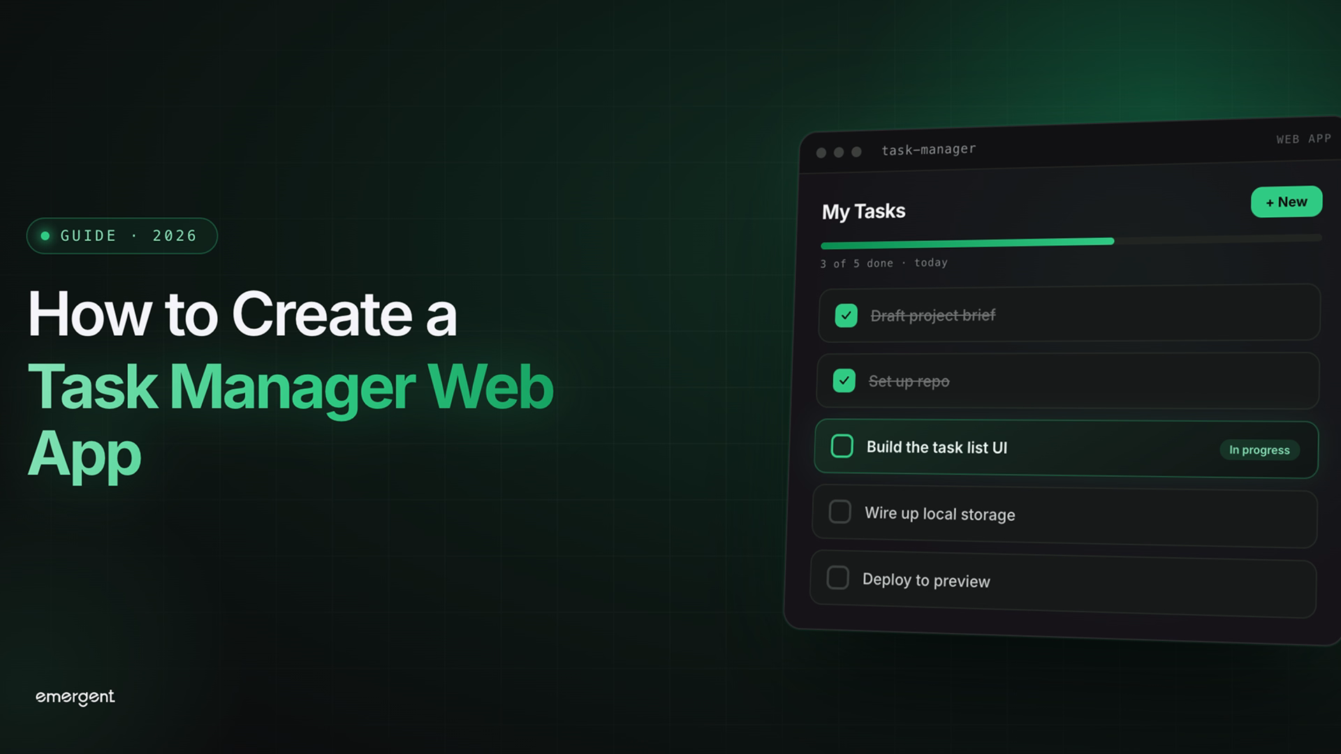
One of the most up and coming tools in this category is Emergent, a full-stack builder that lets you build your own website with just a few instructions.
Step 5: Secure your domain name and online identity
Your domain name is one of the few parts of your website that is genuinely difficult to change later. Once people know your address, start linking to it, and search engines have indexed it, switching costs are real. Choose carefully from the start.
A good domain name is:
- Short and easy to type from memory
- Free of hyphens, numbers, or unusual spellings
- Directly connected to your name, brand, or what the site does
- Available as a .com if possible, or a relevant country-code extension
For example, a personal finance advisor named Jordan Mills might consider "jordanmills.com", "jordanmillsfinance.com", or "millsfinancial.com". All are clean, professional, and immediately associated with the person or service.
You can purchase a domain through registrars like Namecheap, GoDaddy, or Porkbun. Most offer straightforward search, registration, and renewal management. If you are using a platform that handles hosting as part of its service, you may be able to purchase and connect your domain directly within that platform, which removes the need to configure DNS settings manually.
Once purchased, also consider securing matching social media handles on platforms relevant to your audience. Consistency across your domain and social profiles strengthens how your brand is perceived.
Step 6: Pick a platform that matches your workflow
Now that you have your purpose, flow, and domain sorted, it is time to commit to the platform you will build on. The right choice is not the one with the most features. It is the one you will actually be able to use, update, and maintain without constant friction.
Here is how the main options compare:
- Wix: Best for people who want full drag-and-drop control over layout and design without any technical knowledge. Large template library, built-in hosting, and a broad app marketplace. A good starting point for business sites, portfolios, and service pages.
- Squarespace: Known for clean, design-forward templates that work particularly well for creative professionals and product-based businesses. Less flexible in layout than Wix, but the default visual quality is consistently high.
- WordPress: The most flexible CMS available. Best suited for those comfortable with a moderate learning curve or who have access to technical support. Huge ecosystem of themes and plugins for almost any use case.
- Webflow: A more design-focused builder that generates clean HTML and CSS. Good for designers who want pixel-level control without writing code. Steeper learning curve than Wix or Squarespace, but more flexible output.
- Emergent: A full-stack AI-powered personal website builder that brings frontend, backend, and database into a single workflow. You describe what you want to build, and Emergent handles the underlying structure and configuration. It’s a strong option for people who want more than a template allows, without managing multiple tools separately.
Think about how often you plan to update your website yourself. If you want to change copy, add pages, or update features regularly without relying on a developer, pick a platform where those tasks feel natural and fast.
Step 7: Create pages based on user intent, not just structure
Most websites are built around what the owner wants to say. The pages that work best are built around what the visitor wants to know or do. These are different starting points, and they produce very different results.
Instead of asking "what pages should a website have?", ask: "what is someone thinking when they arrive at this page, and what do they need to feel confident taking the next step?"
Here is how that shift plays out in practice:
Example: a consultant's website
Standard structure-first approach:
- Home, About, Services, Blog, Contact
Intent-first approach:
- Home: "What does this person actually do and is it relevant to me?" → clear headline, one-line description of who you help, and immediate examples of work or results
- Services: "Do they offer what I specifically need?" → describe each service in terms of the client's problem, not your process
- Results: "Have they done this before and did it work?" → case studies or testimonials with specific outcomes
- Contact: "How do I reach them and how quickly will they respond?" → short form, clear response time expectation
Example: an online course creator
Standard structure-first approach:
- Home, Courses, About, FAQ, Contact
Intent-first approach:
- Home: "Is this course for someone like me?" → specific audience statement, transformation promise, and one clear enrollment call to action
- Course page: "What exactly will I learn and is it worth it?" → curriculum breakdown, outcomes, instructor credibility, and pricing with a risk-reduction element like a money-back guarantee
- FAQ: "What objections do I have that aren't answered above?" → address the real hesitations, not generic questions
The page titles might look similar, but the content strategy is fundamentally different. One is organized around what you want to tell people. The other is organized around what they need to hear.
For more on writing web copy around user intent, Nielsen Norman Group's writing for the web guidelines are a practical reference grounded in research.
Step 8: Add only the features you actually need
One of the most common mistakes when building a website is adding features because they seem useful, rather than because they serve a specific, defined purpose. Every feature you add creates complexity: something that can break, something that needs updating, something that slows the page down, and something that can distract visitors from your primary call to action.
Start with a features audit. For each feature you are considering, ask: does this directly help my visitor take the primary action, or does it serve another goal entirely?
Features by website type
If your goal is generating inquiries:
- Contact form with relevant fields (name, email, message, and one qualifying question)
- Calendar booking tool, such as Calendly or Cal.com, embedded directly on the page
- Clear display of contact email and response time expectation
If your goal is e-commerce:
- Product pages with high-quality images, descriptions, and a prominent buy button
- Checkout with as few steps as possible
- Payment processing via Stripe or PayPal, both widely trusted by buyers
- Order confirmation email triggered automatically on purchase
If your goal is audience building:
- Email signup form, connected to a provider like Mailchimp or Kit (formerly ConvertKit)
- Lead magnet delivery, a free download or resource that incentivizes signup
- RSS or blog feed for regular content publication
Features like live chat, loyalty programs, multi-currency support, and advanced analytics are worth considering later, once you have a baseline of traffic and user behavior to learn from. Building for a future you cannot yet see adds cost and complexity with no guaranteed return.
Step 9: Make your website easy to find and use
A website that nobody can find or navigate is a website that is not working. This step covers the basics of SEO and usability that apply to almost every type of website, regardless of what it is for or how it was built.
Search engine optimization basics
SEO does not require specialist expertise at the early stage. Consistent attention to a handful of fundamentals makes a meaningful difference over time.
Pre-launch SEO checklist:
- Write a unique page title for every page, describing clearly what that page contains (60 characters or fewer)
- Write a meta description for every page that summarizes the content and includes a natural call to action (150 to 160 characters)
- Use your primary keyword naturally in the first paragraph of each page, in at least one heading, and in the page title
- Add descriptive alt text to every image. Instead of "photo1.jpg", write "ceramic mug with blue glaze on wooden surface"
- Make sure your website is indexed by submitting your sitemap to Google Search Console after launch
- If your audience is local, include your city or region naturally in key page content and set up a Google Business Profile
Mobile optimization
Mobile now accounts for the majority of global web traffic, and that share continues to grow year on year. A site that looks good on desktop but is difficult to use on a phone is losing a significant portion of its potential visitors.
Mobile usability checklist:
- Text is readable without zooming in
- Buttons and links are large enough to tap easily with a thumb
- Navigation works clearly on a small screen
- Forms are easy to fill out on a mobile keyboard
- Images load at appropriate sizes for mobile screens
Page speed
Slow websites lose visitors before they even see the content. The two most common causes are unoptimized images and too many external scripts loading on each page.
- Compress images before uploading using Squoosh or TinyPNG
- Test your page speed with Google PageSpeed Insights and address the issues flagged
- Avoid loading unnecessary third-party scripts, each one adds latency
Step 10: Test your website and make it ready for launch
Going live with a broken form, a 404 page, or a layout that falls apart on mobile creates a poor first impression that is hard to recover from. A structured pre-launch review is short but genuinely worth doing.
Pre-launch checklist
Content and copy:
- Every page has a clear headline that tells visitors what it is about
- There are no placeholder texts, lorem ipsum, or unfinished sections
- Spelling and grammar have been reviewed
- Contact details are accurate and up to date
Links and navigation:
- Every internal link goes to the right page
- No broken links or 404 errors
- Navigation is consistent across all pages
- Your logo links back to the homepage
Forms and functionality:
- Every form submits correctly and sends a confirmation to the user
- Payment processing works end to end (test with a real transaction or sandbox mode)
- Any booking or scheduling tools function correctly
- Email notifications trigger as expected
Device and browser testing:
- Test on both desktop and mobile devices
- Check on at least two browsers: Chrome and Safari cover the majority of users
- Confirm the layout does not break on narrow screens
Performance:
- Run Google PageSpeed Insights on your main pages
- Images are compressed and loading at appropriate sizes
- No unnecessary scripts or plugins are slowing the page
Once you have completed this review, connect your domain, publish the site, and share it. A site that is live and imperfect is almost always more valuable than one that is perfect in draft.
Doing all of this without managing multiple tools
The ten steps in this guide are individually straightforward. The challenge most people run into is not any single step. It is the friction of jumping between tools: a website builder here, a form plugin there, a booking tool somewhere else, a hosting dashboard in another tab, and a domain registrar you log into twice a year.
Every handoff between tools is a point of friction. Something needs to be configured, something breaks when another tool updates, or something just does not look quite right when you pull it all together.
Some platforms are beginning to address this by bringing the essential layers of a website into a single workflow. Rather than assembling a website from parts, you build within one system that handles design, functionality, hosting, and integrations together.
Emergent is a full-stack AI-powered website builder that works this way. It is built for people who want to build a personal website or any other type of site without managing a stack of separate tools. You describe what you want in plain language, and Emergent handles the structure, design, and configuration.
The technical foundation is production-grade: it produces real, maintainable code on solid infrastructure.
On the domain front, Emergent covers every scenario: you can host instantly on an Emergent subdomain, connect a custom domain you already own, claim a free domain (for a limited period of time), or purchase a paid domain directly through Emergent without leaving the builder.
For people who want to add third-party services, such as a payment processor, a scheduling tool, or an email marketing platform, integrations can be connected through simple prompts rather than manual API setup. And because Emergent uses multiple large language models, applying different AI models to different parts of the build, the output at each step is better matched to the specific task.
If the process of building your website should be focused on your content, your audience, and your goals rather than on tool management, Emergent is worth looking at.
Final thoughts
Building your own website is not a technical challenge anymore. It is a clarity challenge. The people who get stuck are not usually stuck because they cannot figure out how to use a tool. They are stuck because they are not sure what the website is supposed to do, who it is for, or what success actually looks like.
The ten steps in this guide are designed to answer those questions before you start building, so that every decision along the way has a clear reason behind it. Define your outcome first, then build toward it. Keep the structure simple, focus on what your visitors need, and launch before it is perfect.
A live website that you improve over time is infinitely more useful than a perfect one that exists only in a draft folder.


Describe what you want and Emergent builds it. A real, production-ready app you can launch the same day.
- One prompt to build
- Zero code required
- Deploy in minutes