



A financial dashboard usually gets overloaded the same way. Someone asks for one more ratio, another department wants its own line item, and a few requests later, the screen holds everything anyone's ever asked for.
That kind of dashboard ends up trusted by nobody, and it turns into a wall people stop opening past the first week.
I built a sample CFO financial dashboard in Emergent's AI Dashboard Builder to pressure-test that problem. Deciding what belonged on the screen was the hard part. The build itself took just 15 credits and eight minutes.
This checklist walks through what a financial dashboard should include, in priority order, and where most builds go wrong before they reach the metrics.
Financial Dashboard Examples
Here's what the sample build looked like once Emergent's AI Dashboard Builder finished it.
The headline view holds four cards, revenue, gross margin, net income, and cash position, each paired with a change indicator, sized to scan in the few seconds a headline view is supposed to take.
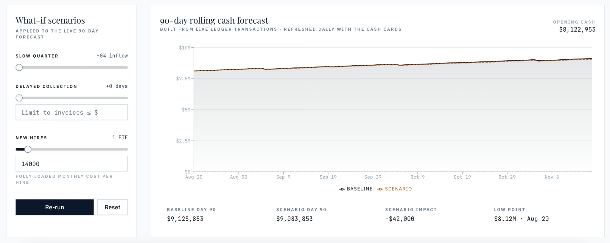
The forecast view pairs what-if sliders for a slow quarter, delayed collection, or a new hire with the rolling 90-day cash forecast, so a scenario's impact shows up on the same chart as the baseline.

That forecast view sits behind a tab bar for P&L/balance sheet, budget vs. actual, and cash & receivables, so the detail stays out of the way until someone opens it.
What Is a Financial Dashboard?
A financial dashboard brings a company's statement-level, cash, and ratio data into one view so a chief financial officer (CFO) or executive can make a decision without opening a spreadsheet first.
It's a specific case of the broader analytics dashboard concept, narrowed to the numbers a CFO has to answer for.
A general business intelligence (BI) dashboard tracks whatever your team decides to watch. A financial dashboard has a narrower job. It has to reconcile against the general ledger and stay accurate enough for a board to act on. It isn't enough to look current.
That's a different bar than a sales dashboard too. Sales leadership checks in daily, while a CFO's board-facing numbers need to be right more than they need to be fast.
Here's what belongs on yours.
Six Categories Every Financial Dashboard Needs
I gave Emergent's AI Dashboard Builder the brief below to build the sample dashboard behind this checklist:
Build a CFO financial dashboard. Show headline cards up top, including revenue, gross margin, net income, and cash position. Put the full P&L, balance sheet, and department-level budget-vs-actual one click behind them, mapped to the same chart-of-accounts categories the general ledger uses.
Add operating cash flow and cash flow after debt service side by side, plus days of cash on hand and accounts receivable aging. Add current ratio, quick ratio, and debt-to-equity, with debt-to-equity behind a separate view for finance and treasury only.
Add a rolling 90-day cash forecast pulling from live transaction data, with scenario inputs for a slow quarter or a delayed collection, plus a forecast-vs-actual accuracy check. Split the dashboard into a general headline view and a permissioned finance view, with drill-down to the source transaction and threshold alerts on the figures that move the most.
Six categories, in this order, separate a dashboard someone opens from one that gets built once and forgotten. Each one below names the specific line items that earn a spot on the screen. They're ordered from the numbers a CFO needs open by default to who gets to see the rest.
Core Financial Statements and Executive Summary
The first version of my sample dashboard's headline view pulled in every trial-balance line item Emergent could reach, 12 of them. They were laid out as a dense table under the top row.
It technically worked, but I couldn't scan it in the handful of seconds a headline view is supposed to take.
One prompt later, I cut it down to four cards, one each for revenue, gross margin, net income, and cash position. That's the executive summary, full stop.

Everything else stays one click behind those four cards. That includes a full profit and loss dashboard, the balance sheet, and the department-level breakdowns.
The headline view and the detail view need to be two different screens, sized for different jobs. A summary card that needs a scroll bar has stopped being a summary.
Cash Flow and Liquidity
The cash flow dashboard view needs both cash figures side by side, plus days of cash on hand and accounts receivable aging. Operating cash flow tells you if the business generates cash; cash flow after debt service tells you what's left over after debt payments. Showing only one of them tells half the story.
My first cash card only showed operating cash flow. One test month, that number looked fine while cash flow after debt service was negative, because the two figures answer different questions.
Cash on hand without an aging view hides the risk sitting behind it. A company can show healthy cash today and still be a month from a liquidity problem, and that happens when the receivables behind that cash are 60 or 90 days old.
Budget vs. Actual and Variance Tracking
Budget vs. actual by department demands consistent account and department definitions, mapped back to the same chart-of-accounts categories the general ledger uses, whether that data starts in the GL or gets pulled in from a planning tool.
When I built the budget-vs-actual view for my sample dashboard, one department's actual spend got mapped to the wrong category instead, landing under a different line than the budget it was supposed to compare against.
The variance read as a double-digit overspend until I fixed the mapping. The two sides of the comparison were pulling from different source categories, and that mismatch is what created the variance. A mapping kept by hand, never enforced automatically, is exactly how mismatches like this happen.
A variance number is only trustworthy when both sides map back to the same account and period definitions every time. Pair it with a variance percentage and a rolling forecast vs. budget view so a department head can see where the number is headed.
Add a short comment field next to the variance too. A number on its own says something moved; a line explaining why is what a department head needs to act on it.
Financial Ratios and Efficiency Metrics
Current ratio and quick ratio track short-term obligation coverage, and debt-to-equity shows how leveraged the company is, sensitive enough to need its own access rule.
I started the ratios section on my sample dashboard as one shared view instead, with all three visible to the same broad list that saw the headline cards. That was a mistake. Debt-to-equity needed to move behind a permissioned view for treasury and finance leadership.
Every key performance indicator (KPI) on a financial dashboard deserves that same access scrutiny, including the ones on a KPI dashboard.
Return on assets and return on equity are worth adding once the core three are solid, though I didn't build them into this demo. Start with these three as your baseline financial-health set, then expand.
A financial dashboard is one kind of KPI dashboard. Our what is a KPI dashboard guide covers the wider concept and how to choose what to track.
Forecasting and Scenario Planning
I left the 90-day rolling cash forecast alone for a stretch while testing other categories. A large receivable got collected and showed up in the actuals, but the forecast's own assumptions never picked it up.
Its days-of-cash-on-hand figure went stale and kept reporting a number that was already wrong.
A forecast that doesn't update as the underlying data changes is a snapshot with a forecast's label on it, nothing more. Build the rolling cash forecast to pull from live transaction data.
Add scenario or what-if inputs for the assumptions that move (a slow quarter, a delayed collection, a new hire). Then include a forecast-vs-actual accuracy check, so you can see how far off last month's forecast was.
That accuracy check tells you whether to trust the current forecast, and it's the piece most builds skip.
Creators tracking income across several platforms have a different problem. Our best creator dashboard software guide covers the tools built for it.
Access, Drill-Down, and Refresh Cadence
A financial dashboard needs two views: a default view with only the headline summary for general access, and a permissioned view carrying the deeper budget-vs-actual and ratio breakdown for finance only.
My dashboard started as one shared view instead, and it kept accumulating filters and detail that only finance needed, while everyone else only wanted the four headline cards. I split it into two.
Role-based access on that split keeps a sensitive ratio out of a distribution list that never needed it.
The summary needs drill-down access to the source transaction.
Refresh cadence should match how often the underlying numbers change, independent of how often someone glances at the screen. And a few of the figures that need attention the moment they move deserve threshold alerts.
Benefits of a Financial Dashboard Built This Way
I built mine with prioritized categories, split views, and defined metrics. That changes what the dashboard does for the people who open it.
- Faster board and executive prep: One consolidated view replaces stitching together separate spreadsheets before every board meeting, so your prep time goes to the narrative instead.
- Fewer arguments over whether the numbers are right: Once every metric on the dashboard has one agreed definition, disputes shift from what a number means to what you do about it. That agreement has to happen before the tile gets built, or the dispute resurfaces later.
- A budget-vs-actual view that replaces the monthly spreadsheet rebuild: Built this way, budget holders can check their own actuals as they update, without waiting on a static file someone recreates every month. The monthly budget conversation shifts from reconciling numbers to deciding what to do about the variance.
- A dashboard people keep opening: Sized to six categories, it stays short enough that you'll still open it three months in. A metric earns its spot on a screen like this because it drives a decision, nothing else.
Common Mistakes to Avoid
A missing category rarely breaks a financial dashboard. What got added, and how it was built, usually does.
Some of this is avoidable, and some isn't. Even a well-built dashboard is only as trustworthy as the general ledger feeding it, and it still takes a person to decide what a metric means or update the chart of accounts as the business changes.
- Cramming in every available metric: This is the most common failure pattern in how these dashboards get built. Every ratio, KPI, or line item a stakeholder wants ends up on the screen, with nothing tying any of it to a decision your team makes. It stops being a dashboard, and no one has a reason to open it again.
- Never agreeing on what a metric means before building the tile: If your finance team and department heads define "revenue" or "cash" differently, the dashboard inherits that disagreement from day one. It shows up as a trust problem long before anyone questions the data itself.
- Treating cadence as one-size-fits-all: An executive who checks your dashboard only a few times a year still expects the numbers to be current every time they do. A stale executive view does more damage than no dashboard at all.
- Building even coverage across every category: Trying to stand up all six categories evenly on day one usually means none of them get built well. Start with the category tied to the problem that's been costing your team the most.
How Emergent Helps Finance Teams Turn This Checklist Into a Working Dashboard
Building six categories worth of statement data, cash figures, ratios, and permissioned views into something that works is the real challenge, not knowing what belongs on a financial dashboard.
Most finance teams don't have a dedicated BI team or a long IT queue to make it happen. That gap is what CFO dashboard software is built to close.
I gave Emergent's AI Dashboard Builder the brief above to test whether it could turn the requirements into working screens without a dedicated BI team. Its multi agents scoped, assembled, and checked the build before handing it back.
What you can do with Emergent:
- Turn a written brief into working screens: Describe the categories, fields, and access rules you need, and get working screens from the same brief.
- Get the access split built in: A general headline view and a permissioned finance-only view ship as part of the build, so you don't need a separate access-control project.
- Deploy to a real, working app: Deploy the dashboard on the Standard plan or above and get managed hosting, a database, uptime monitoring, and SSL. Deployment costs 50 credits per month per app on top of build credits, and a custom domain needs a DNS record added at your registrar.
- Keep changing it after the first version: Adjust a metric, a chart-of-accounts mapping, or an access rule with another prompt, skipping the change request to IT.
The checklist above still guides a finance team's judgment about which numbers to prioritize.
Ready to turn this checklist into a working dashboard? Build it with Emergent's AI Dashboard Builder.

Most AI app builders stop at prototypes. Emergent creates production-ready apps you can actually launch.
- Production-ready apps
- Web & mobile apps
- Deploy in minutes