



TL;DR
- A KPI dashboard is a live, visual display of a small set of predefined performance metrics, each tied to a target and pulled from a connected data source. It's built for one team to track and act on.
- Dashboards are usually grouped into four types: Strategic, Operational, Tactical, and Analytical, each built for a different audience and decision.
- A dashboard only works if people keep opening it and trust what's on it, regardless of how polished it looked at launch.
I've watched dashboards get plenty of usage at launch, then lose interest within a few weeks. Nobody killed them. People drifted back to the old spreadsheet because the numbers on the screen stopped matching what they already believed.
The pattern got me digging into what a KPI dashboard is, past how dashboards get pitched in demos and into how teams use them day to day. I wanted to find what separates a dashboard people rely on from one that fades from use on a shared screen.
This guide walks through the four main types, how it differs from a plain analytics dashboard or report, and what makes one worth building.
What Is a KPI Dashboard? The 30-Second Answer
A KPI dashboard shows a small set of pre-defined, high-priority key performance indicators (KPIs), each tied to a specific target, in a live, visual layout. It pulls from a connected data source and is built for one team or decision-maker to act on. It's a scoreboard for the handful of numbers that decide whether things are on track.
A lot of dashboards miss that part. Charts pulling from a live database become a working KPI dashboard when everyone agrees on which numbers drive action and what "on track" means for each one.
Key Features
I once caught two dashboards reporting two different revenue numbers in the same meeting, both technically correct by their own definition. A dashboard that skips these five parts breaks trust the same way.
A KPI dashboard that works needs:
- A small set of KPIs, each tied to a target: Every metric here earns its spot because a target makes it actionable.
- Visualization layer: Charts and graphs turn raw numbers into something a person can read in seconds.
- A live, connected data source: The system that produces the data feeds it in and refreshes it automatically.
- Refresh cadence matched to the metric: A sales dashboard might update hourly. A quarterly churn figure doesn't need to.
- Defined ownership and a governed definition per KPI: One person is accountable for what "Revenue" means. Otherwise, it can mean three different things to three different teams.
Miss that last one and you get exactly the meeting I described.
The Four Main Types of KPI Dashboards
Each KPI dashboard type serves a specific audience, and choosing the wrong one can leave you with a screen the team stops opening.
Strategic Dashboards
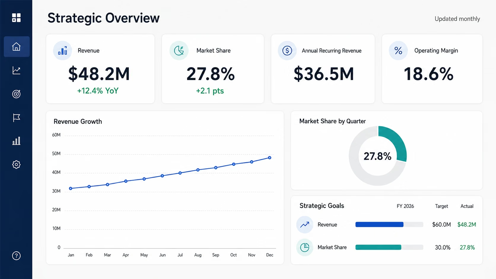
This dashboard is built for executives tracking high-level goals like revenue growth or market share, refreshed weekly or monthly since those numbers move slowly.
Operational Dashboards
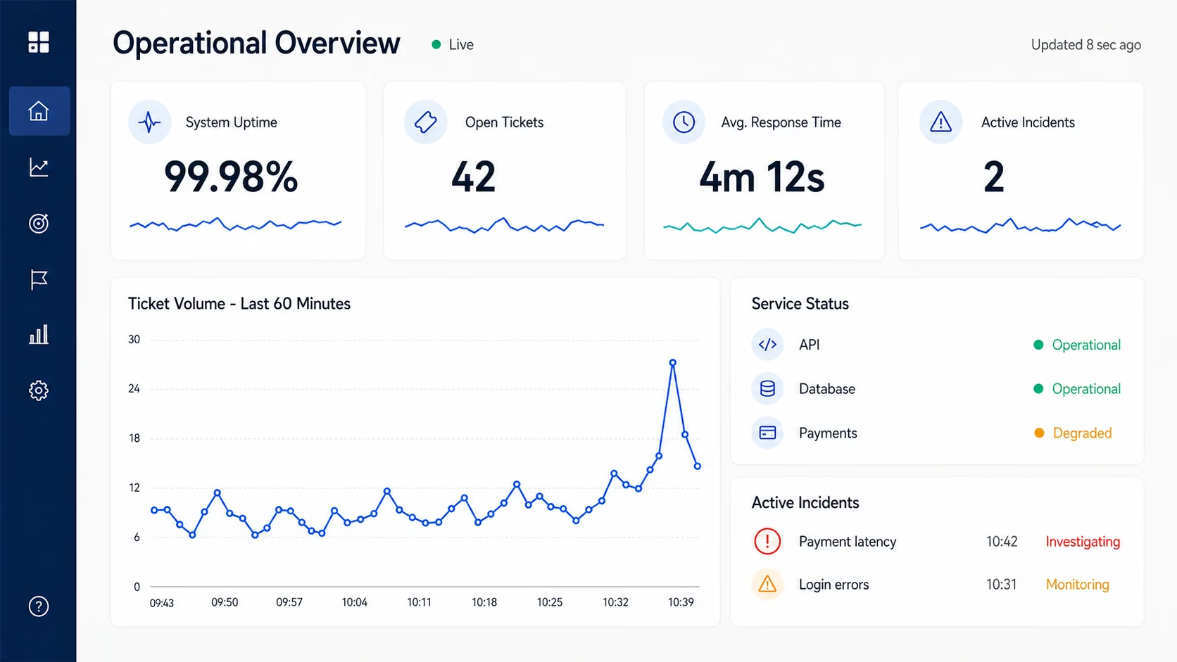
Teams monitoring what's happening right now, like open support tickets or server uptime, need this type, refreshed in real time or close to it.
Tactical Dashboards
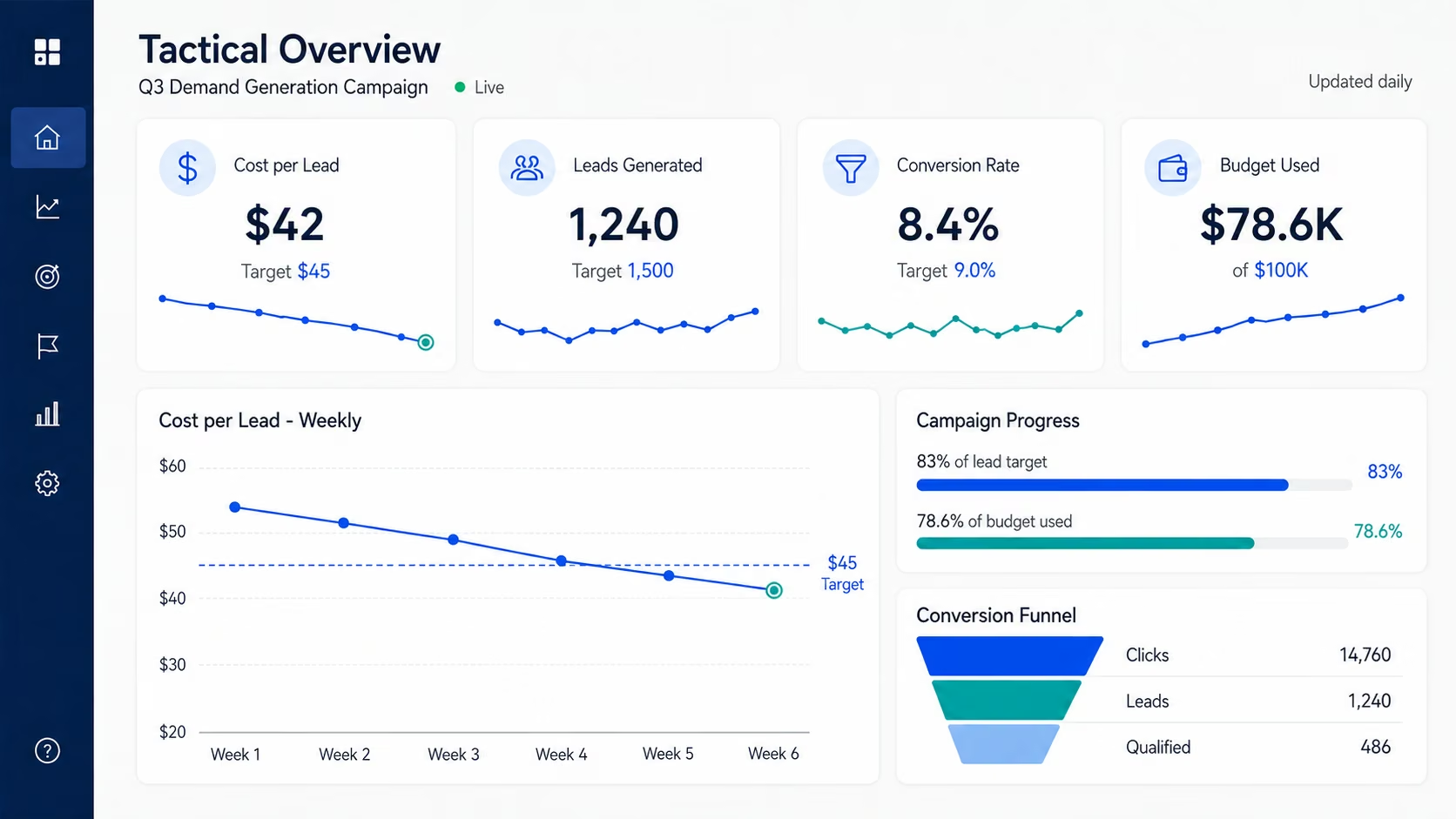
Managers use this type to track one initiative's progress against a target, such as a marketing dashboard focused on cost per lead for this quarter's campaign.
Analytical Dashboards
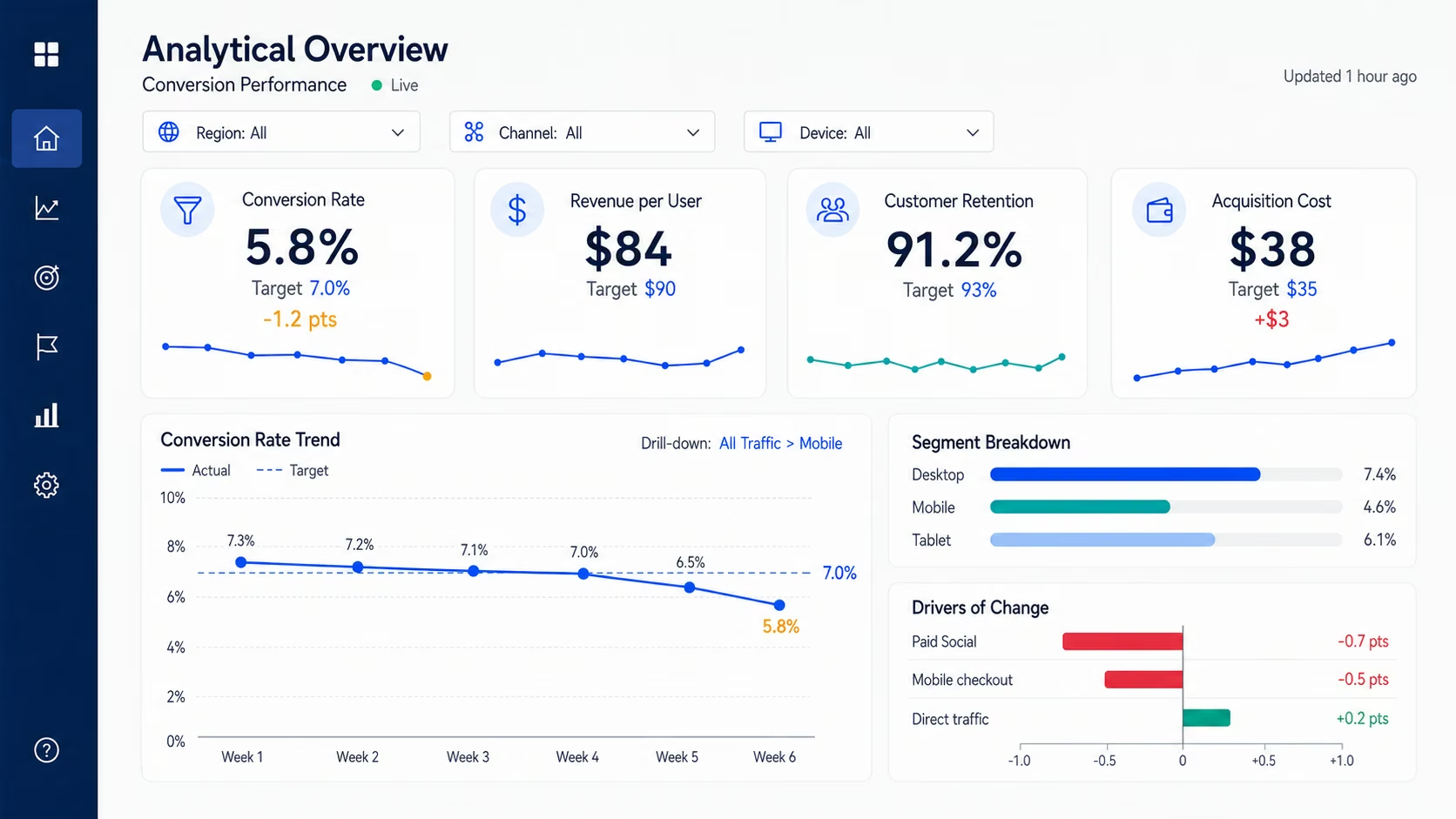
Analysts and data teams track KPIs tied to targets and investigate why a number moved. Drill-down and segmentation distinguish this view from a general analytics dashboard, which can explore data without a defined KPI list.
The process for building an analytics dashboard with AI covers how to connect live data and choose the right chart for this kind of investigation.
Pick the type that matches who's looking at it and what they need to decide. Skip the type that only looks best in a demo.
How Does a KPI Dashboard Work?
It works like the dashboard in your car. You don't need to see every sensor reading. Speed, fuel, and whether something's wrong are glanceable enough to register in a second without pulling your eyes off the road.
A KPI dashboard runs the same loop. It connects to a live data source, refreshes on a set schedule, and renders the numbers as a chart or gauge. It compares each one against its target to flag status as on track, close, or off, so you see where you stand without digging for it.
Say your support team's average response time crosses the two-hour threshold you've set. The dashboard flags it red immediately, instead of sitting unopened in a spreadsheet for the rest of that day. You see the flag, check staffing, and fix it before one bad afternoon turns into a pattern.
That pattern repeats across every dashboard type. A budget dashboard needs a next step for burn rate spikes just as much as a support KPI needs one for a ticket backlog.
Picking the flag color is straightforward. Deciding the next step is the work, and it has to happen before the number turns red, not in the meeting afterward.
KPI Dashboard vs. Analytics Dashboard: What's the Difference?
Ask five people to build "a dashboard," and you'll get five different things. Most people ask for one without knowing which kind answers their question.
A KPI dashboard and an analytics dashboard look similar at a glance. Both show charts and pull from live data. What separates them, once you dig past the surface, is scope and purpose.
Where the two pull apart:
| Factor | KPI Dashboard | Analytics Dashboard |
|---|---|---|
| Purpose | Tracks progress toward specific targets | Explores data broadly to find patterns |
| Audience | One team or decision-maker | Analysts and data teams |
| Update cadence | Matched to how fast the metric moves | Often real-time or near-real-time |
| Action orientation | Built to trigger a specific action | Built to support open-ended investigation |
| Metric count | A small, fixed set (five to nine) | Dozens of dimensions and filters |
A KPI dashboard exists to answer one question, fast: Are we on track? An analytics dashboard lets someone dig through data until they find an answer they didn't know to look for yet.
A metric and a KPI also split there. A KPI is always a metric. A metric only becomes a KPI once you tie it to a target because it drives a decision.
A static report differs from both because it's a snapshot, usually stale the moment it's exported, with no live connection to refresh it. Any threshold-based formatting it carries got baked in at export time. It won't update again when the numbers change.
A KPI dashboard tells you whether you hit this month's number, while an analytics dashboard helps you figure out why you missed it.
KPI Dashboard Pros and Cons
Pros (What Works)
- Cuts the time between a number moving and someone noticing it, since the dashboard flags status on its own, before anyone has to run a report.
- Replaces manually rebuilt weekly reports with a live view that updates on its own.
- Gives a team one shared source of truth, once the underlying metric definitions are governed.
- Surfaces a problem while it's still small, before it turns into an emergency nobody saw coming.
Cons (Where It Falls Short)
The vanity-metric test alone kills a lot of dashboard tiles. Here's where a KPI dashboard can fall short:
- A metric that can move up or down while nobody changes what they do about it is noise, not a KPI.
- A dashboard that impresses on day one can still lose its audience once people stop believing the numbers on it.
- The same metric name can mean different things on different teams, which turns a mismatched number into a trust problem for the whole dashboard.
- Too many KPIs on one screen buries the number worth watching under a pile of ones that aren't.
A useful dashboard can still fail without warning when nobody completes the governance work first.
Should You Use a KPI Dashboard? My Take
A KPI dashboard earns its build time under narrow conditions. Here's how I'd sort it:
A KPI Dashboard Is Perfect For:
- A team with clearly defined KPIs and a named owner accountable for each one.
- Teams making the same recurring decision often enough that a static report can't keep up.
- Anyone currently rebuilding the same spreadsheet report by hand every week.
- Groups where an executive, a manager, and an analyst each need to see a different slice of the same numbers.
Skip a KPI Dashboard If You:
- Track a small, uncontested handful of numbers. A shared spreadsheet already covers it.
- Have a team that won't act differently regardless of what the dashboard shows.
- Haven't agreed on what your core metrics mean yet. Fix that first. A dashboard won't fix it for you.
How to Get Started With a KPI Dashboard in 6 Steps
The deeper, step-by-step version lives in Emergent's guide on how to build a KPI dashboard. Here's the short version:
- Name the decision the dashboard needs to support, before picking a single metric.
- Pick five to nine KPIs, each with a target and a named owner.
- Set thresholds so the dashboard can flag status on top of the raw number.
- Connect the actual live data source, since a dashboard fed by a re-pasted spreadsheet isn't live.
- Mock it up before you build it for real.
- Choose an update frequency that fits the metric. Then revisit it as the business changes.
KPI Dashboard Best Practices I Wish I Knew Earlier
A few practices keep teams opening a dashboard after launch.
Essential practices:
- Define KPIs collaboratively: Loop in the people who'll use the dashboard before you build anything. A metric picked in isolation rarely survives contact with the team that has to act on it.
- Cap the KPI count: Stop at five to nine at the top level, a range drawn from Miller's 7±2 rule on working-memory limits rather than a hard cutoff. Past that, nobody's eyes know where to land first.
- Match the chart to the question: A line chart shows a trend, and a gauge shows progress toward one number. A bar chart compares categories instead, and the wrong pick is why a KPI can look busy on screen and still not answer anything.
- Separate the views: Keep the daily "what's happening" view apart from the "why" drill-down view. A quick check doesn't require wading through an analyst's workbench that way.
- Revisit definitions periodically: What each KPI means drifts as teams and tools change, so re-agree on it more than once, at launch and after.
Common mistakes:
- Loading one screen with every visual available, so the eye never lands on the one number that counts.
- Tracking a metric because it's easy to pull, the exact vanity-metric trap from earlier.
- Skipping the mockup step, then rebuilding from scratch after the first real look at it.
Nail which metrics to track right at the start, and you'll skip most of this list.
Choosing KPI Dashboard Software: BI Platforms, Spreadsheets, or AI Builders
Once you know what you want to track, the next question is what KPI dashboard software to build it in. That split mostly comes down to three categories.
BI Platforms
A handful of KPIs on a spreadsheet is often the right call. A full business intelligence (BI) platform for three metrics is a solution looking for a problem. You'll keep running into that mismatch as a small team.
Traditional BI platforms (sometimes marketed as dashboard reporting software) are built for teams juggling complex, cross-system data, often with a dedicated analyst on staff to run it. That's what they're built for. For a team tracking five to nine numbers cleanly, you'd be paying for infrastructure and a learning curve you'll never use.
Spreadsheets
A spreadsheet is the right call while your data source and update cadence are simple enough for someone to keep it current by hand. Once that upkeep starts taking hours each week or the numbers lag behind reality, you've outgrown it.
AI-Assisted Dashboards
AI dashboard builders are the new middle ground. You describe what you want tracked in everyday language and the tool generates the dashboard itself. You connect it to your data in a separate, quick step. Licensing and onboarding requirements vary by tool.
Your team still needs to define each KPI before building. Without that governance step, an AI-built dashboard can lose trust sooner than a hand-built one.
My Verdict on a KPI Dashboard
Past the demo polish, a KPI dashboard is a standing bet that four things stay true. It needs defined KPIs, a named owner per KPI, someone who will act on what it shows, and a commitment to keep definitions current.
Skip any one of those, and you're left with an expensive habit that lapses unnoticed. Until all four are in place, a lighter report or a well-organized spreadsheet will serve you better than a half-governed dashboard nobody trusts. Build the dashboard once the groundwork is in place.
How Emergent Helps Teams Build a KPI Dashboard Without a BI Team
Moving from "here's what we should track" to a connected dashboard usually means learning a BI platform, briefing a data team, or building one in a spreadsheet. The spreadsheet often needs its connections or formulas updated when your data source changes.
Emergent's AI KPI dashboard builder closes that specific gap for teams without a BI team to lean on. Describe the KPIs you're tracking, and it puts together a working dashboard right away. Then point it at your data, and it pulls your real numbers in automatically.
With just one prompt, here's what I built with Emergent in 11 minutes, using 12.7 credits:

Emergent won't decide what "Revenue" means on your team, who owns each number, or whether anyone will act on a red flag, so that groundwork stays on you. Once your team agrees on its metrics, Emergent gets you a working dashboard fast.

Most AI app builders stop at prototypes. Emergent creates production-ready apps you can actually launch.
- Production-ready apps
- Web & mobile apps
- Deploy in minutes