


TL;DR
- Most KPI dashboard examples map to one business function, like sales or finance, and list the exact metrics that function should track.
- This guide covers 15 functions, from sales and marketing to HR and supply chain, with specific named metrics.
- The tighter the question a dashboard answers, the better it works.
- Executives and daily operators need different layouts built from the same underlying numbers.
I've watched a sales screen get so crowded with widgets that nobody could scan it, and a marketing report end up with more filters than a tax form. I also watched an executive view that stopped getting opened after its first week.
Every one of those dashboards had plenty of data. They lacked a clear line to the one number worth acting on that day.
So I spent nine days working evenings on it. I used Emergent's AI Dashboard Builder to build 15 KPI dashboard examples, one for each core business function, from sales and marketing to HR and supply chain.
Each build was an internal test only, never deployed to production or handed to a real team, and each one had to answer a single question: what does a dashboard for this function need to show, and to whom?
Work through the one for your function below, and you'll know which metrics deserve a spot on your dashboard and which ones are noise.
What Is a KPI Dashboard?
A KPI dashboard tracks your Key Performance Indicators (KPIs), the metrics most important to one part of the business. It lives on a single screen that updates in near real time, replacing a stack of spreadsheets and slide decks with one place to check how a team is doing.
A good one focuses on a specific function, like sales, marketing, or operations. A single screen covering the whole business rarely works as well.
Business dashboard software handles the plumbing, pulling numbers from wherever they live and refreshing them automatically, so the team isn't updating a spreadsheet every morning. Department leads check the dashboard each morning. Executives glance at it before a meeting.
That's the theory. Each function turns it into a different, specific dashboard.
What Every KPI Dashboard Needs (Regardless of Function)
Every one of the 15 builds below needed the same four things in place before any metric was worth looking at.
- Visualizations that fit the number: A trend needs a line chart. A comparison needs a bar. The wrong chart type makes a correct number harder to read.
- Targets and thresholds: A target or threshold turns a bare number into a verdict, good or bad. The IT build measures uptime against a target like 99.9% for that reason.
- Filters and date range: A dashboard locked to one time window can't show a trend forming or a number recovering. Every build here can narrow to a period, like month-to-date or a fiscal year.
- Data connectors: Every number here comes from a live database or spreadsheet connection instead of a manual paste, so the dashboard reflects what's happening now.
How to Build One of These KPI Dashboards
Start with the one question the dashboard needs to answer. A sales lead checking deal momentum and a CFO checking runway need different screens even if some of the underlying numbers overlap.
From there, pick as few KPIs as it takes to answer that question, usually four to eight. Connect them to your actual data, and set a target or threshold on each one, the same way a healthy margin still needs a runway number next to it to mean anything.
The next 15 sections apply that per function, with the specific metrics each one kept. For the layout and rollout decisions behind each build, see how these dashboards get built.
The 15 Dashboards, Sorted by Function
The 15 functions below cover sales, finance, operations, product, and nearly everything in between. Each one names the specific metrics that function runs on. Some you'll recognize immediately. Others might be metrics your own team hasn't started tracking yet, and they're worth stealing regardless of department.
Sales KPI Dashboard

Building the sales dashboard meant picking the exact moment a deal counts as closed: signing day or the day payment clears. That decision alone put two totals 11.9% apart on the same trailing period: $6.85M signed against $6.04M cleared.
Neither number was wrong, but that gap is how a sales team stops trusting its own numbers. This guide to what a sales dashboard should include breaks down the rest.
- Sales growth and revenue: Revenue trending period over period shows the team's momentum.
- Conversion rate: The share of total site visitors who complete a purchase.
- Average deal size: The typical value of a closed deal points to what's driving growth.
- Sales cycle length: Time from first contact to close, a number that turns uncomfortable fast once it starts stretching.
Marketing KPI Dashboard

The marketing build started at 11 metrics and settled on four, easy to check each morning.
CAC landed at $187 for the period, down 6.2%. The website traffic card breaks that same period down by source: organic pulled 38% of the build's 112.8K sessions, ahead of paid search's 23%.
I cut it to four, which made the dashboard easier to check each morning.
- CAC (Customer acquisition cost): What it costs, on average, to win one new customer across every channel.
- ROAS/ROI (Return on Ad Spend/Return on investment): ROAS measures ad revenue against ad spend; ROI measures profit against total cost, including spend beyond ads.
- Website traffic: Visitor volume, split by source.
- Cost per lead: The cost to generate one lead, moving faster than CAC and flagging trouble before it hits revenue.
Financial KPI Dashboard
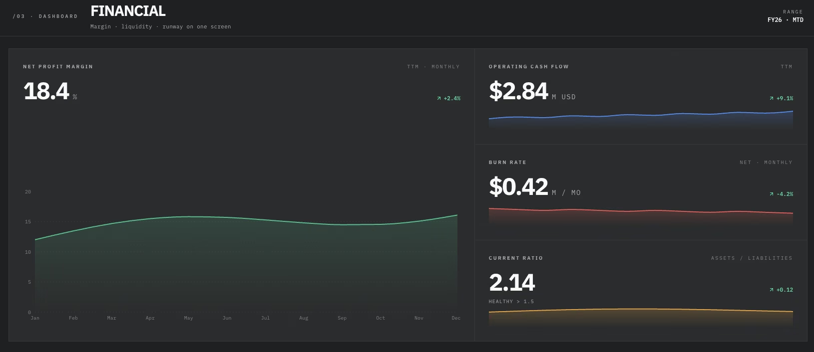
The financial build started as a single profit-margin card. I added operating cash flow and burn rate next to it because a healthy margin on paper (a comfortable 22% here) can still mean only three months of cash left.
Cash flow and burn rate sharing that screen is what makes the gap between looking fine and being fine harder to miss.
- Operating cash flow: Cash generated by day-to-day operations, separate from financing or investment activity.
- Net profit margin: Net profit divided by total revenue, a signal of how profitable the business is.
- Burn rate: Cash burned each month, setting the runway clock.
- Current ratio: How well current assets cover short-term bills, calculated as current assets divided by current liabilities.
Operational KPI Dashboard
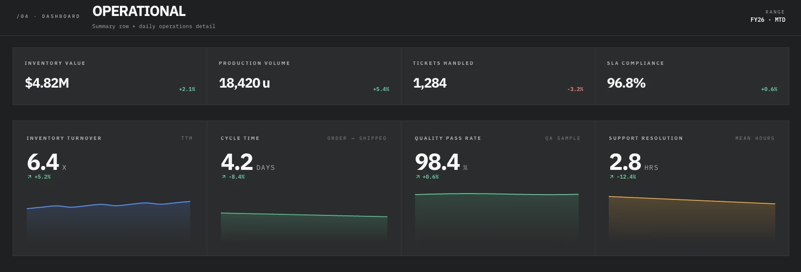
This build pulled together metrics spanning inventory, production, and support at once, more than most single-department dashboards cover. I crammed all 14 metrics into one row first, and I could not scan it in under a minute.
Splitting it into a summary row and a second row for daily operations made it easier for me to scan.
- Inventory turnover: How many times inventory sells and gets replaced in a given period separates moving stock from stock that's stuck.
- Cycle time: The time one unit of work takes, start to finish.
- Quality pass rate: The percentage of output that clears quality checks on the first attempt.
- Support resolution time: The time a request stays open, start to finish.
IT KPI Dashboard
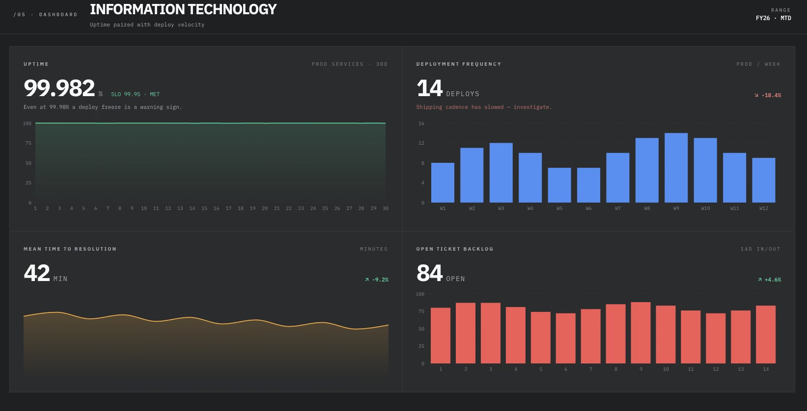
I expected uptime and deployment frequency to move together in the IT build. Instead, uptime stayed pinned at 99.97% while deployments ran at one every 12 days, infrequent enough that uptime alone wouldn't have flagged it.
- Uptime/availability: The percentage of time a system is available to users, usually measured against a target like 99.9%.
- Mean time to resolution: The clock runs from when an issue is flagged to when it's fixed.
- Open ticket backlog: How many support or incident tickets are sitting unresolved at any given moment.
- Deployment frequency: How often new code or updates ship, a proxy for how fast the team can move.
Customer Service KPI Dashboard
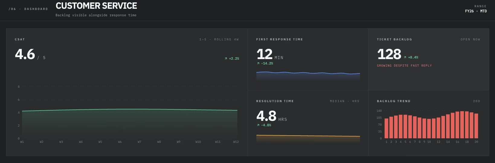
Response time held steady under two hours, while ticket backlog climbed past 40 open tickets.
Both numbers stay on one screen, since a support lead needs response time and backlog together to see whether the team is keeping up.
- CSAT (Customer Satisfaction Score): A direct rating customers give after an interaction, usually on a simple scale.
- First Response Time: How long a customer waits for that first human reply.
- Resolution Time: How long it takes to close out a request, from open to done.
- Ticket Backlog: Open requests at a given moment, tracked over time to show whether the count is rising or holding steady.
Manufacturing KPI Dashboard
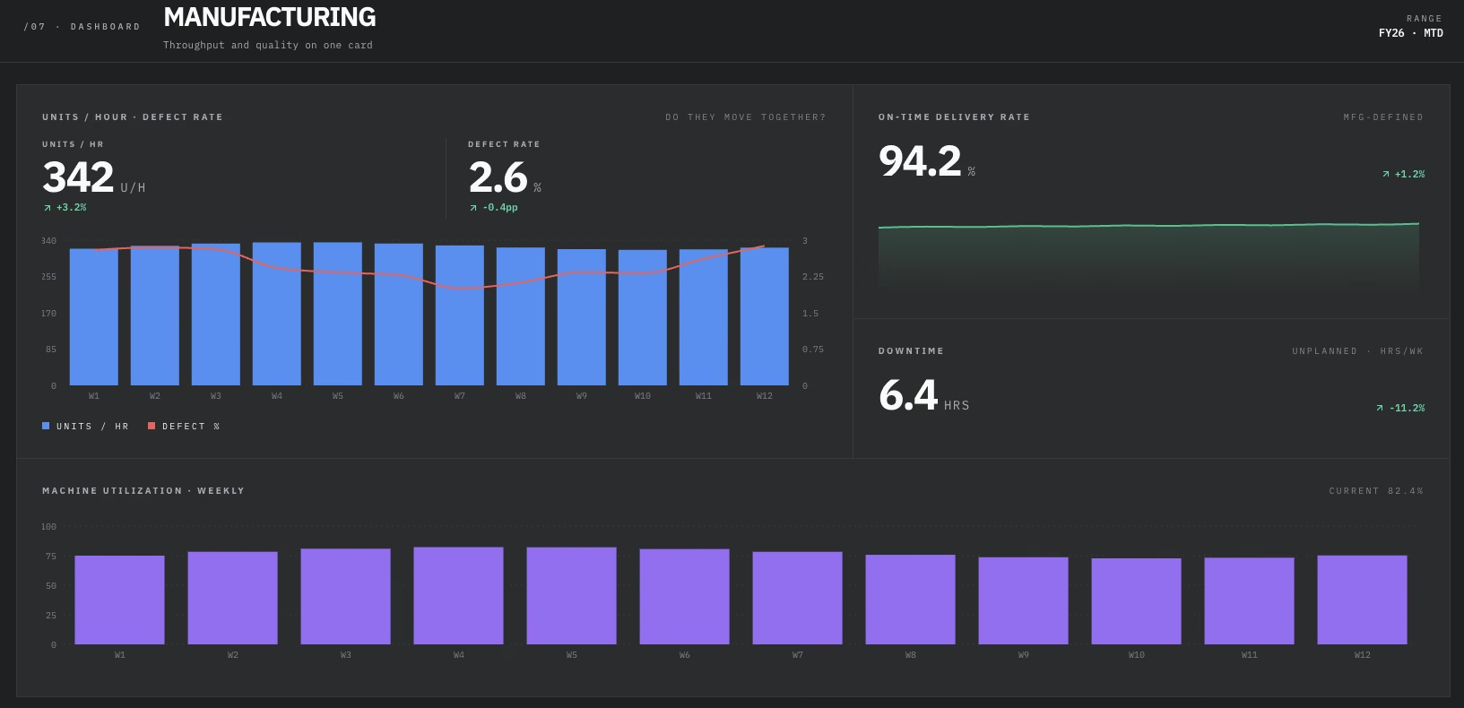
A defect rate under 3% and a throughput that had fallen to 342 units per hour can move independently. Putting both numbers on the same card showed them coinciding in this build, without one explaining the other.
- Units produced per hour: A straightforward measure of throughput on the line.
- Defect rate: The percentage of units that fail quality checks. Comparing it with production volume adds useful throughput context.
- On-time delivery rate: Orders that arrive when promised.
- Machine utilization/downtime: Utilization measures the share of available time a machine is producing; downtime measures scheduled production time when the machine is stopped.
Executive KPI Dashboard
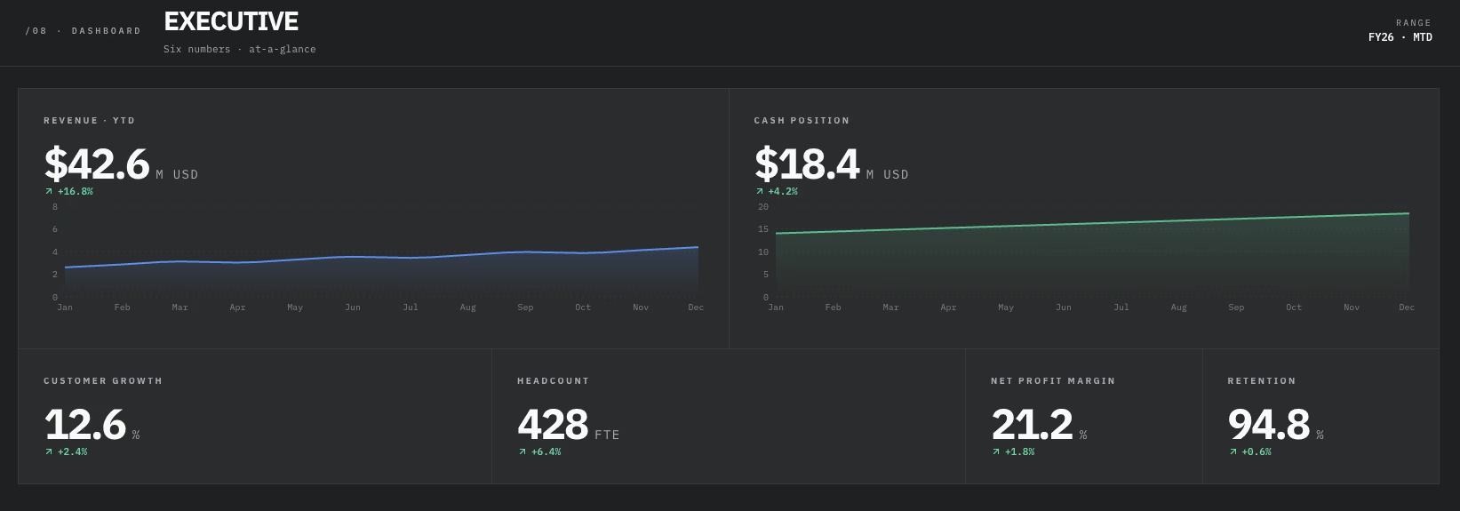
The first version of the executive dashboard had 18 metrics on it, each added because it seemed reasonable at the time. One more card felt harmless until the screen was unreadable.
I rebuilt it to six cards, readable in about the time it takes to glance at a phone. It's a small, fixed set of numbers meant to answer one question: How is the business doing right now?
- Revenue: The top-line number, tracked against the same period last year or the plan.
- Cash position: Cash on hand right now, paired with burn rate to estimate how much runway is left.
- Customer growth: Net new customers gained in the period, adjusted for churn.
- Headcount: The team's current headcount, tracked against budget.
- Net profit margin: The same profitability number as the financial dashboard, condensed into one card for quick review.
- Customer retention rate: The share of customers still active from one period to the next, adding retention context to the customer growth number.
HR KPI Dashboard

I kept the HR build deliberately short, cutting nine metrics to four. Every metric on it earns its place, and none of them need a legend to explain what they mean.
That restraint paid off, and it's easy to read at a glance.
- Headcount trend: Total headcount's month-over-month movement, a leading signal for both growth and cost.
- Open requisitions: Open, unfilled roles, and how long they've stayed that way.
- Turnover/regrettable attrition rate: Turnover counts every departure; regrettable attrition counts only the departures of people the company wanted to keep.
- Internal mobility: Moves into new roles inside the company, as opposed to leaving for one elsewhere.
Project Management KPI Dashboard
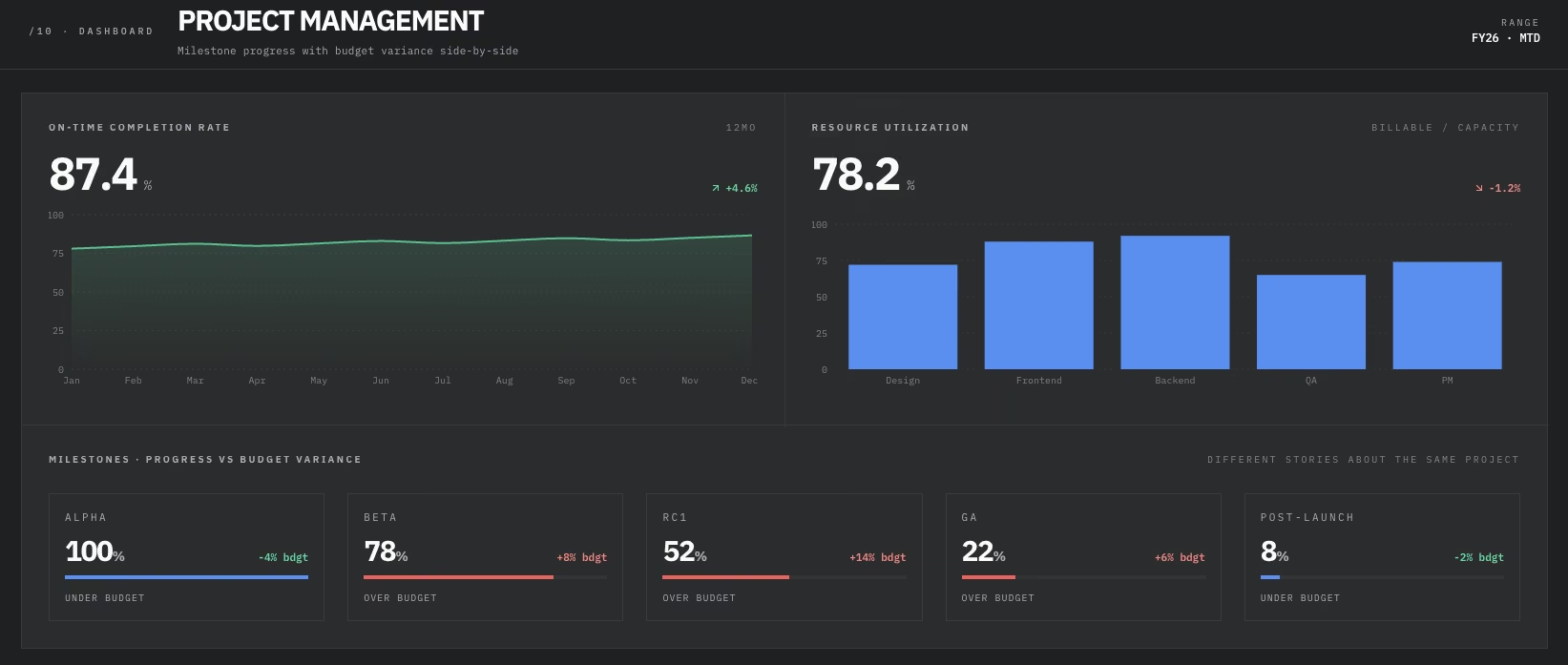
Budget variance and milestone progress told two different stories when I built this one. Budget variance said the project was 5% under budget. Milestone progress said it was already three milestones behind schedule.
Both numbers were accurate. They measured different things, so I kept them as two separate cards on the same row instead of picking one to lead.
- On-Time completion rate: Projects or milestones finished by their original deadline.
- Budget variance: How far actual spend drifts from the approved budget, in either direction.
- Resource utilization: Team capacity allocated to active work, as a portion of what's available.
- Milestone progress: Where each project stands against its planned milestones, checkpoint by checkpoint.
SaaS and Product KPI Dashboard
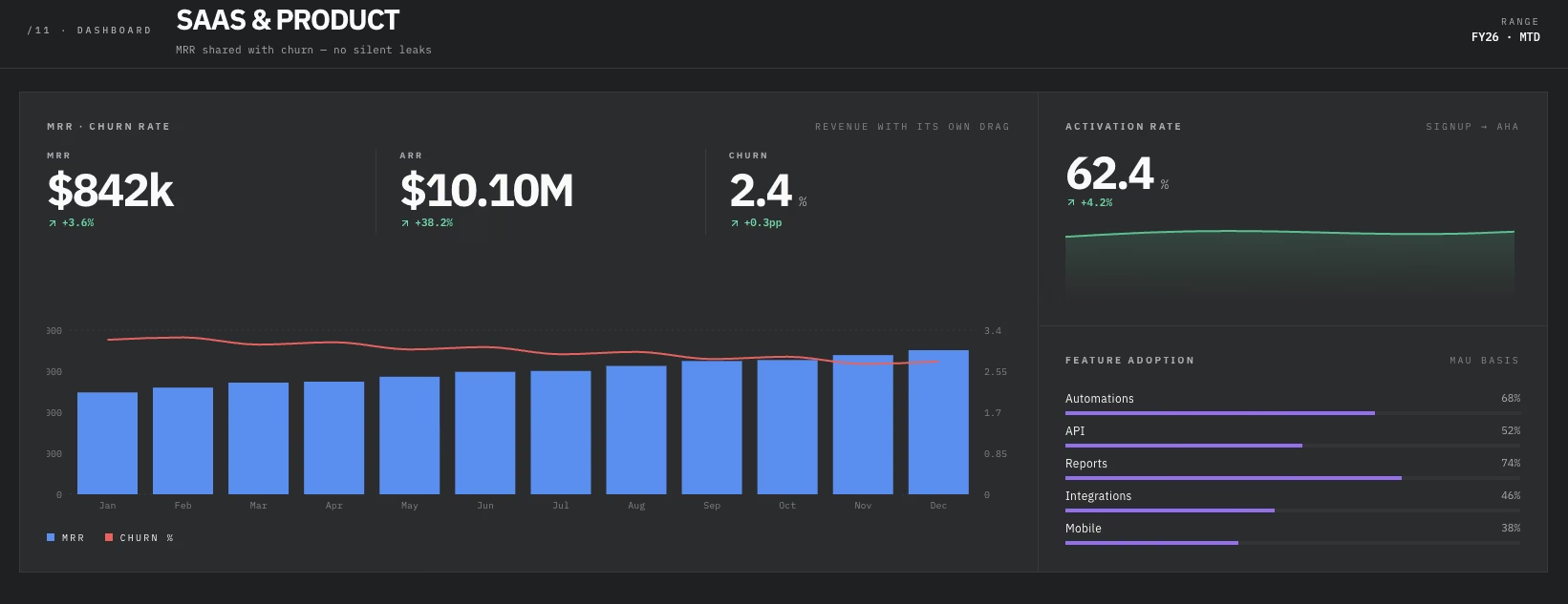
Churn dropped from 3% to 2% monthly during this one, a shift too gradual for a revenue-only view to catch. I gave the metric a shared card with MRR instead of a standalone one, and the timing made the case: MRR climbed steadily through most of the build while churn eased down right alongside it.
The shared card kept the churn improvement visible next to rising MRR.
- MRR/ARR (Monthly/Annual Recurring Revenue): The predictable recurring revenue the business can count on, the backbone metric for any subscription business.
- Activation rate: New signups who reach the point where the product's value clicks.
- Feature adoption rate: The portion of active users who use a specific feature during the defined measurement period.
- Churn rate: Customers or revenue lost in a given period, expressed as a share.
E-Commerce and Retail KPI Dashboard
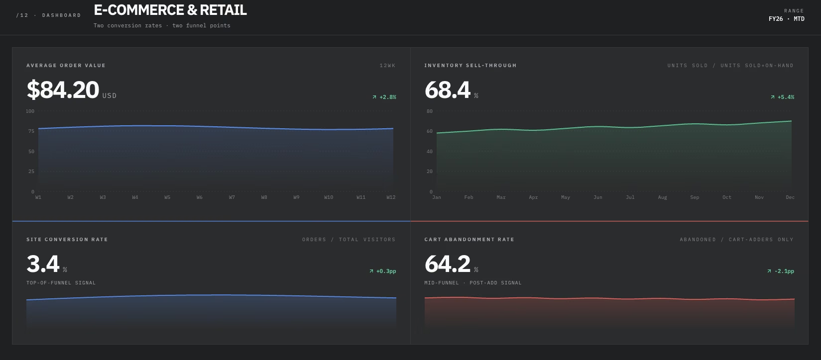
This build's mock data pulled cart abandonment past 64.2% while conversion rate held flat at 3.4%, and the first pass read like a contradiction.
The two metrics track different points in the same funnel. Abandonment counts only shoppers who already added something to a cart, while conversion rate counts every visitor who showed up.
- Conversion rate: The share of total site visitors who complete a purchase.
- Average order value: The typical amount spent per order is often a cheaper lever to pull than acquiring new traffic.
- Cart abandonment rate: The share of shoppers who add something to a cart and leave without buying.
- Inventory sell-through rate: The share of available inventory sold during a defined period.
Supply Chain KPI Dashboard
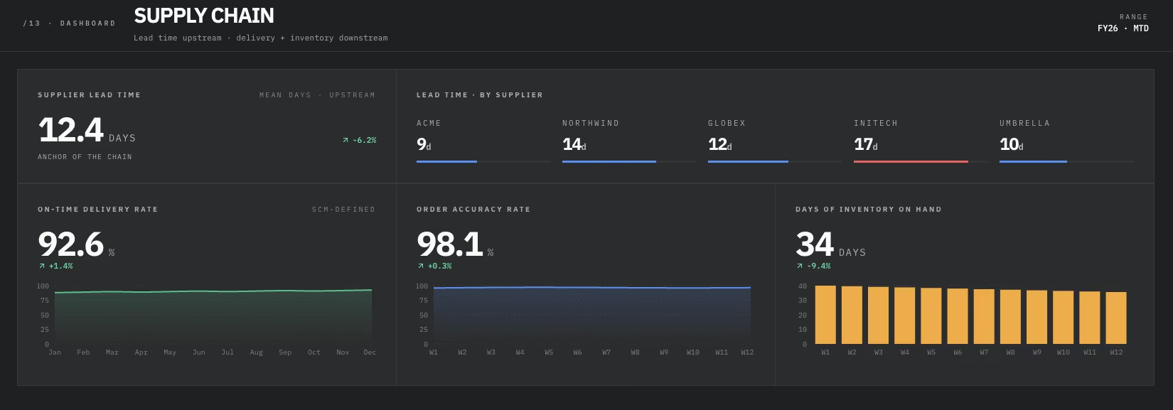
Supplier lead time added useful context to the other numbers on this dashboard. A 92.6% on-time delivery rate and current inventory levels were easier to read alongside a four-week reorder lead time.
Once I moved lead time to the top of the layout, the rest of the numbers stopped feeling disconnected.
- On-time delivery rate: Shipments that arrive when promised, to customers or between internal facilities.
- Order accuracy rate: Orders that ship complete and correct, with nothing missing or wrong.
- Supplier lead time: How long it takes a supplier to deliver after an order goes out.
- Days of inventory on hand: Current stock, measured in days of use at the current rate, flags a stockout or overstock early.
Customer Success and Retention KPI Dashboard
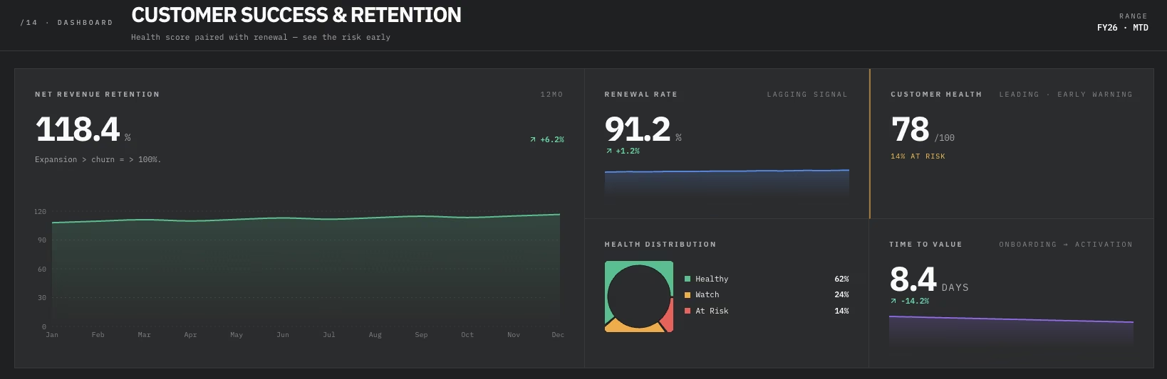
Renewal rate said everything was fine here, even as six accounts went quiet. In the underlying data, the health-score column had flagged those accounts three weeks before they showed up in the renewal numbers.
Renewal rate is a lagging signal. Health score flagged the issue before renewal rate did, which is why it keeps its own card here instead of folding into the renewal number.
- Net revenue retention: How existing customer revenue changes over time, including upgrades, downgrades, and churn.
- Customer health score: A rolled-up signal of how likely an account is to renew, based on usage and engagement patterns.
- Renewal rate: The share of customers who renew when their contract comes up.
- Time to value: How long it takes a new customer to reach the outcome they bought the product for.
Startup and Growth KPI Dashboard
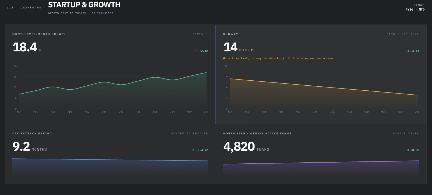
Growth rate can lie by omission. When I built this one, the growth number looked great at 18.4% month-over-month right up until runway (14 months) sat next to it. Fast growth funded by a runway heading toward zero is a different story than growth with room to spare.
Runway put the 18.4% growth number in context.
- Runway (Months of cash left): Months of operation left at the current burn rate, before running out of cash.
- Month-over-month growth rate: How fast the core metric, usually revenue or users, grows from one month to the next.
- CAC payback period: The number of months it takes for a new customer's gross profit to cover what it cost to acquire them.
- North star metric: A team treats this as the number that ties most directly to the value the product delivers to users.
Benefits of Using KPI Dashboards
Across all 15 internal builds, I could scan a dashboard faster when it focused on one clear question. Layouts that tried to cover everything took longer to interpret.
That pattern points to a few concrete benefits, beyond looking organized.
- Faster answers than a slide deck: A dashboard shows how a team is doing right now, without waiting for someone to pull numbers for a meeting. That's what counts when a decision can't sit until Friday's report.
- A shared source of truth: The sales example above showed what happens without one, as signed and cleared revenue landed 11.9% apart on the same period.
- A forcing function for agreement: Each of these 15 dashboards forced a decision about which metrics earned a spot and which didn't. That's a conversation worth having with your team before the dashboard exists.
- Different views from the same data: The executive dashboard's profit margin card reuses the same number as the financial dashboard, but condenses it into one card and skips the full view. One layout is built for a glance, the other for someone who needs the full picture.
Limitations of KPI Dashboards
The same builds also exposed clear limits.
- Dashboard overload: The instinct to add one more metric is strong, and it's how a focused screen turns into a wall of numbers nobody wants to open twice.
- Decay into maintenance metrics: A dashboard that isn't revisited stops being a decision tool. It becomes something checked only when a number looks wrong.
- Metric-definition drift: The same KPI name can mean something different in two departments. That's the same mismatch the sales example above ran into with a closed deal.
- Staleness: A dashboard refreshed once a week is useless for a team that needs to react daily. One refreshed constantly is overkill for a metric that only moves monthly.
- No dashboard tells the whole story alone: A number on a screen still needs someone to interpret why it moved and what to do about it. A dashboard surfaces the question, but someone still has to answer it.
How Emergent Helps You Build Any of These Dashboards Without a BI Team

What belongs on a good KPI dashboard is one question. Every example above still needs someone to connect the data, lay out the screen, and keep the dashboard current. That's usually a business intelligence (BI) analyst's job or a spreadsheet workaround pieced together on a Friday afternoon.
Emergent's AI KPI Dashboard Builder is built for that gap. Describe the dashboard you want, and it generates the layout.
You connect it to your own databases or spreadsheets as a separate step, and once linked, the numbers update on their own, no spreadsheet formulas required. It's one option worth trying if the metrics above fit your team, but no one has time to build the screen.
Here's what you can do with Emergent:
- Skip the grid, start with a description: Say which metrics belong on the screen and how they should be grouped, and it lays out the dashboard without a drag-and-drop builder.
- Connect data you already have: Point it at a spreadsheet or an existing database once, and the numbers keep refreshing on their own, no re-pasting every morning.
- Deploy with a live, shareable link: On the Standard plan and above, dashboards launch on managed hosting with automatic SSL at a live web address, so there's something to share the same day. Deployment costs 50 credits per app.
- Adjust it as priorities shift: Add a card or swap a metric by describing the change; no query builder required to rebuild the view.
The right metrics count as much as the build. This guide to KPI dashboard metrics walks through how to choose them for your function.
Our guide on building a KPI dashboard covers the layout and rollout choices that decide whether people open it after week one.
Ready to build one of these 15 KPI dashboard examples for your own team? Try Emergent's AI KPI Dashboard Builder and start from the metrics list for your own function.

Most AI app builders stop at prototypes. Emergent creates production-ready apps you can actually launch.
- Production-ready apps
- Web & mobile apps
- Deploy in minutes