



It was Friday afternoon, and my SEO lead had a client call in an hour. Search Console showed clicks climbing while the rank tracker flagged three keywords sliding, and last month's report matched neither number.
Nobody had time to dig through three different tools and figure out which numbers to trust before the call started.
That's where a good SEO dashboard earns its place. It brings the important metrics together, makes changes easier to spot, and gives you a clearer picture of what changed without spending an hour piecing together a report.
I tested seven SEO dashboard software tools over two weeks using the same mock SEO data where possible. I connected data, built charts, tested different visualizations, and noted where each tool made the process easier or harder.
By the end of this guide, you'll know which dashboard fits your workflow and which tools justify the setup time.
Why Most SEO Dashboard Software Falls Apart by the Second Client
Building one dashboard is easy. The problems usually show up when you need to repeat it for another client.
Your first client might use Google Search Console, GA4, and one rank tracker. The next might use a different rank tracker, care about different KPIs, or need local rankings by city. You now have different data sources, metrics, filters, and reporting requirements to manage.
This is where the tools in my test started to separate. AgencyAnalytics puts client management at the center of the workflow, while DashThis relies heavily on presets and reusable widgets. Data Studio gives you more freedom to adapt a dashboard, but that flexibility also means more configuration.
The tools worth considering are the ones that keep that repeat work under control while still giving you enough flexibility to report the metrics each client cares about.
What an SEO Dashboard Actually Shows You
Before comparing seven tools, it helps to see what a finished SEO dashboard actually looks like. Here’s one built during testing, using AgencyAnalytics’s pre-built client template.
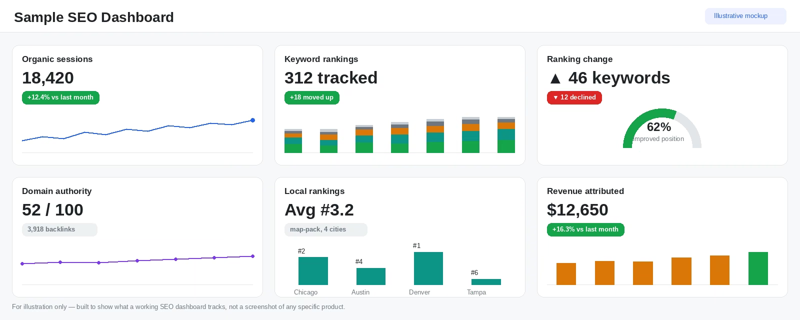
Six metrics show up on nearly every SEO dashboard worth using:
- Organic sessions: How many visits came from search, tracked over time so a dip is visible before a client asks about it.
- Keyword rankings: Current position for tracked terms, usually grouped into bands like top 3, top 10, and top 20 rather than one flat number.
- Ranking change: How many keywords moved up or down since the last check, which matters more than any single position.
- Domain authority and backlinks: The site’s overall link profile, tracked as a trend rather than a one-time score.
- Local rankings: Position in map-pack and local search results, when local SEO is part of the work.
- Revenue or conversions: The business outcome the traffic and rankings are supposed to produce, when analytics data is connected.
A dashboard that shows all six in one screen answers what happened in the time it takes to glance at it. The rest of this guide comes down to which tool gets you there with the least setup work and the fewest surprises in the numbers.
How I Researched & Tested These SEO Dashboard Tools
I connected the same SEO dataset, including clicks, impressions, and average position across 20 keywords, to five of the seven tools.
SE Ranking reports on data it tracks itself, and Emergent took the same figures as a CSV import, so those two got equivalent data in the format each one accepts. I then built the same core widgets in each one, including a single-metric chart, a multi-metric chart, and one AI-assisted query.
I used those tests to judge each tool on these five factors:
- Features: How well each tool turned clicks, impressions, and rankings into readable charts with the available features.
- Usability: How many steps it took to get from raw data to a finished chart.
- Data accuracy: Whether metrics calculated correctly by default and whether the tool made errors easy to spot and fix.
- AI reliability: Whether the AI caught a wrong assumption or bad number before answering, or confidently repeated the error.
- Export and sharing: Whether I could download, schedule, share, or white-label the finished report.
This hands-on approach let me see how each tool behaved once I put the same dataset through it, including where the setup, calculations, and visualizations started to cause problems.
Before you connect a paid tool at all, it's worth asking whether a free AI assistant can do the job. Emergent ran a hands-on ChatGPT dashboard test to find out where it falls short of purpose-built tools.
7 Best SEO Dashboard Tools: Quick Comparison
1. AgencyAnalytics
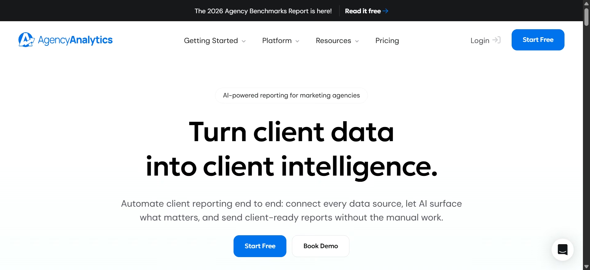
What it does: AgencyAnalytics is a client reporting platform built for marketing agencies, with templates, white-label dashboards, and an AI widget builder.
Best for: Agencies managing multiple clients that want ready-made reporting rather than building every dashboard from scratch.
I started by creating a client, which immediately confirmed AgencyAnalytics' positioning around agencies managing multiple client accounts rather than individual dashboard builders.
I tried two of its four dashboard-building options, starting from scratch and using a template.
The template route was much easier, and I can see why reviewers recommend it. Once I connected my client's data, I could apply a pre-built dashboard and focus on customizing the style rather than building each widget myself.
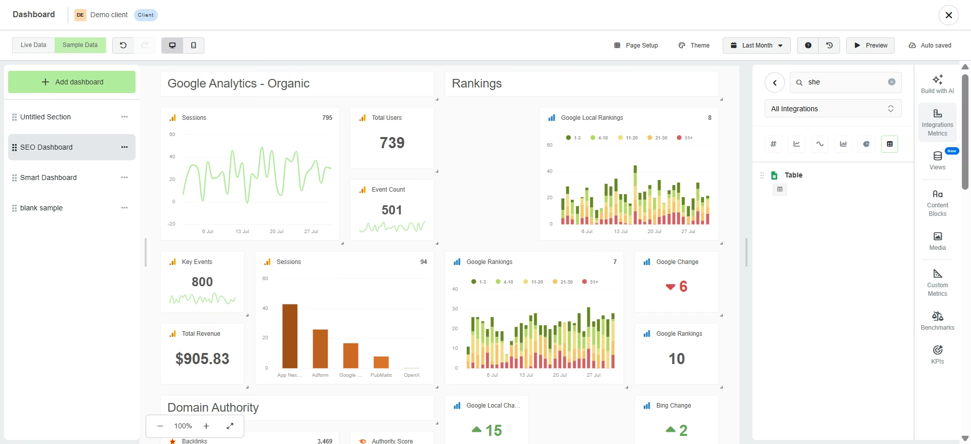
The custom route was a different experience. I had to connect each widget manually and understand how AgencyAnalytics expected the data to map. It automatically plotted fields for me, but initially selected the wrong column and returned a flat graph line. I had to consult the help docs to figure out what went wrong.
The field selector made this harder. It uses spreadsheet letters instead of column names, so I had to go back to my source sheet to work out which letter contained the field I needed.
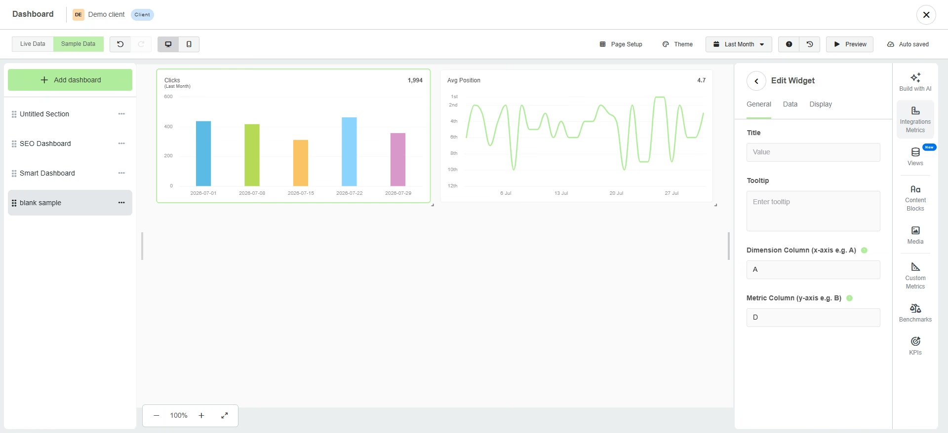
AgencyAnalytics also has an AI widget builder that accepts plain-English prompts and is supposed to find the right widget and metrics for you. On my trial, it kept trying to create a new data connection instead of reusing the one already active on the dashboard. It eventually hit the connection cap, so the AI shortcut didn't help me get around the manual setup.
Key Features
- Template-driven dashboards: Auto-populate from already-connected client data which makes widget setup easier
- AI Insights and AI widget builder: Generates plain-language summaries and widgets from a prompt
- Wide integration list: 91 total integrations at last check, covering most SEO, PPC, and social tools an agency would connect
Pros and Cons
Pros:
- Built around managing several client accounts at once
- 4.7 out of 5 across more than 460 G2 reviews as of August 2026, one of the strongest reputations in this test
- White-label branding and client portal come standard, not as an upsell
Cons:
- Its custom widget builder offers the smallest set of chart types of the seven tools I tested
- Doesn’t let you preview your data
What Users Say
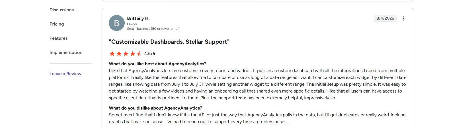
“I like that AgencyAnalytics lets me customize every report and widget. It pulls in a custom dashboard with all the integrations I need from multiple platforms. I really like the features that allow me to compare or use as long of a date range as I want.” - Brittany H., G2
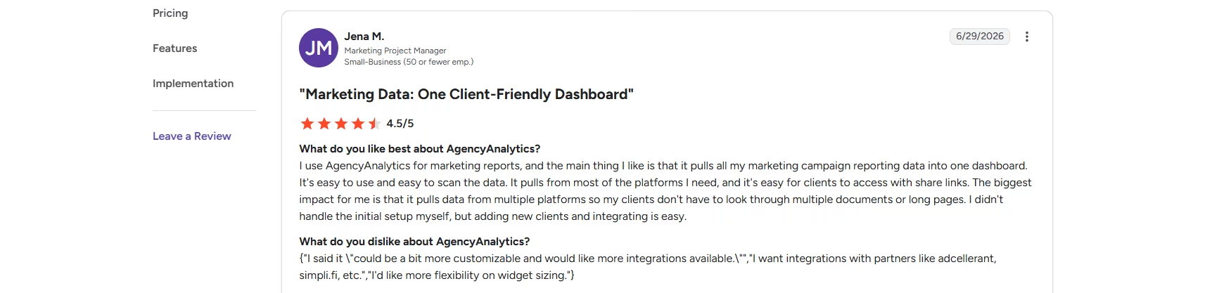
“It could be a bit more customizable and would like more integrations available. I want integrations with partners like adcellerant, simplifi, etc. I'd like more flexibility on widget sizing.” - Jena M., G2
Pricing
AgencyAnalytics now runs one plan with every feature unlocked, priced at $20 per client per month billed annually. Managing more than 25 clients moves you to a custom Enterprise plan with volume discounts and dedicated onboarding. A 14-day free trial requires no credit card, backed by a 30-day money-back guarantee.
Bottom Line
AgencyAnalytics is a good fit if you manage several clients and want a reporting system with ready-made dashboards and white-labeling. Start with a template if you want to get a dashboard running quickly. If you need more control over the dashboard itself, the other tools in this test offered me an easier path.
2. Data Studio (Formerly Looker Studio)
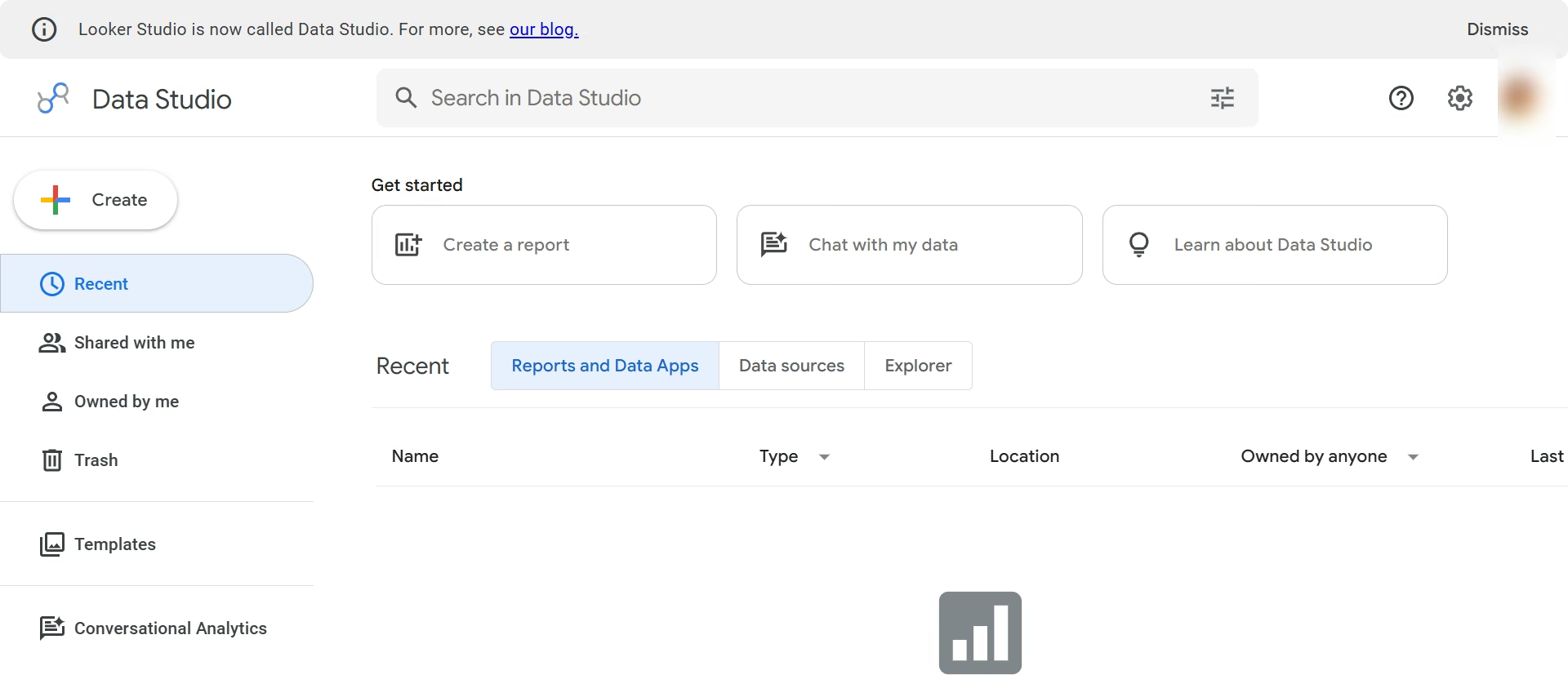
What it does: Data Studio is Google's free data visualization tool, renamed from Looker Studio in April 2026, that connects to Search Console, GA4, and hundreds of other sources.
Best for: Teams already deep in Google's tools who want a free dashboard and don't mind configuring chart details themselves.
I connected my mock SEO sheet in under a minute, and every column came in with the correct data type. It even added a Record Count field automatically.
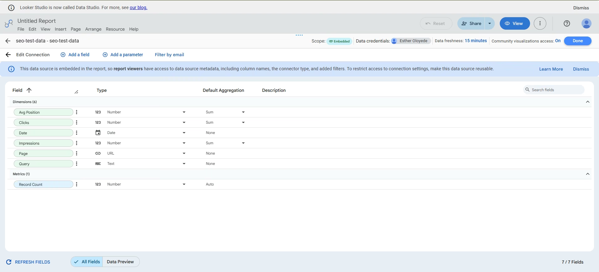
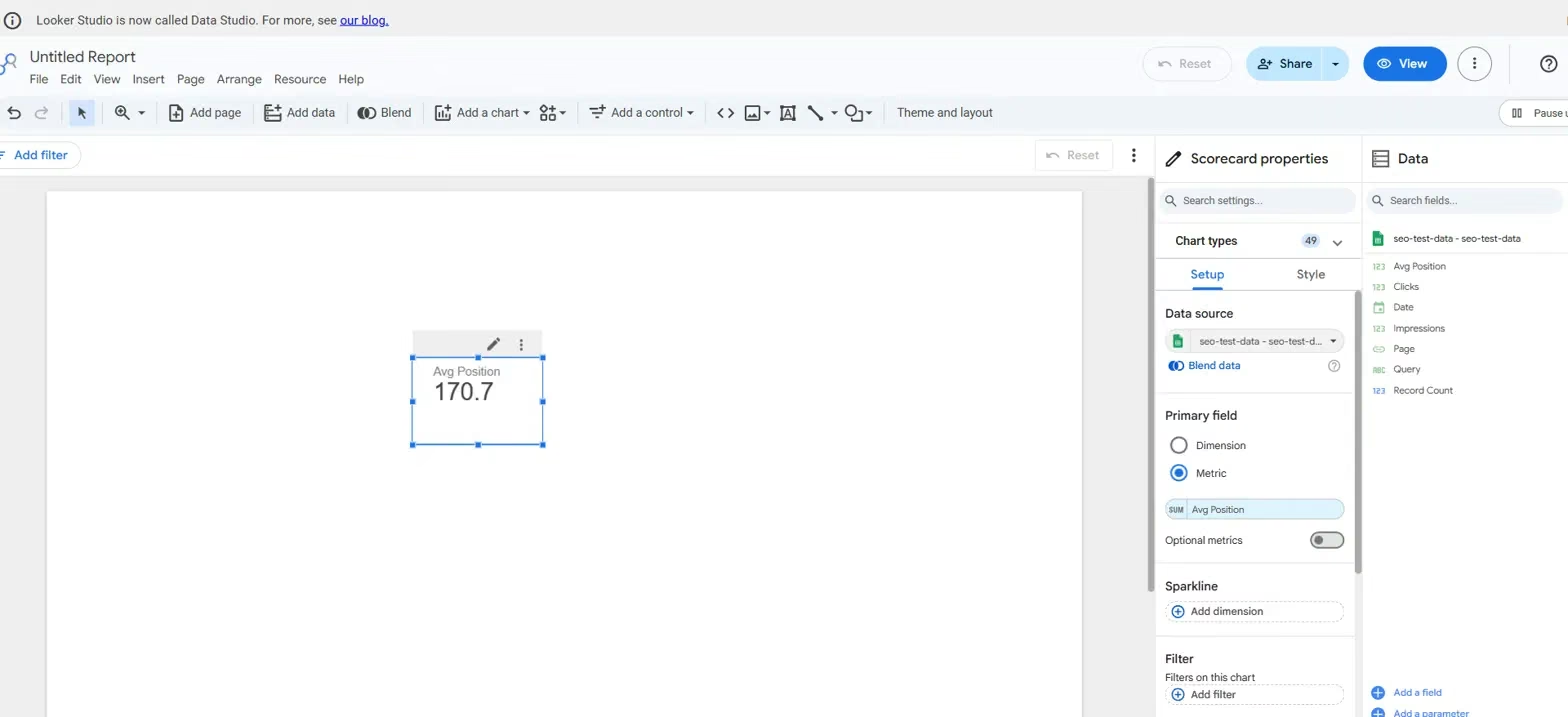
Then I dragged Avg Position onto the canvas to build a score card widget and got a result of 170.7. My actual average position values ranged from about 3 to 18, so the number immediately looked wrong.
The problem was the chart's default aggregation. Data Studio had set the field to SUM instead of AVG, adding the position value from every row instead of calculating the average.
I switched it to AVG and got the result I expected. Lots of people on the Google developer forum have run into the same problem, so beware of it when using it.
From there, I built a bar chart comparing average position across each keyword.
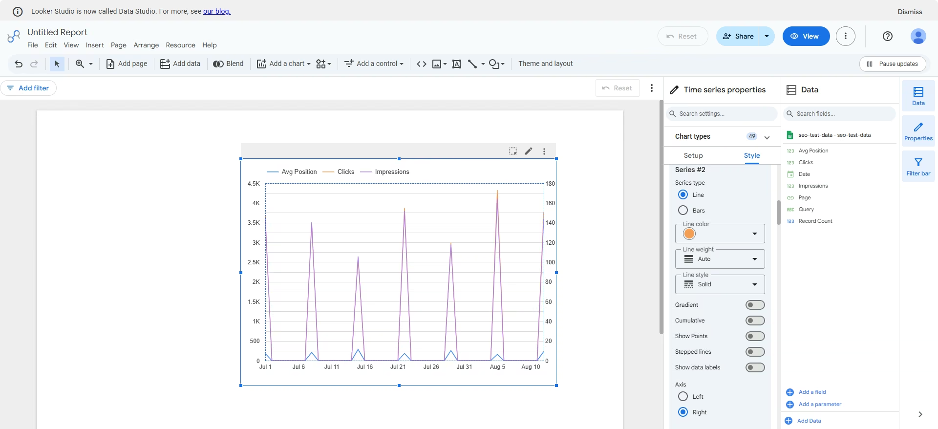
Once those charts worked, I wanted clicks, impressions, and rankings on one chart, similar to how Search Console presents these metrics.
The problem was the huge difference in scale between the three metrics. Putting them on the same axis made the smaller values difficult to read, so I needed a second axis.
Data Studio handles this through the right-axis option in the Style pane. It lets me separate the scales, although the chart supports only two axes, not three. That's still a useful advantage because I couldn't achieve this kind of comparison with the other tools I tested.
Key Features
- Interactive filters: Add dropdowns, checkboxes, sliders, and date controls so viewers can change the data displayed without editing the report.
- Data blending: Combine up to five data sources in one report, making it possible to bring data from sources such as Search Console, GA4, Google Ads, or other connectors into the same visualization.
- Calculated fields: Create custom metrics and dimensions directly from your existing data, including formulas and conditional logic, without changing the underlying source.
Pros and Cons
Pros:
- Free with no seat limits or data caps on the standard version
- Widest range of chart types of any tool tested, which is useful once reporting needs grow past a basic line or bar chart
- Has a genuine right-axis feature that most other tools lack entirely
Cons:
- Defaults every metric to SUM regardless of what makes sense
- Has a learning curve due to the wide range of feature set
What Users Say
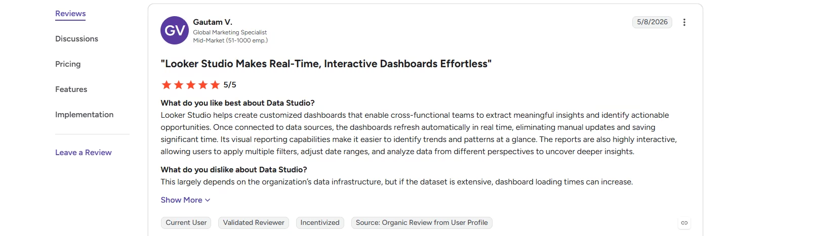
“Looker Studio helps create customized dashboards that enable cross-functional teams to extract meaningful insights and identify actionable opportunities. Once connected to data sources, the dashboards refresh automatically in real time, eliminating manual updates and saving significant time.” Gautaum V., G2
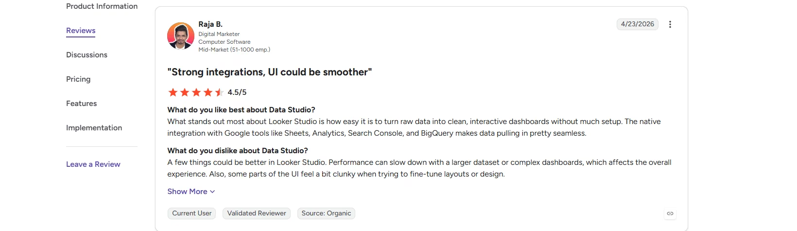
“A few things could be better in Looker Studio. Performance can slow down with a larger dataset or complex dashboards, which affects the overall experience. Also, some parts of the UI feel a bit clunky when trying to fine-tune layouts or design.” Raja B., G2
Pricing
Data Studio is free, with no seat limits or data caps on the standard version. Data Studio Pro adds enterprise governance features and is billed separately through Google Cloud.
Bottom Line
Data Studio gives you a lot of control without another subscription, but you need to pay attention to how it aggregates and displays your data. Choose it if you want a free, flexible SEO dashboard and are comfortable configuring the charts yourself.
3. Geckoboard
What it does: Geckoboard is a live dashboard tool built for streaming KPIs to office TVs, Slack, and shared links, using real column names rather than spreadsheet cell references.
Best for: Teams that want a simple, always-on KPI dashboard without spending time configuring complex visualizations.
Connecting my SEO data sheet showed me a live preview of my spreadsheet, where I could choose fields by their actual column names, unlike AgencyAnalytics, where fields are selected by spreadsheet letter.
I liked how easily the interface let me preview my selected fields in different graphs and choose the one that best represented what I wanted to show. I quickly built a table of Query against Avg Position without having to figure out which spreadsheet letter contained each field.
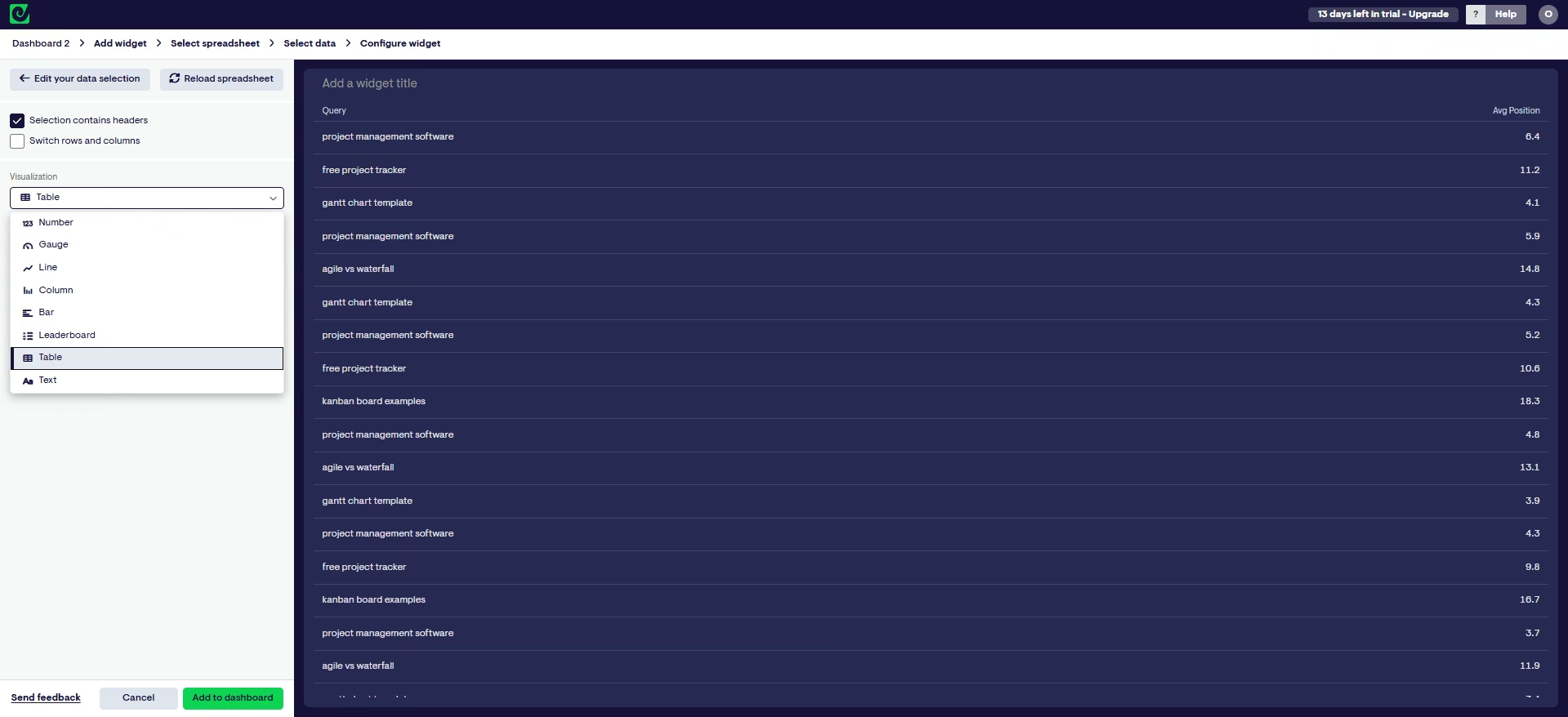
That simplicity continued as I built out the dashboard. Compared with Data Studio, where I had to pay attention to aggregation and other chart settings, Geckoboard gave me fewer decisions to make.
That made it faster to get from a connected spreadsheet to something I could use. However, the same simplicity became a limitation once I wanted more control over the visualization.
I saw that when I tried to plot three metrics on one graph. Geckoboard let me put all three on the same chart, but it had no option to give the metrics separate scales. That made the smaller values difficult to read when the metrics had very different ranges.
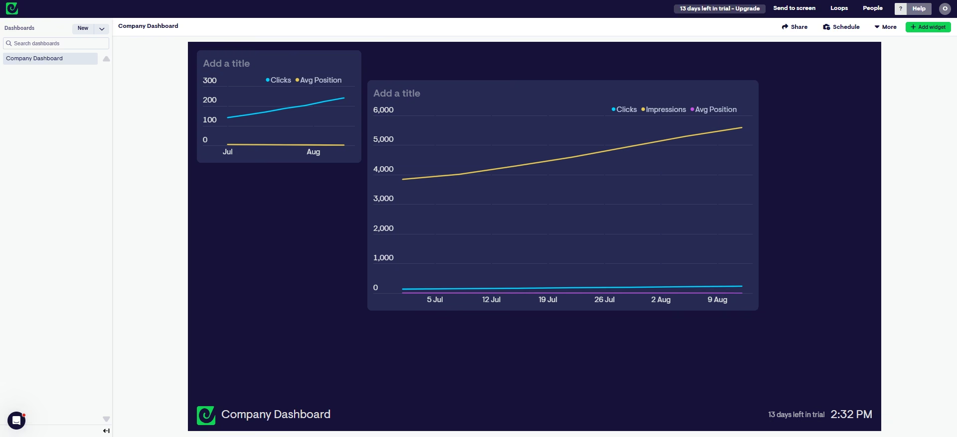
Geckoboard offers 11 visualization types, and none of them let me set a second axis, so the customization ceiling showed up as soon as I wanted more than a standard chart. That lines up with a broader complaint in G2 and Capterra reviews, where users ask for more visualization and customization options.
Key Features
- TV dashboard streaming: Display live SEO metrics on any office screen without a dedicated device
- Slack and email alerts: Get notified the moment a tracked metric crosses a threshold
- 90+ native data sources: Connect GA4, Google Sheets, and Search Console
Pros and Cons
Pros:
- Picking fields by column name instead of spreadsheet letter made setup fast and accurate
- Auto-detected headers from a full-range selection with zero manual mapping
- 14-day free trial requires no credit card
Cons:
- No AI feature of any kind, no chat assistant, no automated insights
- Extra dashboards ($24), editors ($20), and screens ($20) each cost extra per month beyond the entry plan, though viewers are unlimited on every plan
What Users Say
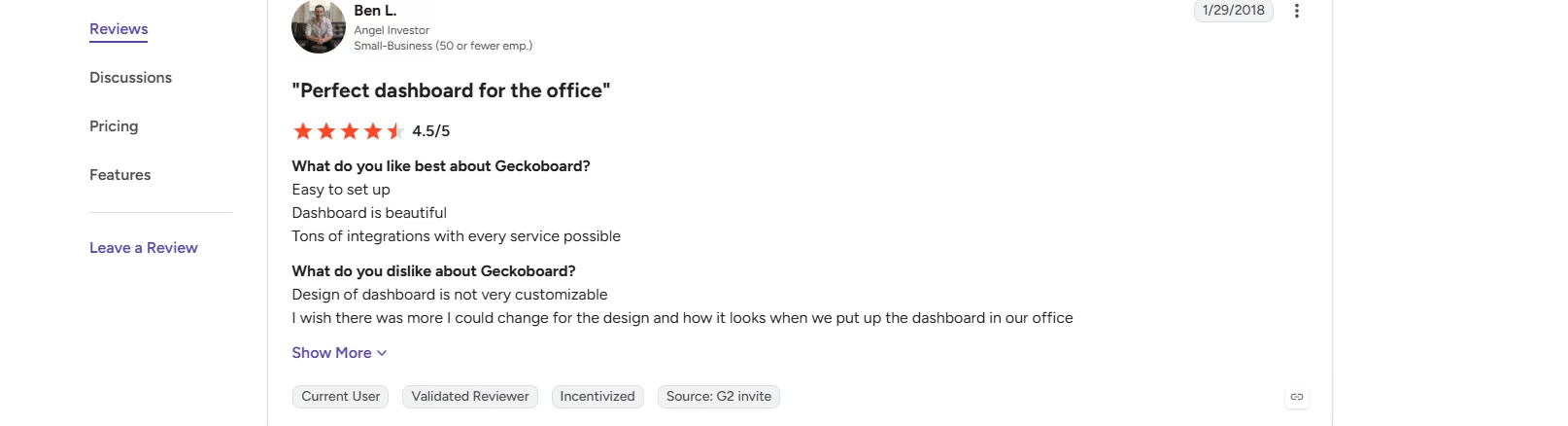
Easy to set up. Dashboard is beautiful. Tons of integrations with every service possible. - Gen L., G2
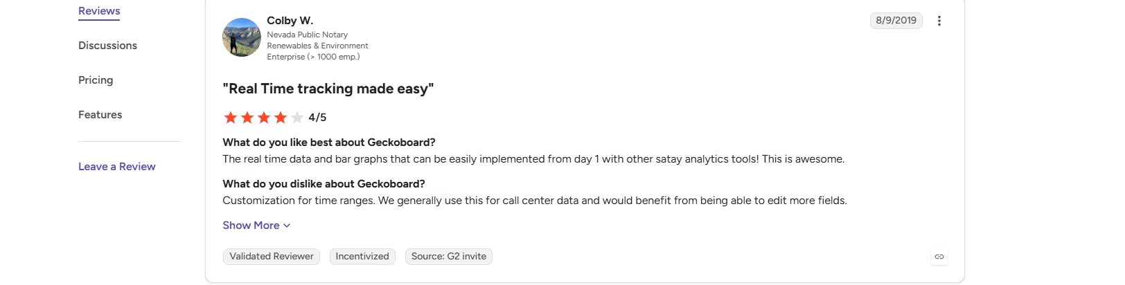
Customization for time ranges. We generally use this for call center data and would benefit from being able to edit more fields. Colby W., G2
Pricing
Essentials starts at $99 per month, or $79 per month billed annually, for two dashboards, one editor, and one screen. Performance runs $399 per month, or $319 per month billed annually, for 20 dashboards, three editors, and five screens. Enterprise pricing is custom for larger teams. A 14-day free trial requires no credit card.
Bottom Line
Geckoboard is one of the easier tools I tested for turning connected data into a readable dashboard quickly. Choose it for simple, always-visible KPI reporting, but not if you need the flexibility to build more specialized SEO visualizations.
4. DashThis
What it does: DashThis is a dashboard reporting tool with three ways to build a widget, preset, custom, and calculated, priced by dashboard count rather than by client or data source.
Best for: Teams that want to build marketing dashboards quickly with preset widgets, with option to customize their data.
DashThis gives you three ways to build a widget. The easiest was the preset option. DashThis pre-builds widgets around common marketing KPIs using the data sources available through its integrations, so one widget can combine data from multiple sources.
All I had to do was drag and drop the widgets I wanted onto my dashboard.
Custom widgets took more effort, but I found them manageable. I chose a metric and a dimension, Query or Page in my case, and selected my columns by their actual headers, just like Geckoboard.
I also liked that DashThis correctly identified the numbers in my sheet as metrics and the words as dimensions. That distinction made it easy to plot the fields.
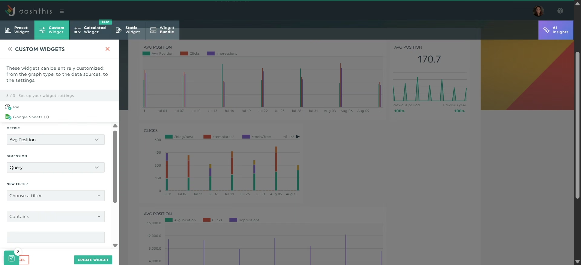
Things got harder when I built the dashboard from my own spreadsheet instead of using a preset. I ran into the same Avg Position aggregation problem I saw in Data Studio. My widget returned 170.7, the exact sum of all twenty rows rather than their average.
Fixing that required me to go back to my spreadsheet and add AVG to the column header. In Data Studio, I could change the aggregation directly from the chart editor.
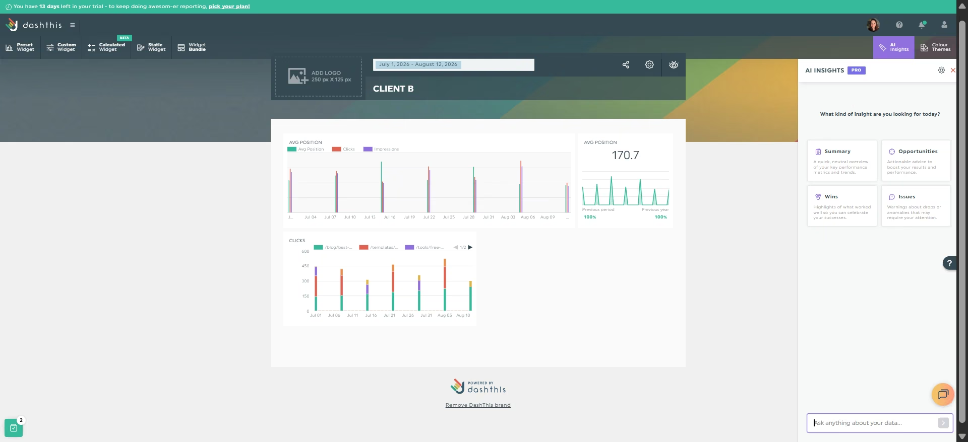
I also tried to give Clicks and Avg Position separate scales on the same chart, as I did in Data Studio. DashThis has an axis setting, but switching between its two options didn't separate the metrics, so I couldn't reproduce the same visualization.
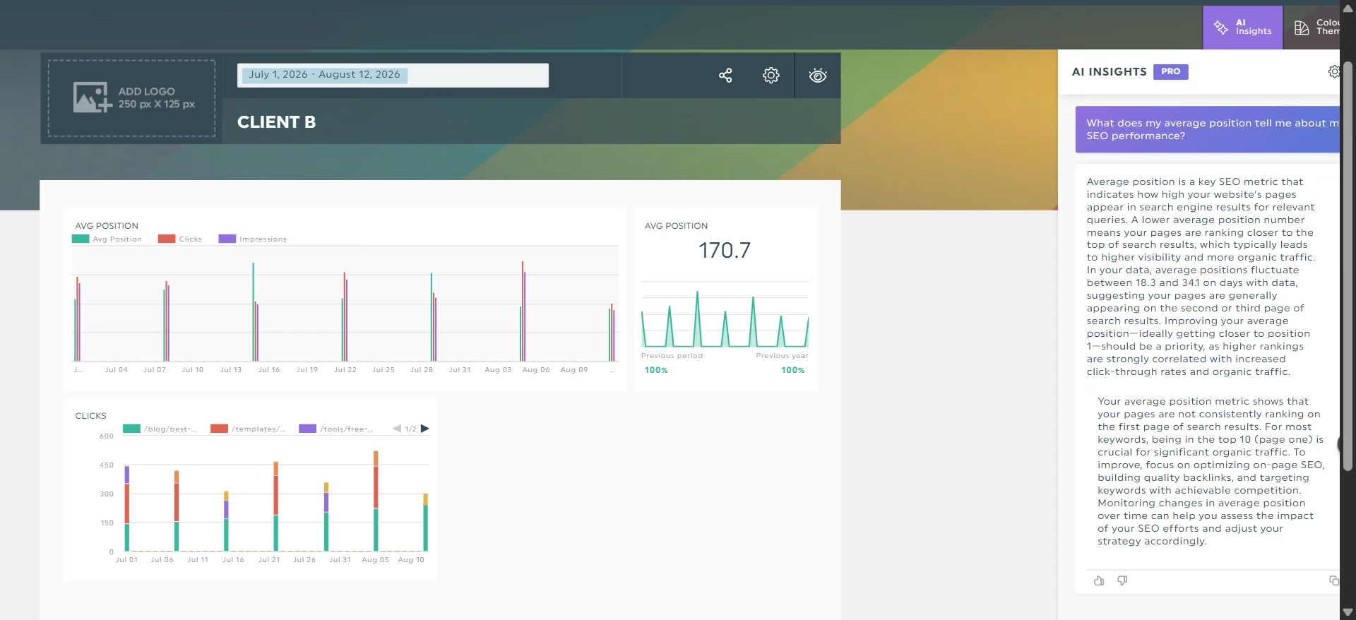
DashThis also has an AI Insights feature, so I tested whether it could catch the incorrect Avg Position calculation. I asked what my Avg Position number meant while the widget was still showing the 170.7 sum.
Instead of flagging the unusual value, it confidently interpreted my rankings as fluctuating between 18.3 and 341 and described the latter as second or third page territory. This shows that the AI can interpret the numbers, but can’t recognize inconsistencies in the data.
Key Features
- Preset widgets: Pre-configured by DashThis's own team, with little setup
- Nine custom graph types: Pie, trend, stacked columns, gauge, historic, simple number, multi-column list, year over year, and list
- Flexible Period Dashboard: Set an exact date range instead of being locked to a single calendar month
Pros and Cons
Pros:
- Custom widgets use real column names, not cell references, matching Geckoboard's approach
- White-labeling is included even on the cheapest plan
Cons:
- Defaults every plain number column to SUM unless a specific tag is added to the spreadsheet header
- Its AI Insights took a broken number at face value and built confident advice on top of it
- The axis setting doesn't actually separate metrics with different scales
What Users Say
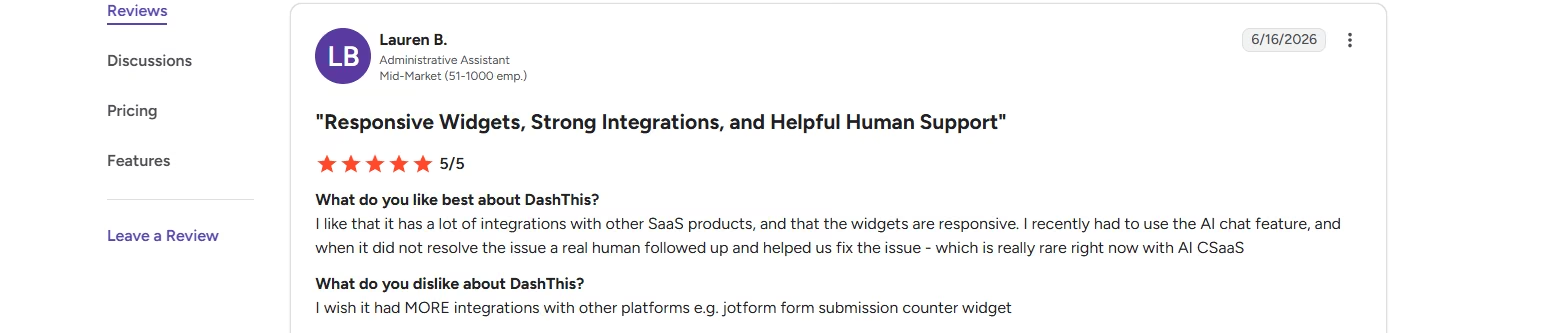
I like that it has a lot of integrations with other SaaS products, and that the widgets are responsive. I recently had to use the AI chat feature, and when it did not resolve the issue a real human followed up and helped us fix the issue - which is really rare right now with AI CSaaS. - Lauren B., G2
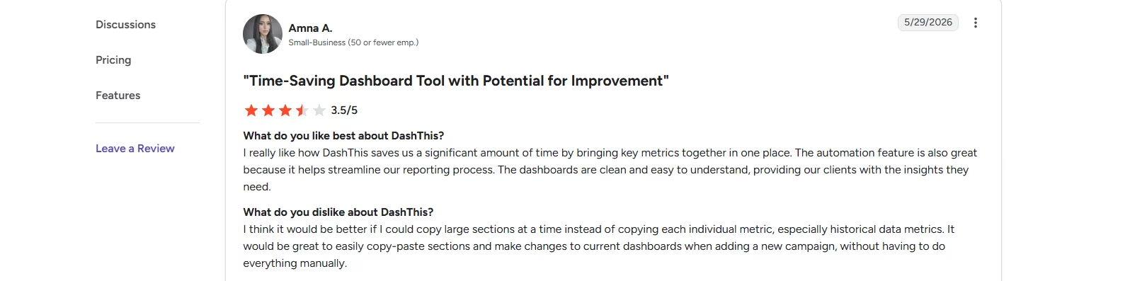
I think it would be better if I could copy large sections at a time instead of copying each individual metric, especially historical data metrics. It would be great to easily copy-paste sections and make changes to current dashboards when adding a new campaign, without having to do everything manually. - Amna A., G2
Pricing
Individual starts at $54 per month for three dashboards and 15 sources. Professional runs $164 per month for 10 dashboards and 40 sources, Business is $324 per month for 25 dashboards and 100 sources, and Standard reaches $499 per month for 50 or more dashboards. A 14-day free trial is included.
Bottom Line
DashThis is a good choice if you want to get a marketing dashboard running quickly, especially with its preset widgets. Custom dashboards are still manageable, but spreadsheet-based reporting requires more attention to settings and column formatting than Data Studio, and I wouldn't rely on its AI Insights to validate whether your underlying metrics are correct.
5. Databox
What it does: Databox is a business intelligence platform with an AI analyst called Genie and a Metric Library of pre-made widgets tied to specific third-party integrations.
Best for: Teams that want pre-built metrics from supported integrations or an AI analyst that can interpret their data and provide context.
Databox offers pre-made widgets built around specific integrations, and when the source you need already exists, they're fast to use.
Databox says its Metric Library contains more than 3,000 pre-built metrics covering integrations such as Ahrefs, AccuRanker, and ActiveCampaign. I couldn't find Google Sheets or Google Search Console among them, though, which meant I had to build my own metrics from my SEO sheet.
Building my own metric meant working through a grid-based canvas rather than placing widgets freely on the dashboard. I connected my data sources and reached a metric builder where I could choose a measure, date, and dimension while watching a live preview update.
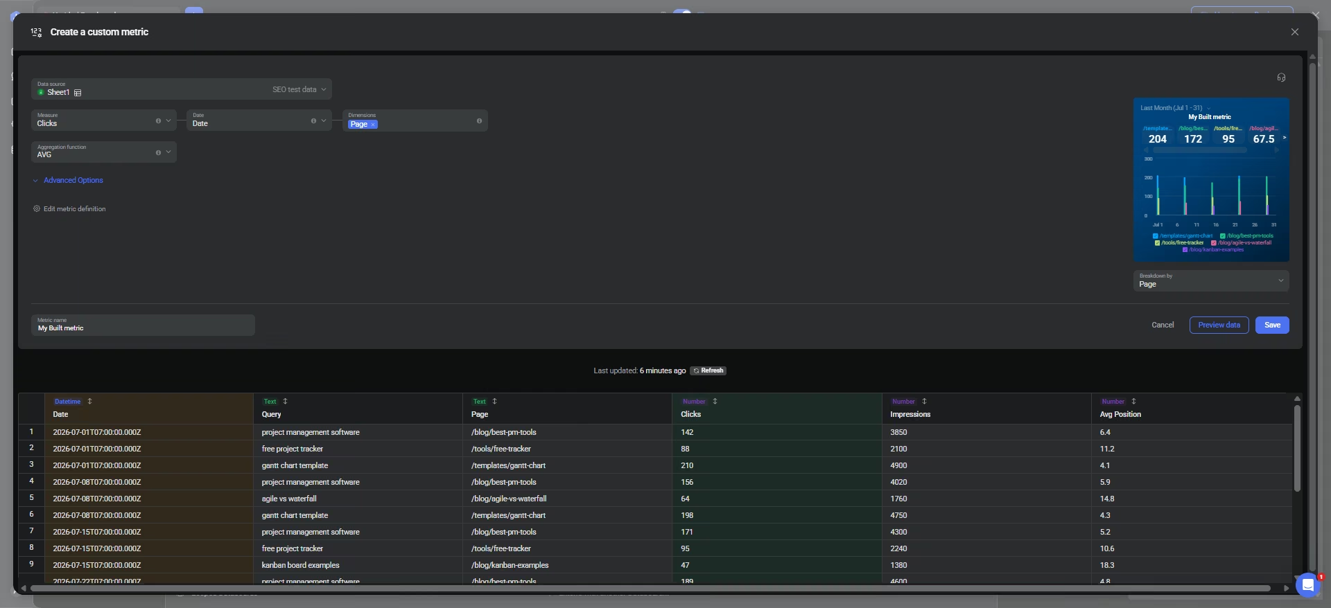
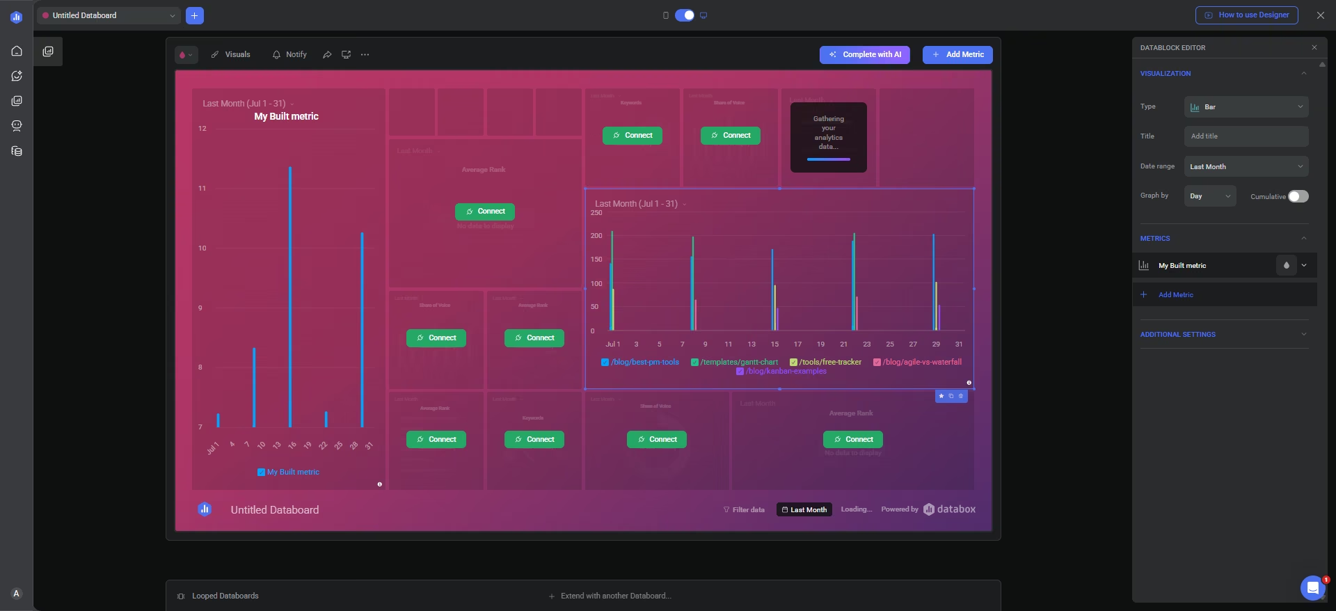
None of that configuration carried over once I saved it. The dashboard reset the date range, collapsed my breakdown into one blended number, and getting the breakdown back meant digging through another settings panel in the canvas. That felt like double work because I had already configured those settings before saving.
Databox also has an Auto Fill feature that populates the grid with pre-made widgets. I expected it to use my connected data sources to automatically create different charts. Instead, it filled the canvas with widgets from various integrations, whether or not those were the tools I used.
Genie, the AI analyst, was the part of Databox I liked most. I asked which keyword had the biggest average position decline over the last 30 days. Instead of blindly ranking the numbers, it recognized that a lower position number means a better ranking, so none of my keywords had declined.
It reinterpreted my question as asking for the biggest improvement, produced a ranked table, and noticed on its own that my sheet covered only six weeks rather than 30 days.
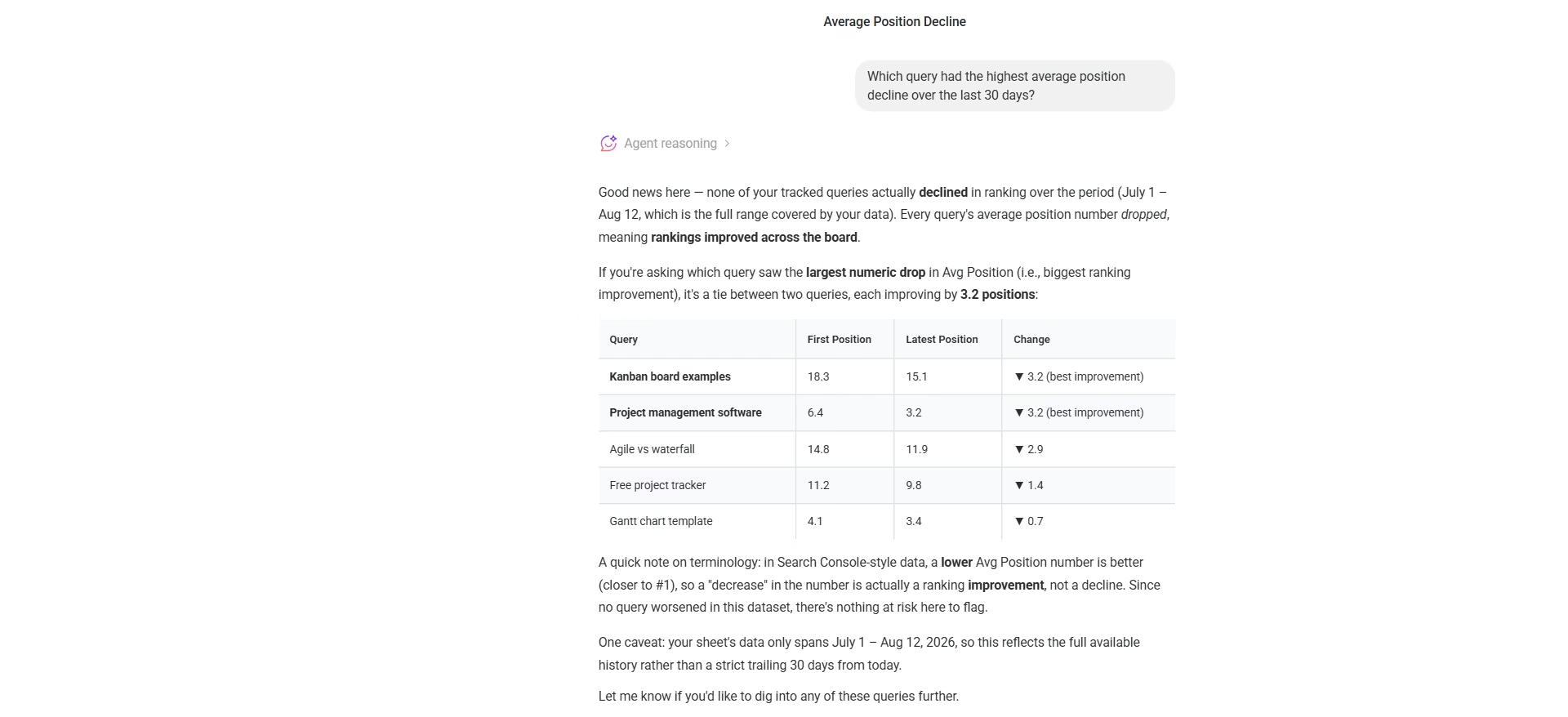
That was a meaningful difference from DashThis's AI. Databox's Genie understood what the SEO metric meant, challenged the premise of my question, and checked the context of the data before answering.
Key Features
- Genie AI analyst: Answers plain-language questions and checks the data before it responds
- Automated reporting: Share dashboards through links or TV streams and send scheduled snapshots, scorecards, alerts, and performance updates automatically.
- 20+ visualization types: Including Number, Line, Bar, Table, and Pipeline
Pros and Cons
Pros:
- Genie caught a flawed assumption in a question and corrected it before answering, twice
- One-click AI chart building produced a correctly totaled result with a genuine, unprompted insight
- Premade Metric Library widgets are fast when your exact data source is already covered
Cons:
- A metric's breakdown and date range don't carry over once saved to the dashboard, requiring manual setup twice
- Building a custom metric takes noticeably more steps than Geckoboard's drag-and-drop approach
What Users Say
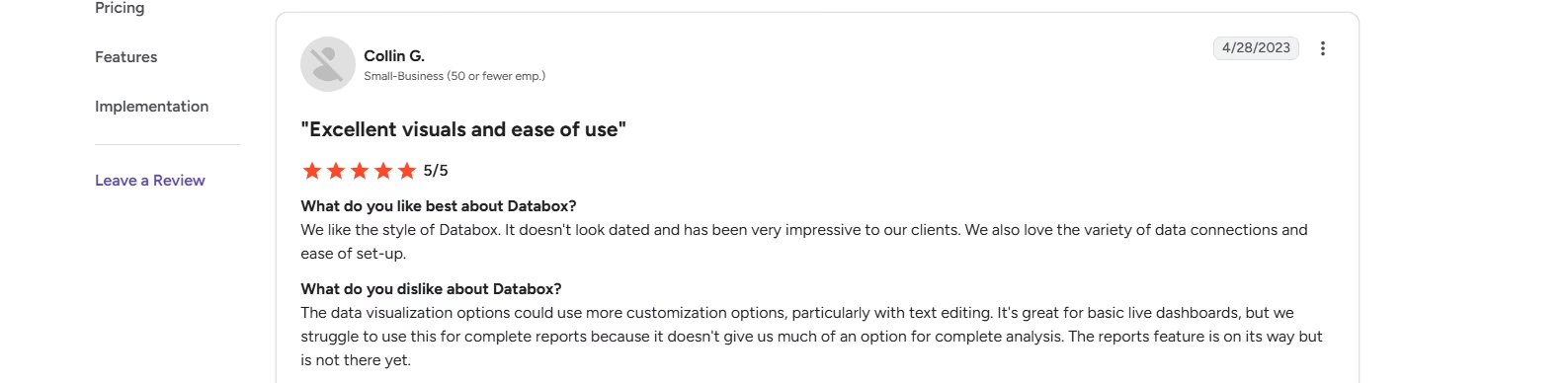
“We like the style of Databox. It doesn't look dated and has been very impressive to our clients. We also love the variety of data connections and ease of set-up.” - Colin G., G2
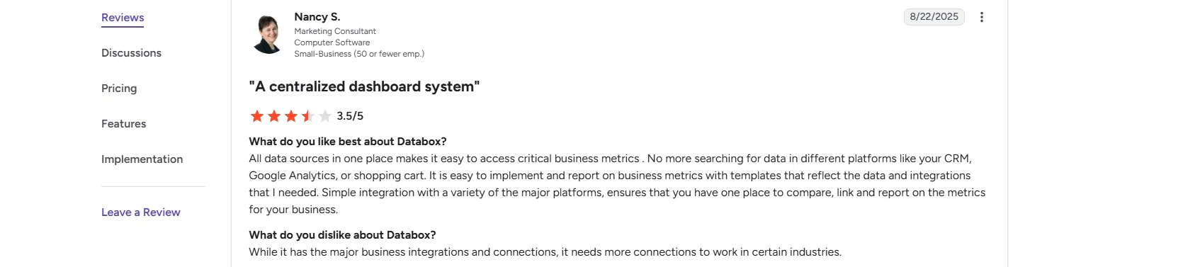
“While it has the major business integrations and connections, it needs more connections to work in certain industries.” - Nancy S., G2
Pricing
The free plan includes three data sources and one dashboard. Analyst runs $79 per month, or $64 per month billed annually, for five data sources. Pro starts at $199 per month, or $159 per month billed annually, for three data sources, with extra sources at $5.60 each on annual billing. Growth reaches $499 per month, or $399 per month billed annually.
Custom plans are available for larger teams.
Bottom Line
Databox is worth considering if your data comes from one of its supported integrations or if you want an AI analyst that can interpret your metrics. The custom dashboard builder took more work than I expected, but Genie was the strongest AI feature I tested across these tools.
6. SE Ranking
What it does: SE Ranking is an SEO platform that tracks keyword rankings, traffic, and backlinks, then turns that data into client reports through a built-in Report Builder.
Best for: Teams already using SE Ranking for SEO data who want client reports without paying for a separate dashboard tool.
SE Ranking takes a very different approach from the other tools in my test. It's an SEO platform that already tracks your keyword rankings, traffic, and competitor backlinks, so building a report means pulling from data it already has rather than importing it from elsewhere.
Building the report itself took about ten minutes. I picked one of the prebuilt templates, and from there it was mostly a matter of adding and removing widgets. I deleted the ones I didn't need and dragged in the ones I wanted from a sidebar of pre-built options.
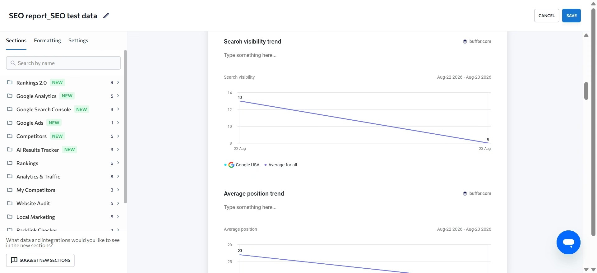
White labeling worked as expected. I clicked the SE Ranking logo, replaced it with mine, and imported my own branding. When I exported the report, I had three format options, PDF, XLSX, and HTML.
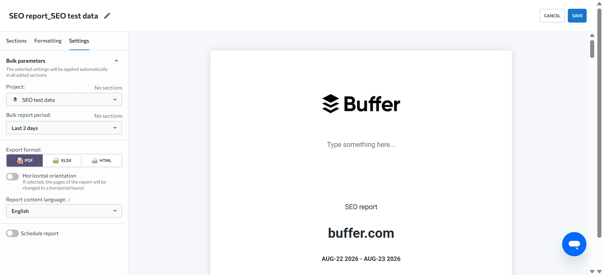
I could also schedule the report to run every Friday, so recurring client reporting doesn't require me to generate the same report manually each week.
The real limit is customization. There's no way to build your own graph from scratch. You choose from what SE Ranking already provides, and if the metric you need isn't available, you can't create it yourself.
That limitation extends to outside data too. SE Ranking lets you bring in data from Google Ads, Search Console, and Google Analytics, and you can connect social accounts as well. My own attempt to connect a social account, however, returned an error page instead of completing.
Key Features
- Report Builder with prebuilt templates: Start from a prebuilt layout or build from scratch
- White label branding: Own domain, own email sender, fully rebranded interface
- Google Ads, Search Console, and GA4 connections: Bring in outside data alongside SE Ranking's own tracked metrics
- Three export formats: PDF, XLSX, and HTML, plus email delivery
Pros and Cons
Pros:
- Reports pull from data SE Ranking already collects, no separate dashboard tool needed
- White label and export both worked exactly as advertised in testing
Cons:
- No way to build a custom widget from scratch, limited to prebuilt options only
- Social account connection returned an error page in testing rather than completing
What Users Say
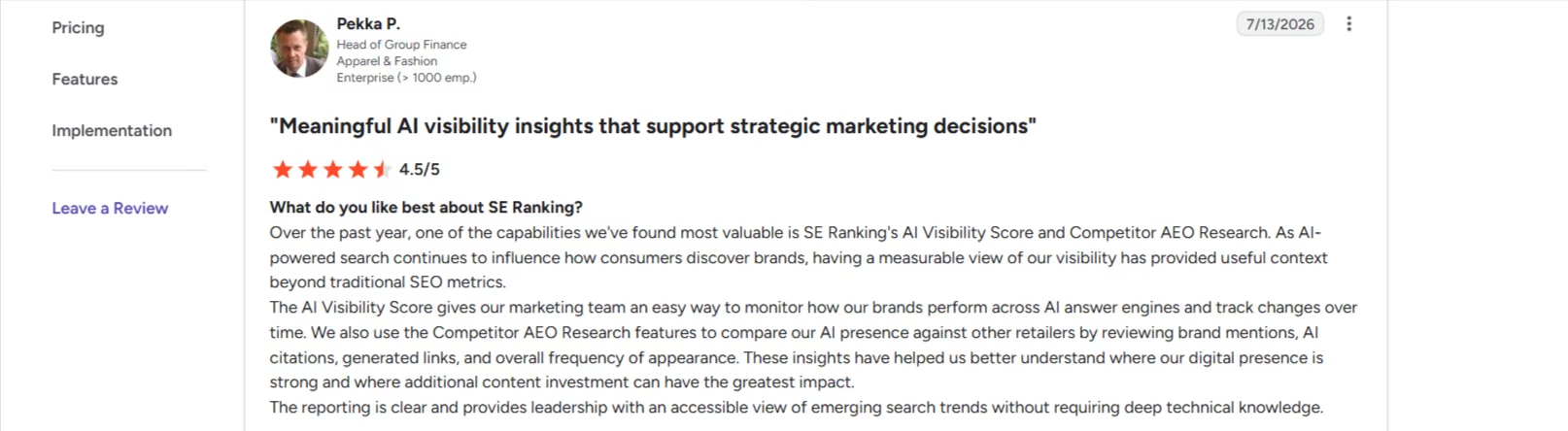
“The reporting is clear and provides leadership with an accessible view of emerging search trends without requiring deep technical knowledge.” - Pekka P., G2
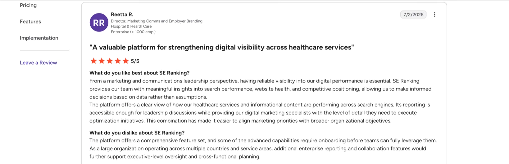
“Additional collaboration and reporting options for agencies managing multiple client accounts would also be a welcome enhancement.” - Reetta R., G2
Pricing
Core starts at $129 per month, or $103.20 per month billed annually, for 10 projects and 2,000 tracked keywords a day. Growth runs $279 per month, or $223.20 per month billed annually, for 30 projects and 5,000 tracked keywords a day. Enterprise pricing is custom. A 14-day free trial requires no credit card.
Bottom Line
SE Ranking makes sense if you're already using it for SEO and want client-ready reports from the data it collects. It's much easier than building a dashboard from scratch, but that convenience comes at the cost of customization.
7. Emergent
What it does: Emergent is an AI dashboard builder that generates a working dashboard from a plain-English description.
Best for: Teams that need a highly customized SEO dashboard and are willing to build their own rather than adapt an existing reporting tool.
Emergent is a dashboard-building platform that lets you create a custom dashboard around your specific workflow. I wanted something built specifically for SEO, so I gave it this prompt:
“Build an SEO reporting dashboard app. Users should be able to bring in their own SEO performance data and see it visualized in a way that helps them understand trends and make decisions. Make it something a user could customize for their own metrics and data source over time.”
Before building anything, it asked me five questions, each with options to choose from:
- How I wanted to bring in data: CSV, Sheets, or an integration
- Which metrics mattered most
- Whether the app needed user logins
- What visual style I wanted
- Whether I wanted AI features built in
It also let me choose the AI model, GPT-5.4, which ran through Emergent's built-in Universal Key, so I didn't need a separate API account.

Those questions help it produce a precise output in 20 minutes. It had a dashboard with stat cards across the top, a trend chart, date ranges, and AI insights. Other tabs handled integrations, where it had already populated six SEO tools, and data import, where I could upload and save CSV files.
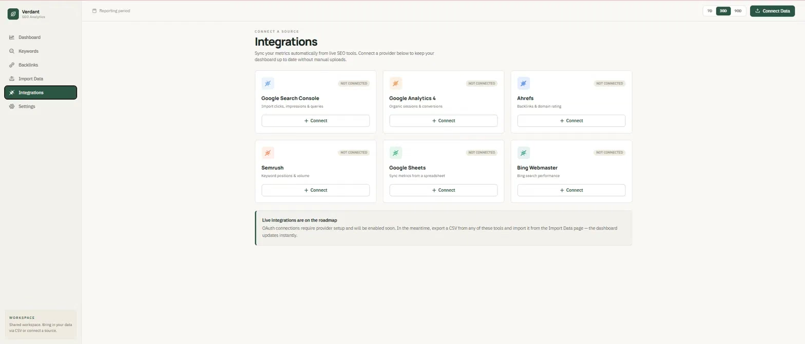
The first version looked right but fell apart when I tested it. I imported a CSV, but the dashboard kept showing its demo numbers instead of my data.
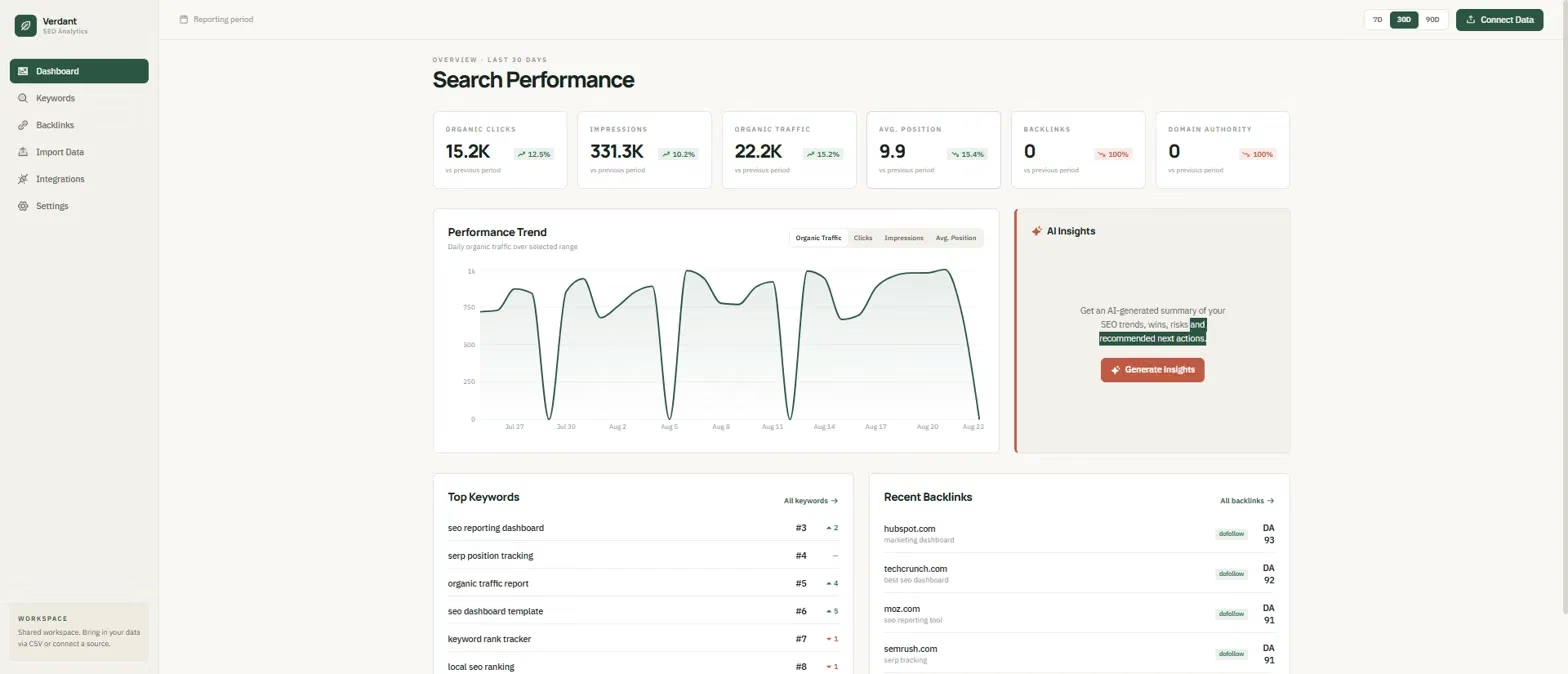
I reported the problem in chat, and six minutes later Emergent's agents returned a fix that worked. After that fix, I could switch between my saved CSVs and have the widgets update with the corresponding data. When a CSV didn't contain a metric, the dashboard left that field empty instead of inventing a number.
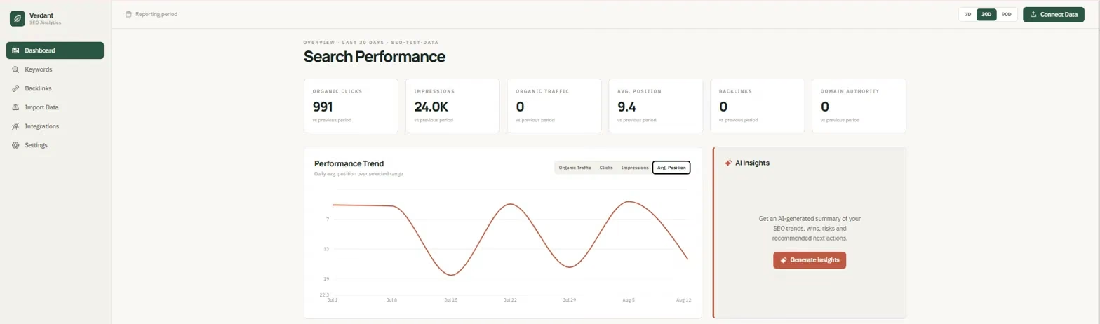
The complete build and repair cost me 77.68 credits. That's expensive for a single dashboard, especially compared with tools that give you a working reporting environment out of the box.
But the trade-off is that I wasn't limited to someone else's widgets, templates, or visualization options. I had a reusable app built around the way I wanted to work, and I could continue modifying.
Key Features
- Custom data and databases: Connect spreadsheets or datasets, or have Emergent generate a database and data model for the app. You can define tables, fields, relationships, filtered views, and data workflows through prompts.
- AI-powered development: Emergent uses specialized AI agents to build and test the application, with different agents suited to complex production apps, detailed builds, quick first versions, and mobile apps.
- Connections to the tools you already use: Link analytics tools, CRMs, payment systems, and other services by describing them in a prompt.
- User logins and going live: Add sign-in, roles, and permissions, then publish the finished app on Emergent's hosting under your own domain.
Pros and Cons
Pros:
- Asked structured, specific questions before building rather than guessing at requirements
- Correctly handled ranking-metric logic in the UI without being told to
- Bug got diagnosed and fixed in six minutes once reported precisely
Cons:
- The first build shipped with a working-looking UI that wasn't actually connected to imported data
- Reviewers report the AI getting stuck in loops on vague prompts, which burns significant credits
What Users Say
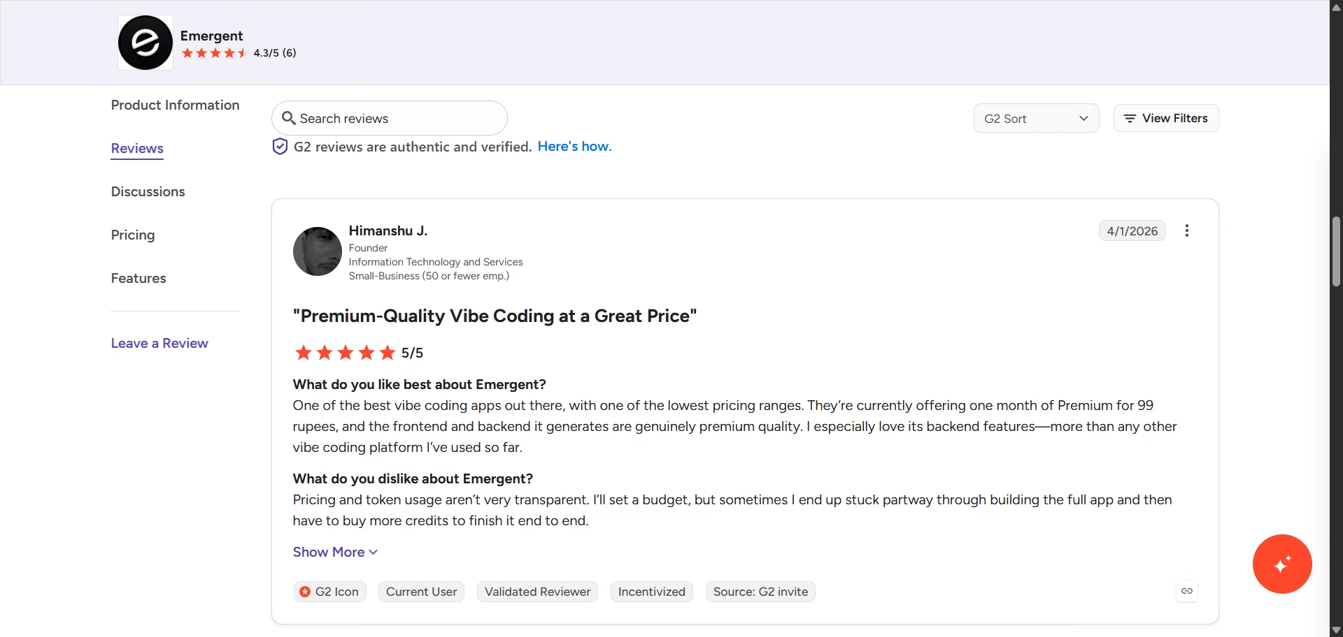
“One of the best vibe coding apps out there, with one of the lowest pricing ranges. They’re currently offering one month of Premium for 99 rupees, and the frontend and backend it generates are genuinely premium quality. I especially love its backend features—more than any other vibe coding platform I’ve used so far.” - Himanshu J., G2
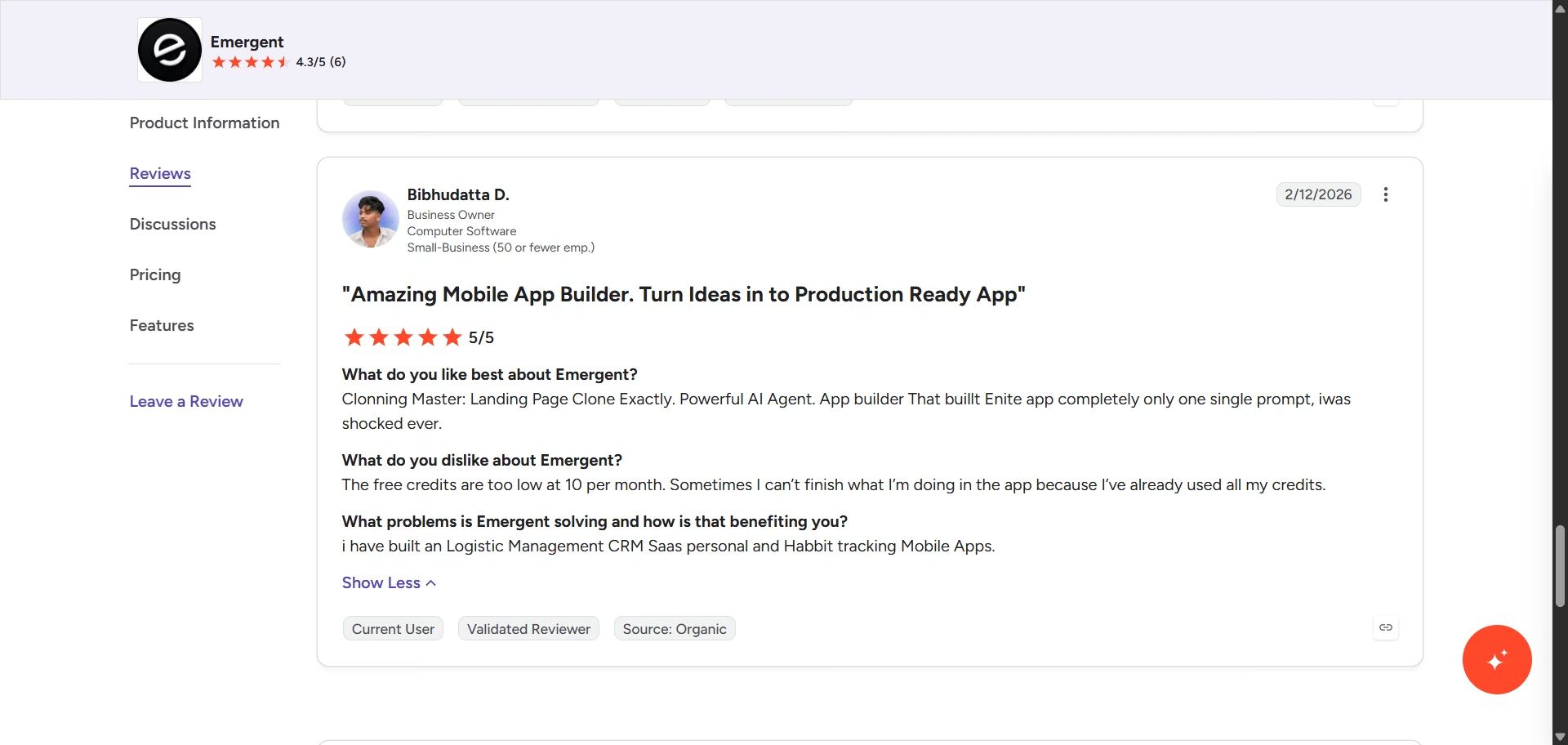
“The free credits are too low at 10 per month. Sometimes I can’t finish what I’m doing in the app because I’ve already used all my credits.” - Bibhudatta D., G2
Pricing
The free plan includes 10 monthly credits, no credit card required. Standard starts at $20 per month, or $17 billed annually, for 100 credits. Pro reaches $200 per month, or $167 billed annually, for 750 credits. Business and Enterprise plans use custom pricing.
Bottom Line
Emergent is the option I'd choose when existing dashboard tools are too restrictive for what I need. It takes more upfront effort and costs more than picking a template, but the payoff is a dashboard built around my SEO workflow rather than the limitations of someone else's reporting system.
Curious what a fully custom build looks like step by step? Emergent's analytics dashboard guide walks through the full process from prompt to finished dashboard.
Which SEO Dashboard Tool Should You Choose?
The best choice depends on how much control you need and how much setup you're willing to handle. My testing showed a clear split between tools that make reporting faster through templates and integrations, and tools that give you more freedom to build around your own data.
Choose AgencyAnalytics if you:
- Manage multiple clients and want client accounts, templates, and reporting in one workflow
- Want to start from a ready-made dashboard rather than build every widget yourself
Choose Data Studio if you:
- Want a free dashboard with extensive control over charts, metrics, and data sources
- Already work heavily with Google Search Console, GA4, and other Google data
Choose Geckoboard if you:
- Need a simple dashboard that puts a small set of KPIs somewhere your team can see them quickly
- Care more about fast setup and readability than advanced visualization options
Choose DashThis if you:
- Want preset marketing widgets that get a client dashboard running quickly
- Need a straightforward reporting workflow with room for custom widgets
Choose Databox if you:
- Already use one of its supported integrations and want to build from pre-made metrics
- Want an AI analyst that can interpret your data and add context to your questions
Choose SE Ranking if you:
- Already use SE Ranking to track your SEO performance
- Want client reports without adding a separate dashboard platform
Choose Emergent if you:
- Need a dashboard built around a specific SEO workflow that existing tools can't accommodate
- Want to control the interface, data structure, metrics, and functionality yourself
Skip this category entirely if:
- You only need occasional SEO reports and your existing SEO or analytics platforms already provide everything you need
- You don't have enough recurring reporting work to justify building and maintaining a separate dashboard
Final Verdict
Across seven SEO dashboard software tools, the split came down to how much control you want. For most agencies, I'd start with AgencyAnalytics if client reporting is the priority, or Data Studio if you want maximum flexibility without another subscription.
Emergent is the most interesting option when existing dashboard tools feel too restrictive and you're willing to build a custom solution around your workflow. If you’re ready to try out Emergent, sign up for free and start building your SEO dashboard right away.

Most AI app builders stop at prototypes. Emergent creates production-ready apps you can actually launch.
- Production-ready apps
- Web & mobile apps
- Deploy in minutes