

A store owner emailed me last spring, frustrated. Plenty of traffic, almost no sales, and a hunch that her products were the problem. Her checkout asked for a phone number twice and hid the shipping cost until the final screen.
I've rebuilt enough store pages to see the same handful of mistakes on repeat. None of them are dramatic. Shoppers don't file a complaint when a site annoys them; they just leave, and you never hear about it.
Here are the ten ecommerce website problems, ending with the one that decides how simple the rest are to solve: how you build the store in the first place.
Mistake 1: Building a Store Before You Know Your Buyer
Most weak stores are built for "everyone," which is another way of saying no one.
Picture a Brooklyn candle shop. "For candle lovers" is forgettable. "For people who need a last-minute gift that looks like they tried" sells.
The fix: Talk to five real buyers before you touch the design. Read the reviews on competitor products, note the complaints, and write one short buyer persona. Everything downstream (your copy, your photos, your categories) gets easier once you know who you're for.
Mistake 2: A Slow, Sluggish Store
Ecommerce conversion rates drop by an average of 0.3% for every extra second a page takes to load, and mobile shoppers are the least patient of all.
A beautiful store that loads in six seconds is a broken store.
The fix: Compress and resize your images, remove plugins you don't use, and move to managed hosting that scales when a sale spikes your traffic. Then test the real thing on your phone, not just your laptop.
Mistake 3: A Long, Confusing Checkout
Checkout is where you lose the traffic you paid for. The average cart abandonment rate sits around 70%, and clumsy checkouts are a big reason why.
The classic killers: forced account creation, a dozen form fields, surprise costs at the end, and no sign of how many steps are left.
The fix: Turn on guest checkout, cut every field you don't truly need, show the full price early, and add trust badges near the payment button. When I added guest checkout to one client's store, the abandoned-cart emails started firing less within a week.
Mistake 4: Weak Product Pages
Your product page is the moment of decision, and a lot of stores fumble it. Blurry photos and supplier-copied descriptions are textbook bad ecommerce website examples, and they send shoppers straight to a competitor who shows the product properly.
Reviews matter more than most owners think. They sway about 93% of buying decisions, so a page with none reads as risky.
The fix: Use several high-resolution photos plus a lifestyle shot, write benefit-led copy in your own words, list the specs, and put real customer reviews on the page.
Mistake 5: Cluttered Design and Confusing Navigation
If shoppers can't find a product, they can't buy it. Cluttered pages and buried menus make people work, and working shoppers bounce. Every extra click is a chance to lose them.
The fix: group products into clear categories, add a search bar with filters, and cut the visual noise so your calls to action stand out. A first-time visitor should reach any product in two or three clicks.
Mistake 6: Ignoring Mobile Shoppers
Mobile drives roughly 59% of ecommerce sales worldwide.
The fix: Use responsive design, make buttons thumb-friendly, keep mobile load times fast, and actually complete a purchase on your own phone. You'll spot the broken bits in about thirty seconds.
Mistake 7: Too Few Payment Options and Weak Trust Signals
Two things push shoppers out at the last step: not seeing their preferred way to pay, and not feeling safe enough to enter a card. Any store taking payments is a target, and outdated software or a lapsed security certificate is how a small shop ends up leaking customer data.
The fix: Offer the popular methods (cards, digital wallets, and a buy-now-pay-later option) and connect a processor like Stripe so the flow stays smooth.
Then earn the trust: switch to HTTPS, show your SSL padlock, install updates when they land, and put your return and shipping policies where people can see them before they commit.
Mistake 8: An Invisible Store
A great store that nobody can find earns nothing. If your product pages aren't written with search in mind, and your site trips up Google with broken links or a missing sitemap, you're invisible to the people already searching for what you sell.
This one bites founders who assume the hard part is over once you get a store online in the first place.
The fix: Do basic keyword research, write descriptive titles, meta descriptions, and image alt text, start a simple blog, and fix the technical issues (slow pages, broken links, no sitemap) that hold back your rankings.
Mistake 9: Making Support and Contact Info Hard to Find
Hiding your contact details reads as hiding from your customers. Shoppers want to know they can reach a human before they hand over money, and a store with no visible support loses the sale and the repeat purchase.
The fix: Put your contact details in the footer and the main navigation, and give a real email address alongside any contact form. Add live chat or a chatbot as a backup (not a replacement) for real support, and answer quickly. Fast, human help turns a first-time buyer into a regular.
Mistake 10: Choosing the Wrong Way to Build (or Rebuild) Your Store
Here's the mistake underneath most of the others: the way you build the store decides how easily you can fix everything above. Most owners weigh two options.
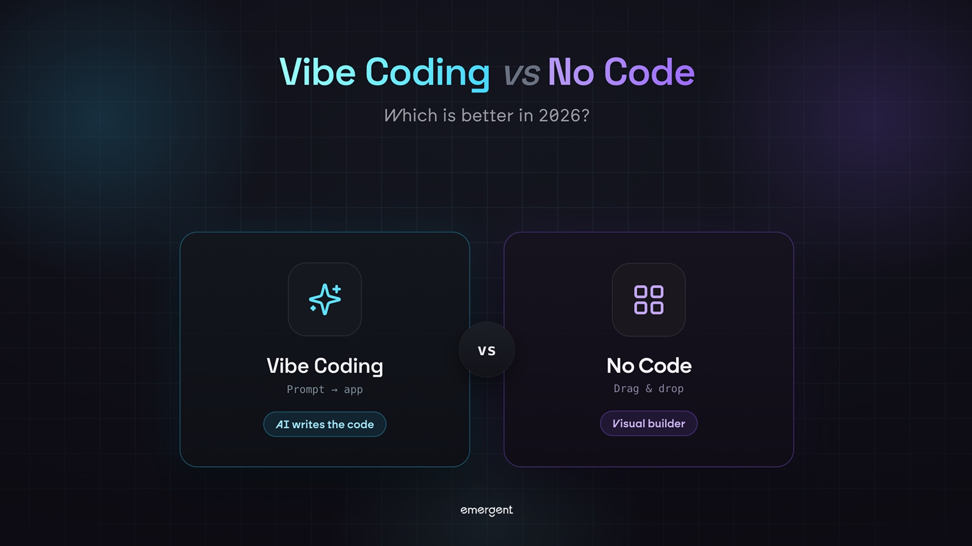
Option one is a rigid drag-and-drop template. It's fast to start, then you hit a wall the moment you want a custom checkout or a layout the template won't allow. Option two is hiring a development agency, which is flexible but slow and pricey for a small business.
There's a third route now. You describe the store you want in plain English, and specialized agents build the interface, product pages, checkout, and hosting into a real, working store you can change anytime. It's the same idea behind vibe coding, applied to commerce.
Tools like Emergent's AI website builder for ecommerce take this approach.
To be fair about the limits: if you're handling regulated or sensitive data (health records, heavy financial info), bring in specialist review for compliance. For a standard online store, an AI-built site clears that bar fine.
Build a Better Ecommerce Store on Emergent
Look back at the first nine mistakes, and you'll notice a pattern. Slow pages, a clunky checkout, a design you can't restructure. They're all much harder to fix when you're boxed into a template you don't control.
For years, the only alternative was an expensive custom build.
Emergent's AI website builder turns a plain-English description into a real, working store. You describe what you want, and a coordinated system of specialized agents builds the design, product pages, checkout, and hosting, then puts it live with a custom domain when you add one.
If you're weighing your options, it's worth first seeing how today's AI build tools actually compare.
With Emergent, builders can:
- Describe a store in plain English and get a custom, production-ready site with no template to fight.
- Build fast, mobile-responsive product pages and a low-friction checkout from the start.
- Connect payments and go live on managed hosting with a custom domain and free SSL.
- Change anything later (the layout, the logic, the categories) without waiting on a developer.
- Fix speed, SEO structure, and navigation without rebuilding from scratch.
- Export the code and keep full ownership of what you built.
Avoiding these ecommerce website mistakes gets a lot simpler when your store is something you can actually shape, instead of a template you're stuck working around.
Start building on Emergent and see how fast a store you control comes together.

Emergent designs, writes, and publishes your whole site from one prompt. No templates, no drag-and-drop.
- Full site from one prompt
- Custom design, real pages
- Publish in minutes