
TL;DR
- Image-led: Full-bleed photography with almost no interface, for work that sells itself on sight.
- Multi-page filterable: Separate streams or categories, for anyone whose work spans more than one type.
- Text-led: Typography and hierarchy instead of thumbnails, for writers and strategists with no imagery to show.
Almost every portfolio worth copying falls into one of three layouts, and which one fits comes down to the work itself.
So I went through dozens of live portfolios and pulled out the 12 clearest, grouped by the three patterns they kept falling into. Then I built one of each with Emergent to see whether an AI builder could produce the same results.
By the end, you'll have 15 portfolio website design ideas you can steal, and a clear sense of which layout fits which kind of work.
12 Portfolio Websites Worth Studying
Image-Led Portfolios
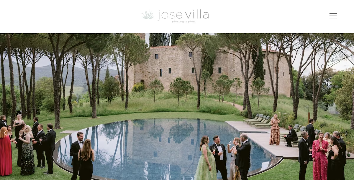
Jose Villa: fine art wedding photographer. The navigation has no portfolio link at all, because the homepage is one scroll of full-width images that ends in the contact form.
Eva Kolenko: food and beverage photographer. There's no landing page; the homepage is the food gallery itself, so you arrive already inside the work.
Eleanor Shakespeare: photomontage illustrator. Her homepage is a grid of portfolio cards under nothing but a one-line job title, so the collage work is effectively the first thing you see, with a press list running back to 2015 on her About page.
Nadav Kander: portrait and landscape photographer. The homepage is a studio feed instead of a curated gallery, and most images link out to wherever the work appeared, from newspapers and galleries to theatres and photography fairs, so the feed doubles as a record of where it ran.
Several of these sites skip a landing page and let the work lead. If you want to do the same, you can build a landing page that opens straight on your strongest pieces.
Multi-Page Filterable Portfolios
Malika Favre: illustrator. Work splits into six themes, most of which open their own sub-navigation, so an art director hunting New Yorker covers never scrolls past the erotica.
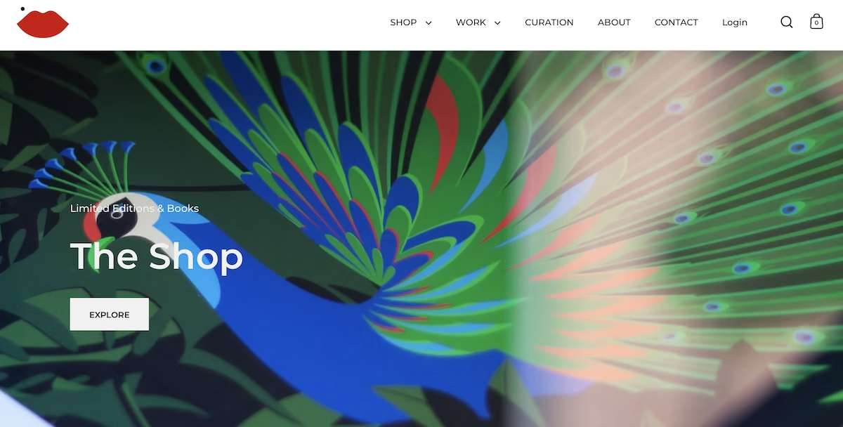
Julie Solvstrom: designer and lettering artist. Commercial design, illustration and personal work are three separate top-level destinations, so a brand hiring for packaging only sees relevant work.
Jessica Hische: lettering artist. The Portfolio menu splits work by output type, and the lettering grid filters by category with a Greatest Hits option, so an art director can skip straight to her strongest pieces.
Text-Led Portfolios
Gari Cruze: copywriter. Every project page writes out the brief and the idea in full, so you read the thinking behind the campaign rather than only the finished ad.
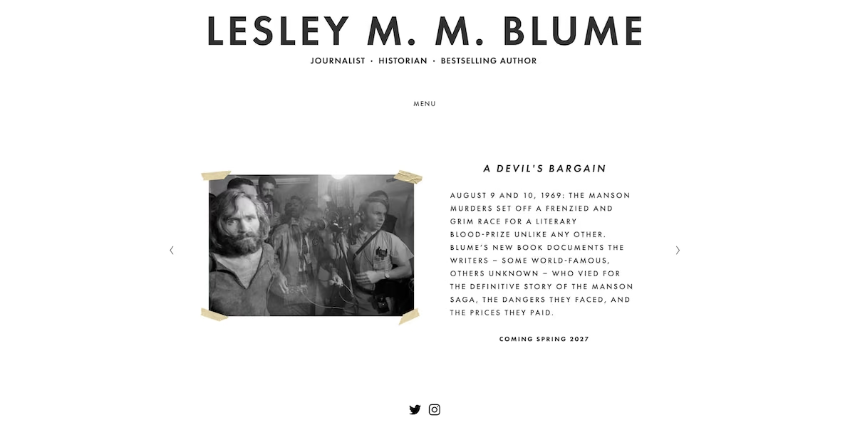
Lesley M. M. Blume: journalist and author. Every clip gets a full paragraph on what the story found, which turns a link list into something worth reading on its own.
Brittany Chiang: frontend engineer. The page opens with plain text and a numbered list of roles, with no hero image, so the writing carries the whole thing.
Robb Owen: creative developer. A short paragraph states what he builds and who he wants to build it for, behind a nav of just four destinations.
Nicole Fenton: writer and experience designer. The projects page describes four pieces of work in prose with no screenshots, and clients are listed as plain text rather than logos, so you read the work instead of scanning brands.
Those 12 sites cover the three patterns. To find out whether an AI builder could actually produce them, I built one of each. I gave Emergent one prompt per site, describing the pages, content, and design direction in plain terms, and then let the agents build. None of the three is a real person, and the names, text, and images in them were all made up for the demo.
I used the same setup for every build, so the numbers are comparable. The photographer site used 3.92 credits in about 18 minutes. The illustrator site used 7.92 credits in 19 minutes. And the journalist site used 6.36 credits in 18 minutes, plus a fix that I’ll go over shortly.
The free plan's allowance is 10 credits a month, which covers any single one of these builds. Two in the same month doesn't fit, and the journalist site passed 10 on the repair alone. Publishing takes a paid plan regardless, since the free plan doesn't deploy.
Three Portfolio Sites I Built with Emergent
1. The Image-Led Photographer Site
What it does: Puts the photography first, with full-bleed images filling the screen and very little text or interface around them.
Best for: Photographers, and any visual field where the work sells itself.
I asked the portfolio website builder for a single-page portfolio for a freelance designer, with a warm off-white background, one accent color, a serif for headings over a sans-serif body, and lots of white space. The brief named one serif for headings and one clean sans for the body, with no drop shadows, no rounded corners, and no color accents.
Build a single-page portfolio website for Ava Mercer, a freelance designer.
A six-project work grid. Clicking a card opens a modal with a larger image, a short project summary, the year, and what she delivered.
An about section with a short bio, a list of services, and a list of past clients.
A contact form asking for name, email, project type, budget range, and a message. Submissions save to the database and show a thank-you message in place of the form. Add a simple admin page at /admin that lists submissions with the newest first.
Design: clean and editorial, lots of white space, a warm off-white background, one accent color, a serif for headings and a sans-serif for body text. It should look like a designer made it, not like a template. Fully responsive.
Use placeholder images for the project work.
When I saw the site, it looked like a gallery wall. The home page opened on a single full-bleed image with the photographer's name over it, and scrolling revealed one featured photo per screen. The work page split into three galleries that each opened into a full-screen lightbox.

The dark background did most of the work. Against near-black, the placeholder images looked deliberate rather than empty, and the restraint in the brief paid off in a design that avoided competing with the photos.
If you'd rather compare tools before building, I've put together a comparison of portfolio website builders from the ones I've tested.

Key Features:
- Full-bleed images that fill the screen on the home page
- Galleries that open into a full-screen lightbox
- A dark background that frames each image cleanly
Pros:
- The work is the first and loudest thing on the page
- Detail modals keep a visitor on one page instead of loading a new one
- One image per screen keeps attention on a single piece
Cons:
- One weak image has nowhere to hide at full-bleed size
- Visitors who want detail have very little to read
- You need a finished, consistent set of images before this layout works at all
Best For:
- Photographers with a strong, consistent body of work
- Visual artists who want the images to take the lead
- Anyone with finished pieces to show and no process to walk through
2. The Multi-Page Illustrator Site
What it does: Spreads the work across several pages, with a filterable gallery and a dedicated case study page for each project.
Best for: Illustrators and designers who work in more than one category and want to let visitors sort by type.
I asked for a four-page site for an editorial illustrator, with a gallery of 12 projects tagged by category and filter buttons above the grid. Each project needed its own case study page with the brief and the approach.
Build a four-page portfolio website for Nora Vance, a freelance editorial illustrator based in Portland who works with magazines, book publishers, and brand campaigns.
Home page: a hero with her name, the line "Editorial illustration for magazines, publishers, and brands," and a button to the contact page. Below that, a grid of six featured projects, each with a thumbnail, title, and client name. Then a short row of three client logos and a testimonial.
Work page: a gallery of 12 illustration projects. Each project has a title, client, year, and one of three categories: Editorial, Book Covers, or Brand. Add category filter buttons at the top so visitors can show only one category at a time.
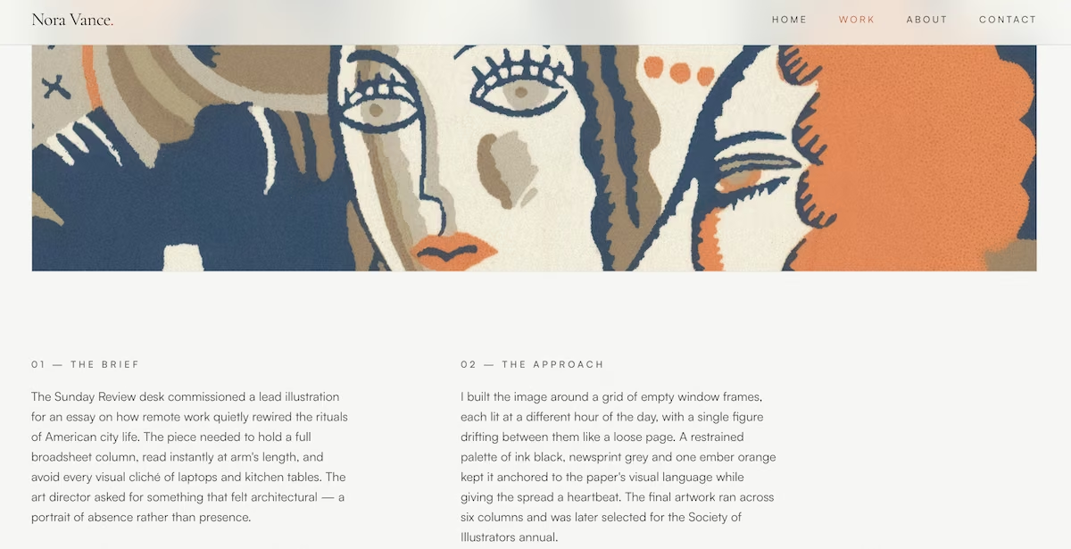
Clicking any project opens its own case study page with a large image, the client name, the year, a two-paragraph description of the brief and the approach, and a link back to the gallery.
Emergent asked three questions before it started, covering the contact form, the imagery, and the design direction. Then it built the gallery with working category filters, and clicking one reduced the grid to only the matching projects.

The case study pages were the strongest part of this build. Each of the 12 projects had its own text, laid out in two columns for the brief and the approach, and Emergent wrote each one to fit that particular project rather than repeating a template.
Key Features:
- A gallery that filters by project category
- A separate case study page for each project
- Category tags on all 12 projects, set from the brief
Pros:
- Filters let a visitor find relevant work fast
- Case study pages show the brief you were given and how you answered it
- Multiple pages suit a large or varied body of work
Cons:
- More pages mean more content to keep current
- A thin project looks thinner on its own page
- Filters only help once you have enough work to sort
Best For:
- Illustrators and designers with a deep back catalog
- Creatives working in two or more categories
- Anyone whose process is a part of the pitch
3. The Text-Led Journalist Site
What it does: Drops the thumbnails entirely and uses typography and hierarchy to carry a site made almost only of words.
Best for: Writers, journalists, and strategists whose work is words, with few or no images to show.
I asked for a journalist's site with minimal photography, a white background, near-black text, and one restrained accent color for links. The home page listed 14 invented clips as single rows, each with a headline in a large serif and a publication and year beneath.
Build a portfolio website for Cass Whitlock, a freelance journalist and content strategist in Minneapolis who writes about labor, housing, and local government for magazines and news outlets, and takes on brand editorial work.
This is a text-led site. There is almost no photography to show, so typography and hierarchy have to carry it. No thumbnail grids and no image cards anywhere.
Home page: name and a one-line positioning statement at the top, then a reverse-chronological list of 14 published pieces.
Each entry is a single row: headline in a large serif, then publication name, section, and year in a smaller sans underneath. The headline links out to the piece. Hovering a row shifts its background and reveals a one-sentence summary of what the story found.
Selected Work page: six pieces pulled out for longer treatment. Each gets its own page with the headline, publication, date, a two-paragraph note on how the story came together, a pull quote set large in the serif, and an outbound link to read the full piece.
Services page: three offerings for brand and organizational clients: Reported features, Editorial strategy, and Ghostwritten thought leadership. Each has three sentences of description and a "from" starting rate.
About page: a single portrait on the left, a 200-word bio on the right, then a plain list of publications she's appeared in set as text, not logos.
Contact page: a form with name, email, outlet or company, assignment type as a dropdown, deadline, and a message field. Show a confirmation screen after submission and save every inquiry to a database with an admin view.
Design direction: white background, near-black text, one restrained accent color used only on links and hover states. A high-contrast serif for headlines and a plain sans for everything else, with generous line spacing and a narrow measure on body text.
The result read like a well-set page. The piece list ran in reverse chronological order, and hovering over a row shifted its background and revealed a one-line summary of what the story found. The selected work pages each included a pull quote set large in the serif.

Emergent also added a few nice touches. It numbered each section with a marker like 01 / INDEX, and it pulled a line from the bio to use as the About page headline. Anyone starting from scratch can follow the same route in our guide to building a website with AI.
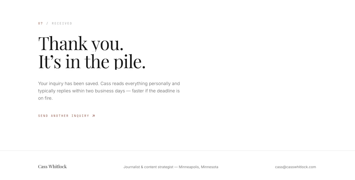
The one thing that didn't work the first time was the contact form. It saved messages to the database and showed in the admin view, but it didn't render on the page itself. Emergent fixed it in one prompt, which cost 4.46 credits, with the repaired version showing the fields followed by a confirmation screen.
Key Features:
- A reverse-chronological list of published work
- Hover states that reveal a one-line summary per piece
- Pull quotes set large on the selected work pages
Pros:
- Strong typography makes a words-only site look intentional
- No images to source, size, or replace
- Fast to load and easy to update
Cons:
- Get the type wrong, and there's nothing else on the page to carry it
- Visitors expecting visuals may find it sparse
- A piece whose headline doesn't land has no image to rescue it
Best For:
- Journalists and writers with published clips
- Content strategists and editors
- Anyone whose portfolio is mostly text
What I'd Do Differently on the Next Build
The three builds went smoothly, but there are a few things to take into account before you copy this approach. Here’s what I’d change if I built the same three sites today.
I'd name the accent color. I left the color up to Emergent on all three, and it chose terracotta for two of them. If you want to choose (or avoid) a specific palette, say so in the brief. Other tools handle this differently, and we've compared the best AI website builders on how much design control they give you.
I'd check every page myself. The journalist site's contact form is the case in point. Emergent's own report said the form worked, because it had confirmed the messages were saving while the form itself never appeared on the page.
That repair pushed the journalist site to 10.82 credits total, just over the free plan's monthly allowance, so that would mean committing to the $20/month plan, at least for the initial build.
I'd write the copy before the build. I described the pages and the design but left the copy to Emergent, and it invented headlines, bios, and rates. That was fine for three sample sites, but a real portfolio needs your own text written before it goes live.
Build Your Own Portfolio Website with Emergent
Each of these portfolio website examples came from a single written brief, and each design suited the field it was built for. Describing the site in words is what let each layout follow the work it had to hold.
Here's how Emergent helps with a portfolio site:
- A design shaped to your field: You describe the work and the builder fits the layout to it, whether that's image-led or text-led.
- Real functionality included: Contact forms, galleries, and admin views come with the build.
- Changes by description: Update a project or restructure a page with a short prompt.
- Your code stays yours: GitHub integration on the Standard and Pro plans lets you export the site or hand it to a developer.
- A built-in assistant: Emmy is available from every page and can turn a rough idea into a clearer brief or explain your options as you go. Talking to her costs no credits.
You can build your first portfolio site with Emergent's AI website builder on the free plan, which includes 10 monthly credits, though the free plan won't publish it. Keeping a site live starts at $20/month on the Standard plan, and each live site uses 50 of that plan's 100 monthly credits.
Most AI app builders stop at prototypes. Emergent creates production-ready apps you can actually launch.
- Production-ready apps
- Web & mobile apps
- Deploy in minutes
Most AI app builders stop at prototypes. Emergent creates production-ready apps you can actually launch.
- Production-ready apps
- Web & mobile apps
- Deploy in minutes