


Most portfolio sites are missing several of the portfolio website features that turn a visitor into an inquiry, and the owner has no way of telling which ones.
So I built a complete portfolio for a fictional editorial illustrator called Nora Vance, using Emergent. One prompt produced four core pages: a home page, a Work gallery, an about page, and a contact form, plus a case study page for each of the 12 projects, in 19 minutes and 7.92 credits.
Below are the nine features I'd consider essential, what each is for, and what happened when I built them.
How I Tested These Features
I gave Emergent the whole brief in one prompt instead of adding a page at a time. Here's the part that covered the Work page:
Build a four-page portfolio website for Nora Vance, a freelance editorial illustrator based in Portland who works with magazines, book publishers, and brand campaigns.
Work page: a gallery of 12 illustration projects. Each project has a title, client, year, and one of three categories: Editorial, Book Covers, or Brand. Add category filter buttons at the top so a visitor can view one category at a time.
Emergent asked three questions before it started: how the contact form should send submissions, which imagery to use for the thumbnails, and whether I had a design direction in mind. I chose real email delivery, curated stock images, and the clean, image-led design already stated in the brief, with Emergent picking the fonts and palette.
The build then paused at the 15-minute mark. The email service had refused to deliver to the placeholder address on the site, so Emergent asked for a real inbox before it would finish. I gave it one, and everything below is what I found on the preview afterward.
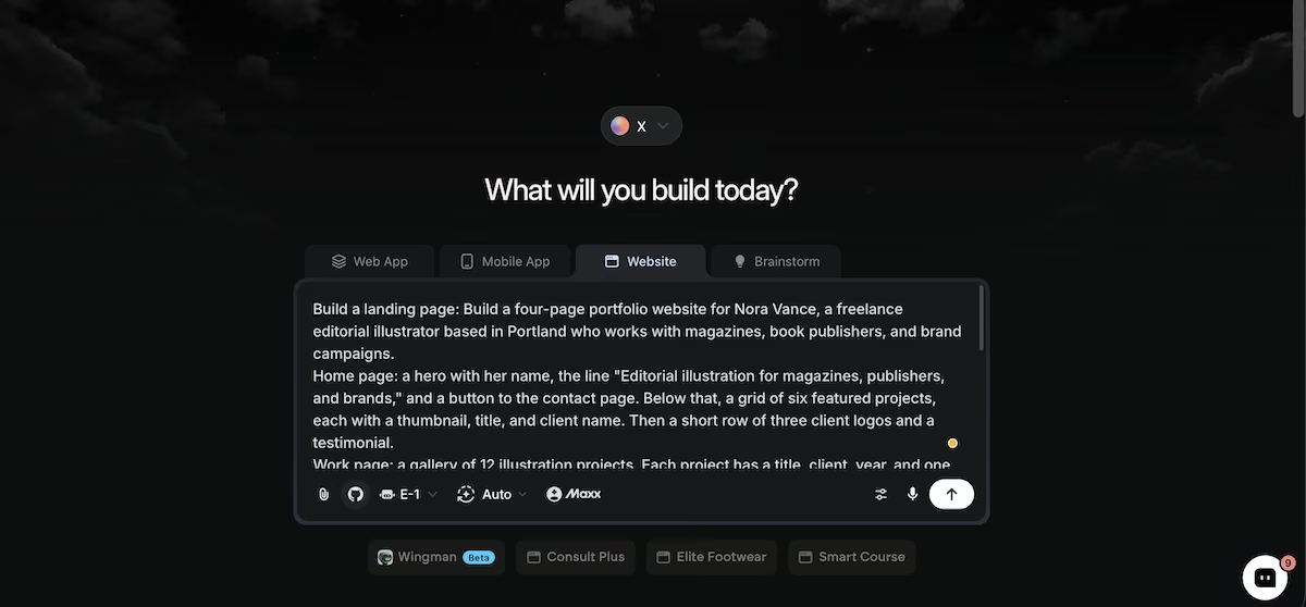
The brief pasted into Emergent's Website tab before the build started.
Nine Portfolio Website Features
1. A Positioning Line in the Hero
What it does: States what you do, in one line, directly under your name at the top of the home page.
Best for: Anyone whose name alone doesn't tell a visitor what they'd hire you for.
The hero came back with three pieces of information stacked above the fold: "Portland, Oregon, est. 2016" in small caps, the name, then "Editorial illustration for magazines, publishers, and brands."
A visitor knows the discipline, the client types, the location, and the years in the trade before scrolling. The Start a Project button sat directly below it, so the answer to "what is this" and the route to acting on it shared the same screen.
Key Features:
- One line, naming the discipline and the client type
- Placed under your name, above anything else
- A call to action within the same screen
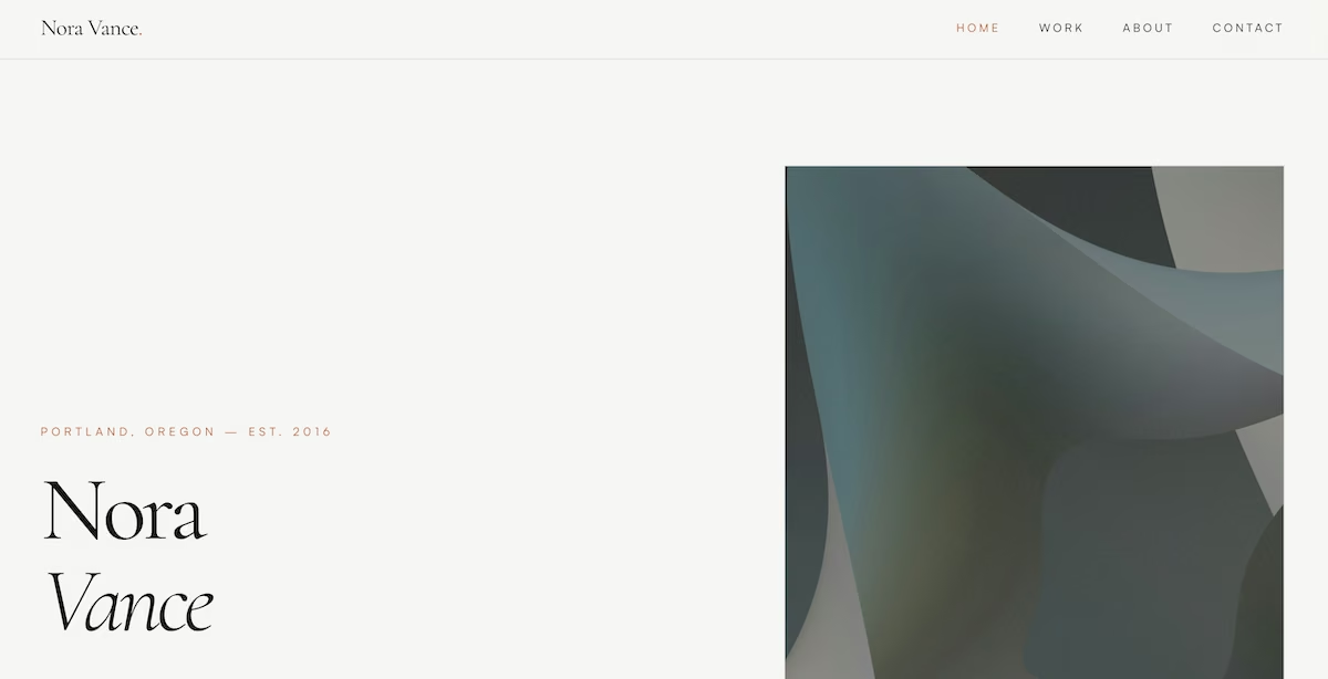
The hero, with the positioning line under the name and the call to action below it.
2. A Featured Work Grid on the Home Page
What it does: Shows a handful of your strongest projects on the home page, each with a thumbnail, title, and client name.
Best for: Visitors who arrived from a link and want to see the work before they read anything about you.
I asked for six featured projects, and the build produced them in a three-across grid under the hero, each labeled with the publication. The layout was clean, but the content let it down, because two of the visible thumbnails weren't illustrations at all. One was a macro photo of oil bubbles, and the other was a photo of a magazine spread.
Contentsquare's 2026 benchmark, drawn from 99 billion sessions across 6,500 websites, puts the average scroll rate at 50.5% on desktop and 45.2% on mobile, so roughly half a page is all most visitors ever see.
Key Features:
- No more than six to eight projects
- Client name visible on every thumbnail
- Each thumbnail links straight to the full project
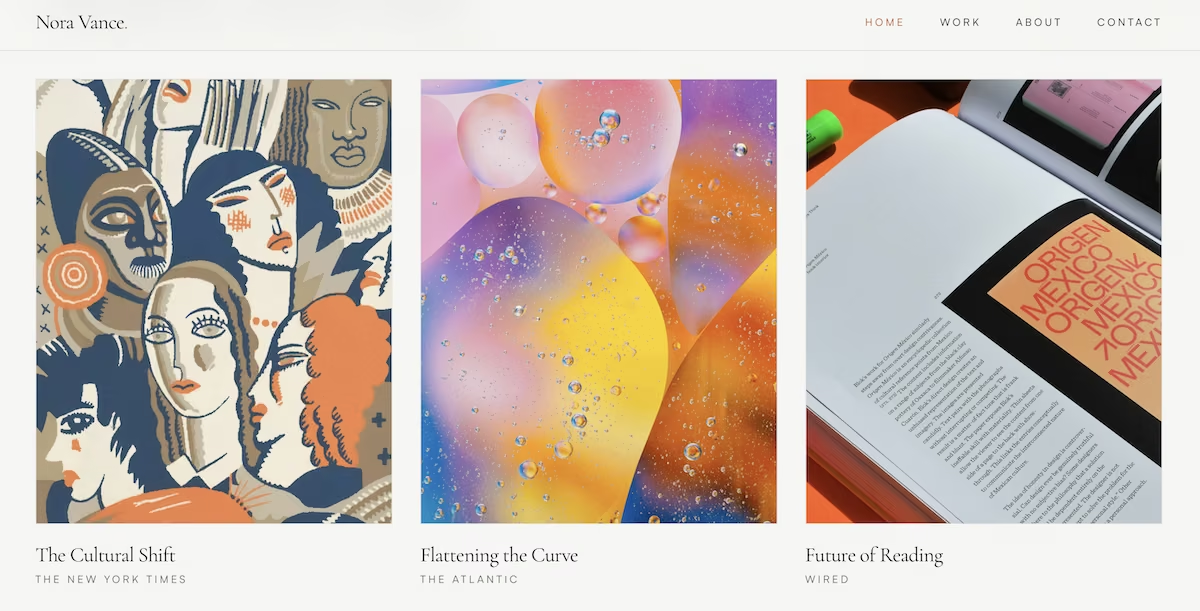
The featured project grid on the home page, showing thumbnail, title, and client for each piece.
3. Case Study Pages for Every Project
What it does: Gives each project its own page explaining the brief and how you approached it.
Best for: Commissioners who’d like to know more about your process.
I opened The Cultural Shift from the gallery and found two columns, 01 The Brief and 02 The Approach. The copy was specific to that commission: a Sunday Review essay about remote work, an art director asking for something architectural, and a palette of ink black, newsprint gray, and one ember orange. Every one of the 12 projects had its own unique text.
The approach column closed on the outcome: the artwork ran across six columns and was later selected for the Society of Illustrators annual. That didn't get a heading of its own, which is how the outcome tends to go missing.
Key Features:
- The brief in the client's terms
- Your reasoning, in two or three short paragraphs
- The outcome, where you can point to one
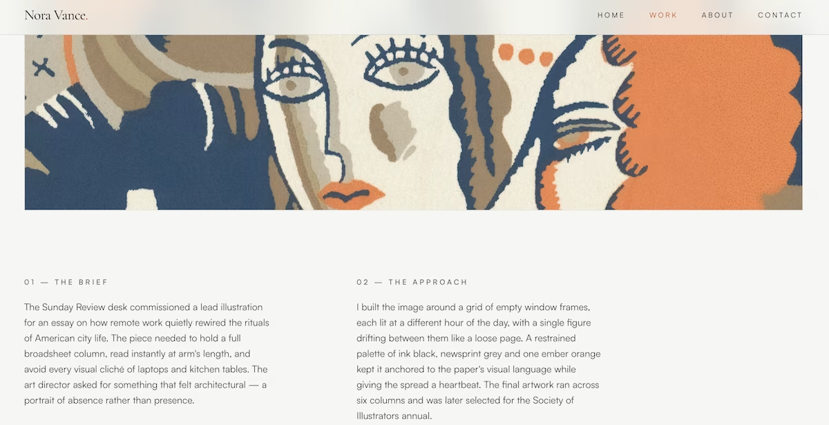
A case study page, with the brief and the approach set out side by side.
4. A Filterable Gallery
What it does: Sorts your projects by category so a visitor can see one type of work at a time.
Best for: Anyone who works with more than one discipline or client type.
The gallery held 12 projects tagged Editorial, Book Covers, or Brand, with three category buttons plus All above the grid, and All active by default. Clicking Book Covers reduced the grid to four projects. That works because a book publisher can go straight to four relevant covers instead of scrolling through brand campaigns they don't need.
Key Features:
- Three or four categories at the most
- An All button above them, selected by default
- A category label on every card
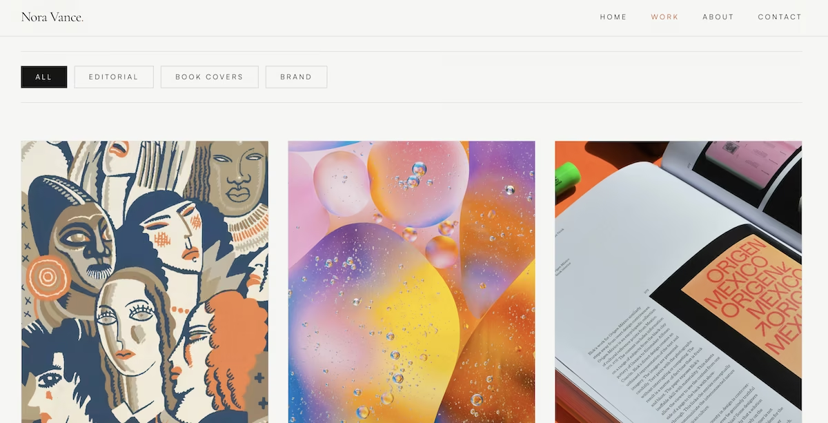
The category filters above the Work gallery, with All selected.
5. An About Page That Positions You
What it does: Gives the visitor a face, a short biography, and a clear statement of the work you take on.
Best for: Freelancers competing on judgment rather than on price.
I asked for a 200-word bio and got about 180, next to a portrait and a numbered manifesto that wasn't in my brief. The bio placed her in Portland, described the shared warehouse studio, a decade of commissions, the client types and the awards, then closed on a description of the drawings themselves.
Key Features:
- A photograph of you, not a logo
- Between 150 and 250 words
- One line naming the work you want more of
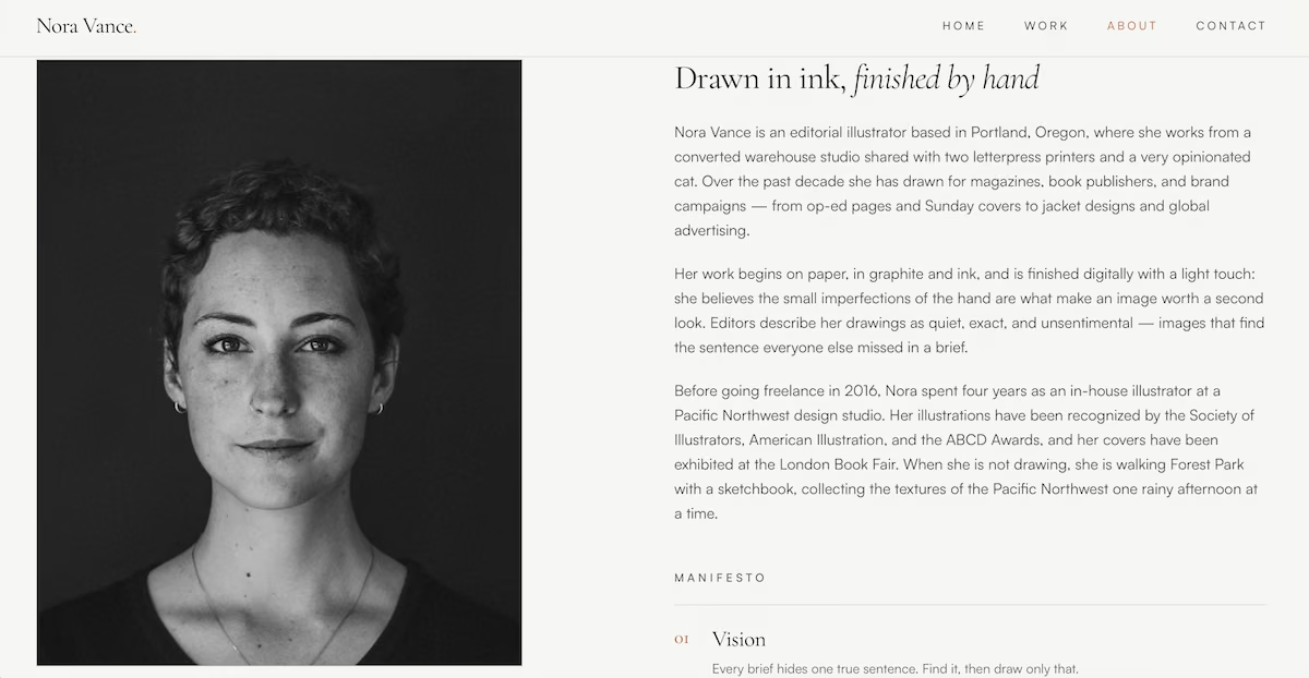
The about page, with portrait, bio, and the start of the manifesto section.
6. Published Starting Prices
What it does: Lists your services with a from figure against each one.
Best for: Freelancers losing hours to inquiries from people without a realistic budget.
The About page listed four tiers: $450 for an editorial spot illustration, $1,200 for op-ed and feature work, $2,800 for a full book cover, and $6,000 for a brand campaign. Figures like these pre-qualify visitors before they contact you. Each one reads as a flat fee, though, so putting a from in front of every price is the one edit I'd make before the site went live.
Key Features:
- Three to five services, ordered by price
- A from figure rather than a fixed fee
- Plain service names a client would recognize
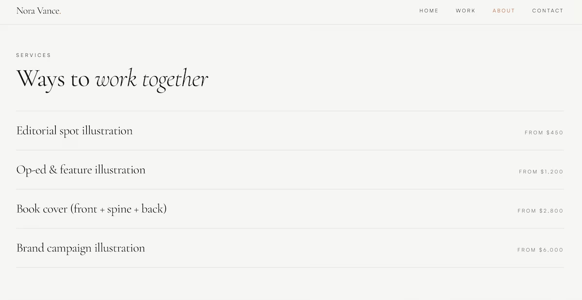
The services list, with a starting price against each type of commission.
If the feature list is starting to feel like a reason to delay, our one-day portfolio build plan covers shipping a working version first.
7. Client Names and a Testimonial
What it does: Shows who’s hired you and what they thought of your work.
Best for: Anyone whose work is strong but whose name isn't known yet.
The build placed three client names under a "Trusted By" heading, with a single quote below, attributed to an art director by name, role, and publication. Set in text, the three names sat in a single row at one size. The quote was a full sentence about how Nora reads a brief, which is the kind of detail a commissioner can act on.
Key Features:
- Three to six client names
- One quote with a full name, role, and company
- Positioned on the home page, below the work
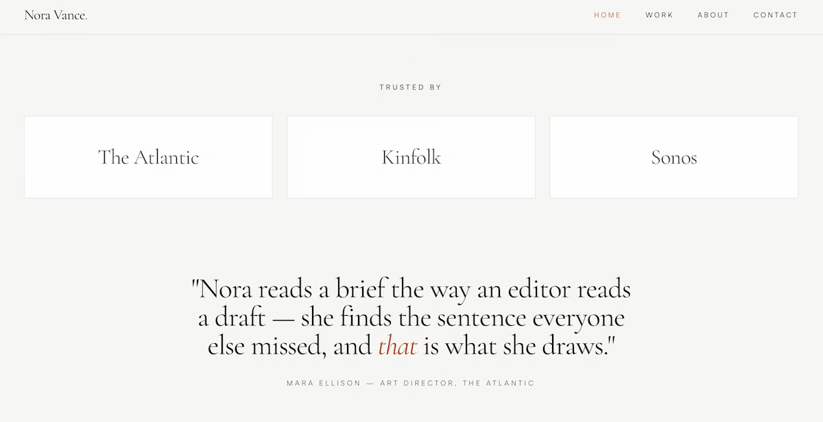
The Trusted By row and client testimonial on the home page.
8. A Contact Form That Delivers
What it does: Takes an inquiry through typed fields and emails it to you.
Best for: Every portfolio site.
The form asked for name, email, project type, budget range, and a message. This is the piece that had stalled the build at 15 minutes, so it is the one I tested hardest. I submitted an inquiry and saw a confirmation screen promising a reply within two working days.
Then the inquiry arrived in my inbox with every field listed, including the dropdown selections, and a line noting it came from the contact form.
The site's call to action repeated at the foot of every page, so the route to that form was one scroll away wherever a visitor landed.
Key Features:
- Project type and budget as dropdowns
- A confirmation message after sending
- The same call to action at the foot of every page
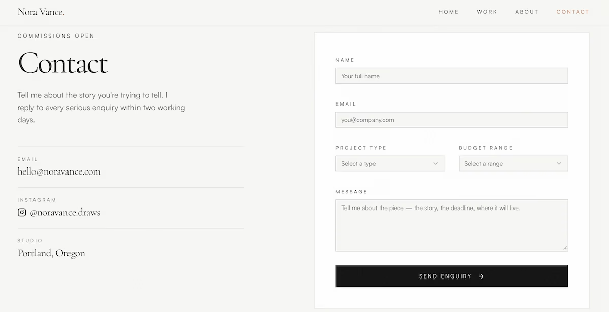
The contact page, with typed fields for project type and budget range.
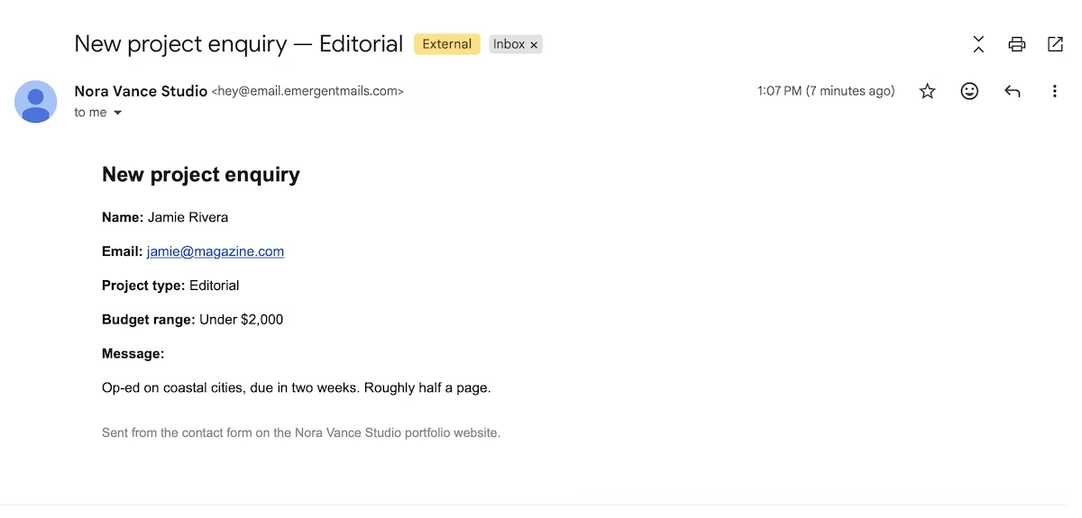
The inquiry as it arrived in the inbox, with each form field set out.
9. A Layout That Works on a Phone
What it does: Reflows the navigation, images, and text so the site reads properly on a phone screen.
Best for: Every portfolio, since more than half of global web traffic now comes from mobile devices.
I opened the preview at 430 by 932, an iPhone Plus width. The navigation collapsed into a menu button in the top right corner, and the hero held its order: the Portland line, the name, the positioning line, then the Start a Project button, all inside the first screen.
On the Work page, the gallery dropped from three across to a single column. Each project kept its title, client, year, and category label below the image, at a size I could read without zooming. Nothing overflowed and nothing needed a horizontal scroll, which is the failure I was watching for.
Key Features:
- Navigation that collapses to a menu button
- Images that scale to the screen width
- Titles and captions readable without zooming
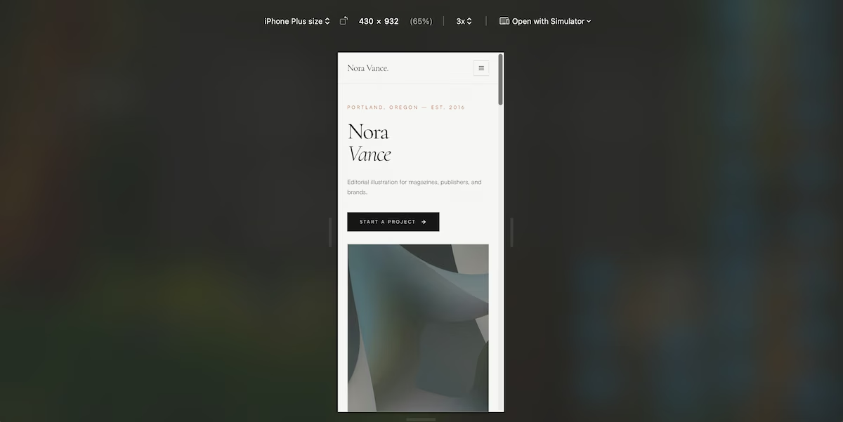
The home page at iPhone width, with the navigation collapsed into a menu button.
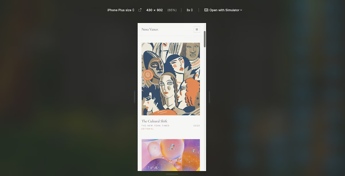
The Work gallery stacked into a single column on a phone screen.
Also read our best portfolio website builders guide for where to actually build one.
Your Portfolio Website Checklist
Run your current site against the following:
- A positioning line under your name saying what you do and who for
- Six to eight projects on the home page, each with a client name
- A dedicated page per project, with the brief and your approach
- Category filters, once you work in more than one category
- A photograph, a bio of 150 to 250 words, and one line naming the work you want more of
- Starting prices for three to five services
- Three to six client names and one full testimonial
- A contact form you’ve tested and confirmed is working
- Menu, images, and text all holding up at phone width on the home page and the gallery
Address any gaps to attract more inquiries. Our guide to building a website covers the stage before this one if you're starting from scratch.
Emergent Makes Portfolio Website Features Easier to Build
Emergent included each of the above features from a single brief, described in plain English. The agents handled the pages, the gallery logic, and the email delivery, pausing only when they needed my input.
Here's how Emergent helps:
- One brief, entire site: Describe the whole site at once instead of assembling it page by page.
- Filters that work: Category sorting comes out of the same brief as the pages.
- Real email delivery: connect a provider like Resend or SendGrid with an API key, and the contact form sends inquiries straight to your inbox.
- Room to grow: Add a shop, a journal, or turn your website into an app later from the same project.
You can build your own portfolio site on the free plan and see the first version before you pay for anything. Publishing it live needs a paid plan, since the free tier doesn’t include deployments at all, and deploying an app costs 50 credits against the 10 you get each month. Our AI website builder page covers the wider set of sites you can generate from the same kind of brief.
Try Emergent and build the version of your portfolio you’ve been meaning to get around to.
Most AI app builders stop at prototypes. Emergent creates production-ready apps you can actually launch.
- Production-ready apps
- Web & mobile apps
- Deploy in minutes