TL;DR
- I built 10 of these websites myself: They cover roofing, consulting, bookkeeping, restaurants, e-commerce, photography, operations, and a church site.
- You don’t need a screenshot for every example: I’ve included screenshots where they show a useful design or site choice.
- The first prompt shapes the result: The strongest briefs named the business, audience, main goal, key sections, and a simple visual direction.
- AI-built sites still need a review before launch: Read the copy, test forms and buttons, check mobile, and remove any business claim you didn’t provide.
Websites built with AI can look far more varied than I expected. After building 10 examples, I had a dark bookkeeping site, an editorial consultant portfolio, a warm candle store, two very different roofing sites, and several other designs that didn’t feel cut from the same template.
For this guide, I used my own Emergent builds as the hands-on core. I then added 17 researched examples from official AI website showcases and an Emergent customer story. You’ll see what worked, what you can borrow, and short prompts you can adapt for your own site.
How I Picked These AI Website Examples
I split the list into two groups. The first 10 are websites I built on Emergent. I focused on the homepage first, then checked forms, mobile views, lead flows, or page details when the build called for them.
For the builds where I tracked first-preview time, I got usable pages in about 7 to 30 minutes. A few needed more work after that. I wanted to see how far a clear prompt could take a real business website before I started polishing it.
I used Emergent’s AI website builder for those builds. You describe the site in plain language, review what comes back, and make changes through conversation. The site can then be published when you’re happy with it.
For the other 17, I kept examples you can open and explore yourself. I used Wix’s official AI website showcase and verified live sites from Emergent customer stories. Each example links directly to the website, so you can look at the layout, copy, and calls to action for yourself.
I also included SSF Detail from an Emergent customer story.
My filter was simple: Could you borrow a useful layout, prompt idea, page structure, or conversion choice from the example?
Also read our guide on how to build a website with AI for the full process behind the first-preview builds above.
10 Websites Built With AI That I Tested
1. Ridgeway Roofing
Emergent gave Ridgeway Roofing a dark, architectural look with a large home image and a bright estimate button. It felt like a high-end contractor site instead of the stock hard-hat look I expected.
The build took about 10 minutes and 5 credits. Before it started, Emergent asked how the quote form should work, whether it could use fictional contact details, and whether I had a color preference.
I chose database storage for the form and let the agent pick the style.
Prompt I used: “Build a modern one-page website for a fictional residential roofing company in Austin, Texas called Ridgeway Roofing.”
The result made the main action easy to spot. “Get a Free Estimate” appears in the navigation and hero, while the opening copy names Austin and roofing right away.

2. Maya Brooks
The Maya Brooks build is one of my favorites because the page has a clear personality. Emergent used a black-and-white portrait, large serif type, and plenty of open space.
It took about 7 minutes and 4 credits. The agent didn’t ask follow-up questions before building. It decided that the “Book a Strategy Call” button should lead to the contact section because I hadn’t asked for a calendar.
Prompt I used: “Build a modern one-page website for a fictional independent marketing consultant named Maya Brooks in Brooklyn, New York.”
The hero says who Maya helps and what she works on. That gives the page a clear job. If you’re building a consultant site, this is a useful pattern to copy.

3. North House Candle Co.
Emergent asked more design questions for North House Candle Co. It wanted a visual tone, a photography style, and a brand-story angle.
I let it choose the premium direction, picked a mix of lifestyle and studio photos, and gave it room to use sustainability or small-batch messaging.
The page took about 7 minutes and 4 credits. The hero uses a full-width candle photo, warm colors, and a clear “Shop the Collection” action.
Prompt I used: “Build a polished one-page e-commerce homepage for a fictional small-batch candle brand called North House Candle Co.”
What I like here is the restraint. The page feels like one brand, from the image treatment to the type choices and product mood.
Also read our comparison of AI ecommerce website builders if the store needs a cart and checkout.

4. ClearLedger Bookkeeping
ClearLedger started as a four-page bookkeeping website for freelancers, consultants, and small businesses. Emergent produced the first usable version in about 10 minutes.
After around 25 minutes of building and refinement, the project had used 20 credits. I checked the contact form, mobile view, calls to action, and basic page details.
The dark navy and gold design makes the firm feel established. The copy also keeps the offer plain, which helps with a service people may already find confusing.
Prompt I used: “Build a clean, modern 4-page website for a small bookkeeping firm called ClearLedger Bookkeeping.”

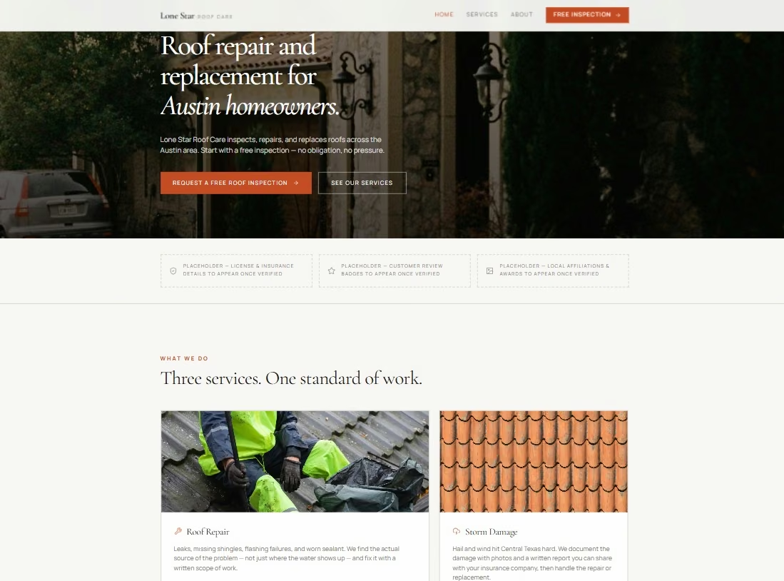
5. Lone Star Roof Care
Lone Star Roof Care went further than a simple homepage. Emergent created a local roofing site with a multi-step inspection flow that I later tested with fake lead details.
The first preview took about 15 minutes. The wider build used 20 credits, and I spent roughly 25 more active minutes refining the lead flow.
I checked how emergency leads were routed, how form details were saved, how campaign information carried through, and how the flow behaved on mobile.
This is the example I’d study if your website needs to qualify a lead before someone calls them.
6. Northstar Ops
Northstar Ops is a quieter example. Emergent built a simple consulting site around one promise, helping small service businesses make client work easier to run.
The first usable four-page version took about 15 minutes. I reached publication after roughly 30 active minutes and 13 credits.
During review, I found placeholder founder details, wording that suggested a calendar booking flow, and a response-time claim I hadn’t supplied.
Those were easy to spot once I read the page like a customer. They’re also a good reason to review generated business copy before publishing.
Prompt I used: “Build a simple, professional 4-page website for Northstar Ops, a solo operations consultant in Austin, Texas.”
7. Juniper & Smoke
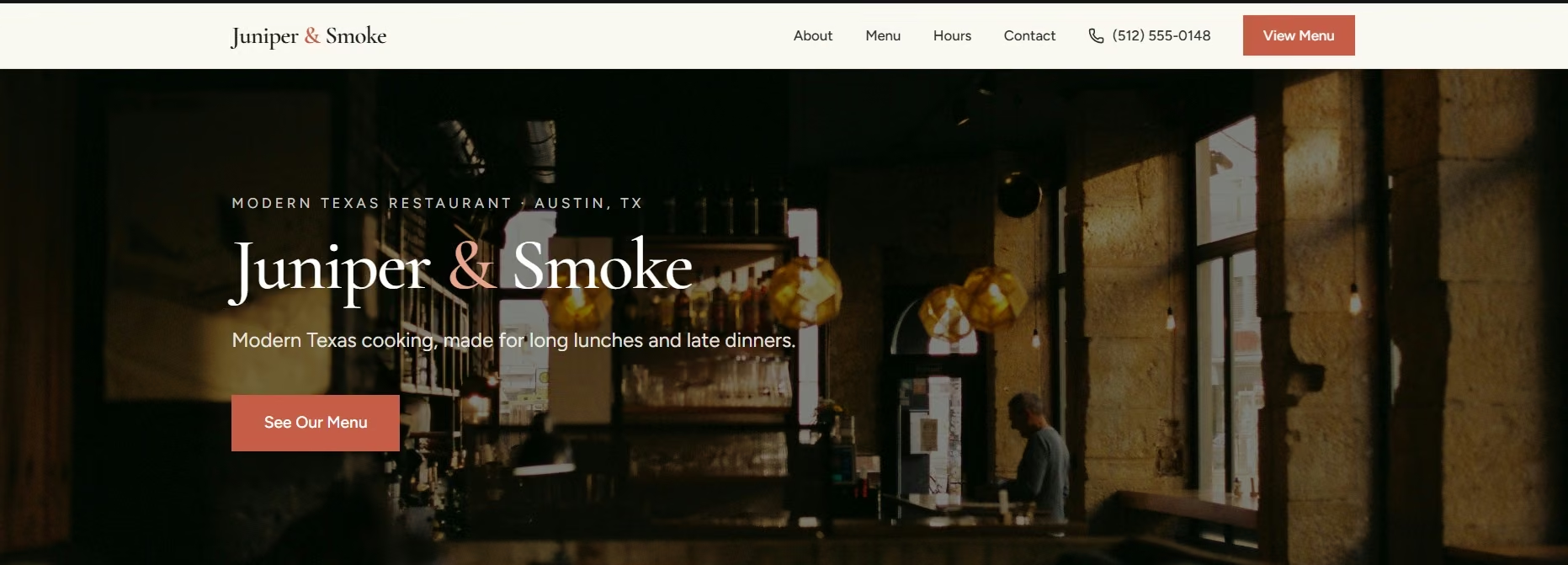
For Juniper & Smoke, I wanted a restaurant homepage that answered the basic visit questions fast. Emergent put the food style, Austin location, menu action, and contact details close to the top.
The first version took about 7 minutes and roughly 3 credits. The hero used a moody restaurant photo and a simple “See Our Menu” button.
The page works because you don’t have to hunt for the main next step. That’s a useful lesson for restaurant websites.
If you run a restaurant, you can start from a restaurant website builder and put the menu and visit details up top the same way
8. Lumen & Pine Photography
Lumen & Pine gave the images room to lead. Emergent built a five-page photography site with a filtered portfolio and an inquiry form.
The full test took about 27 minutes and 14 credits. I checked an 18-image portfolio across Weddings, Portraits, and Branding. I also tested the inquiry form through required fields and a successful confirmation.
Prompt I used: “Build a polished photography website for a fictional business called Lumen & Pine Photography, an Austin-based photographer specializing in weddings, portraits, and personal-brand photography.”
The homepage itself stays quiet. That works well here because the photography needs most of the attention.
For a build like this, a photography website builder can set up the filtered portfolio and inquiry form from one description.

9. Grace Community Church
Grace Community Church had several visitor needs to fit on one site. Emergent put service times, the Austin address, “Plan Your Visit,” and “Watch a Sermon” in the opening screen.
The build also had separate pages for beliefs, staff, ministries, events, sermons, giving, and contact. I asked Emergent to treat sermons and events as reusable records, keep prayer requests private, and send donations to the church’s existing hosted giving provider.
That made this a useful test of how AI handles a website where public information, visitor planning, and private forms have to stay organized.
Prompt I used:
“Build a mobile-first church website called Grace Community Church for a congregation in Austin, Texas.
The primary audience is a first-time visitor. The primary call to action is Plan Your Visit.
- Home
- Plan Your Visit
- About and Beliefs
- Staff and Leaders
- Ministries
- Events
- Sermons
- Give
- Contact
The homepage must show the church name, city, service times, street address, and Plan Your Visit button before secondary content. The Plan Your Visit page must explain parking, accessibility, service length, children’s check-in, dress expectations, and what happens when someone arrives.
Create structured collections for sermons, events, ministries, staff, campuses, and announcements. Staff editors must be able to add or update one record without editing page layouts.
Sermon records need title, date, speaker, series, scripture or topic, summary, video or audio URL, transcript or notes, thumbnail, and publish status.
Event records need title, start and end time, recurrence, location, audience, description, registration URL, contact person, image, and publish or expiry status.
Add a contact form, a Plan Your Visit form, and a private prayer-request form. Collect the minimum information needed, show clear consent text, send each form to the correct church inbox, and never display prayer requests publicly.
The Give page must link to the church’s existing hosted giving provider. Do not collect or store payment-card details in the website.
Use warm, modern styling with high contrast, large readable type, visible keyboard focus, descriptive form labels, alt-text fields, and captions or transcripts for sermon video.
- The page list and navigation
- The content collections and fields
- Editor roles and permissions
- External integrations needed
- SEO fields for each page and collection
- A mobile testing plan
- A phased build order
Do not generate the full website until I approve the plan.
Check that the plan separates public content from private prayer requests, keeps donations on a hosted provider, and treats sermons and events as reusable records. Correct the plan before you approve the build.”

10. Brims & Stone
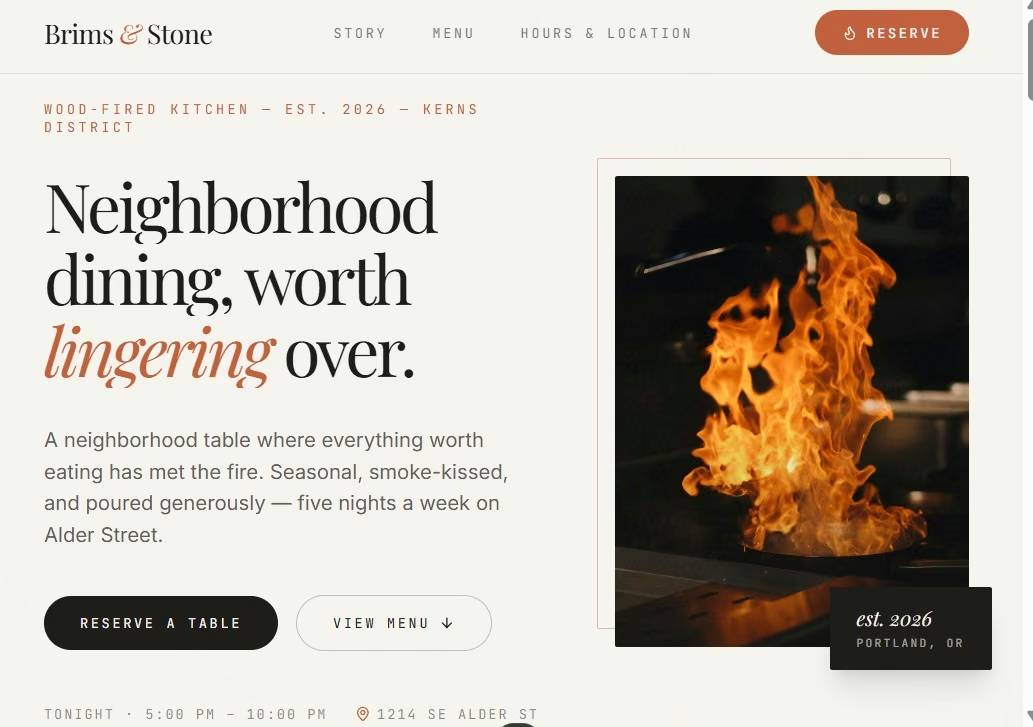
Brims & Stone went beyond the restaurant homepage shown here. Emergent also built the reservation workflow behind it.
A guest could request a table, while a party of nine received a different path. Staff could sign in, find reservation requests, and change each one to New, Confirmed, or Declined.
The full test took about 30 minutes and 30 credits. Publishing also worked during my final check.
Visually, the homepage used oversized type, warm tones, and a wood-fired kitchen image. “Reserve a Table,” “View Menu,” the opening hours, and the address stayed easy to find, so the stronger styling didn’t hide the actions a restaurant guest would need.
Prompt I used:
“Build a mobile-friendly website and reservation app for a fictional neighborhood restaurant called Brims & Stone. Give it a warm, modern design with a homepage, menu, hours and location, and a reservation request form. The reservation form should collect the guest's name, email, phone number, date, time, party size, and optional notes. Save submitted reservations to a simple admin dashboard where staff can view each request and mark it as New, Confirmed, or Declined.”
19 More Websites Built With AI to Explore
The next 19 are live examples you can open for yourself. I’m keeping each entry short, so you can quickly spot a layout, content choice, or site idea worth borrowing.
Local, Service, and Community Websites
Examples 11 through 14 come from Wix’s official AI website showcase.
11. My Party Chef: Food photography, testimonials, and repeated contact buttons make it easy to understand the catering offer and get in touch.
12. Barton Artistry: A photo-led portfolio, About page, and booking path give potential makeup clients several ways to judge the work before reaching out.
13. Sblended Nutrition: Bright product photos and a simple grid make the local smoothie business easy to browse.
14. SSF Detail: The South Florida car-detailing company built its Emergent website in 4 days. The company later reported a 35% rise in lead-form submissions compared with its old WordPress site.
Examples 15 through 22 come from Figma Make’s service and public-sector examples.
15. The Agyekum Group: The professional toxicology firm replaced its previous website with one built on Emergent. Its case study reports about a 5x increase in new business inquiries after the switch.
16. Paisley.org.uk: The long-running Scottish community site combines local news, events, jobs, property listings, and a business directory in one public site rebuilt with Emergent.
17. Teaching Across Borders: Blog posts sit at the center of the site, with a simple contact path for teachers who want to connect.
Portfolio and Creative Brand Websites
Wix and Figma both feature AI-built portfolio examples, which gives you a wide range of styles to borrow from.
18. Roee Ben Yehuda: A visual project grid lets very different pieces of design work live together without making the homepage feel crowded.
19. Sonja van Duelmen: A full-screen menu and masonry-style gallery make the portfolio itself part of the studio’s visual identity.
20. Arrow Radisch: The portfolio gives fashion and still-life photography most of the screen, while keeping navigation quiet.
21. Jessie Bearden: Video, bold type, project categories, and client logos suit a creative portfolio with a lot of visual energy.
22. Aulosa: Bright accents, a process section, and a Spotify widget give the music-distribution site a clear identity.
E-Commerce and Product Websites
23. Evolve Clothing: Editorial photography and a clean product grid give the store more character than a plain catalog layout.
Software and Functional Websites
24. Integrated Clinical Intelligence: This public-facing clinical platform organizes health information and patient intake around a more involved workflow than a standard brochure site. It was built with Emergent alongside IWUMM.
25. VoxSmyth: The audiobook platform lets users choose and swap narrators, showing how an AI-built website can grow into a working product with user-facing tools.
26. TeacherHubPro: The education platform brings lesson planning, grading, attendance, and teacher tools into one site built by a solo founder with Emergent.
27. SalesQualifyd: The GTM platform combines strategy and market-research tools, and its official Emergent case study says the website itself was also built on Emergent.
What I Learned From Building These Websites
A good first prompt gives the builder a clear job. “Build a roofing website” leaves a lot open. “Build a roofing site that helps Austin homeowners request a free estimate” gives the page a clear audience and action.
You also don’t need to choose every design detail. On the three newest builds, I gave Emergent a mood, audience, and goal. I let the agent choose several visual details. Ridgeway, Maya Brooks, and North House still came back with very different styles.
The first version is something you should read and test. My own checks found placeholder details, copy I hadn’t supplied, and calls to action that needed a closer look. A quick review can catch those before a customer sees them.
If you aren’t sure how to turn an idea into a useful first prompt, Emmy can help inside Emergent. Emmy asks follow-up questions and can turn a short description into a build-ready prompt. It’s available in the web product and currently costs no credits to use.
If you’re still choosing a platform, my comparison of the best AI website builders looks at how the main options differ when you’re building a real site.
Also read our comparison of AI website builders for beginners if you’re writing your first prompt and want a gentler starting point.
How to Borrow These Ideas Without Copying Them
Start with the page’s job. Then borrow one or two choices from an example you like.
For a local business: Borrow the clear service area, one main call to action, and a short proof section.
For a portfolio: Let the work take most of the space. Keep the navigation and contact path simple.
For a store: Make products easy to scan. Use consistent photos, clear prices, and a visible route to shop.
For a SaaS site: Explain the problem in plain words, show how the product helps, and give the visitor one main next step.
You can combine ideas too. The Maya Brooks typography could suit an architect. The North House photo style could work for a restaurant. The Ridgeway CTA pattern could fit a plumber, electrician, or cleaning company.
Final Takeaway
Websites built with AI now cover far more than simple landing pages. In this list, you’ve seen service businesses, portfolios, stores, restaurants, public sites, and SaaS pages built from prompts.
The useful skill is writing a clear brief and reviewing what comes back. Tell the builder who the site is for, what you want visitors to do, which sections you need, and how the brand should feel. Then click through the result before you publish.
Most AI app builders stop at prototypes. Emergent creates production-ready apps you can actually launch.
- Production-ready apps
- Web & mobile apps
- Deploy in minutes
Most AI app builders stop at prototypes. Emergent creates production-ready apps you can actually launch.
- Production-ready apps
- Web & mobile apps
- Deploy in minutes