

AI website builder templates all converge on the same design choices. A photographer browsing through them quickly notices the pattern: three-column galleries, identical hero sections, and layouts that make every portfolio feel like a variation of the same website.
So I pulled 10 photography website examples that each make one clear design decision and commit to it. These are working portfolios, picked for a specific choice worth studying rather than for looking nice in a screenshot.
Then I ran two test builds through Emergent's photography website builder to see what a fully custom, prompt-built site produces with no template underneath it.
Here's what follows: 10 photography website examples, what each gets right, and two test builds that show what changes when AI writes a site from a description rather than filling in a theme.
What Makes a Photography Website Example Worth Studying
Plenty of photography sites look good in a screenshot and fall apart on inspection. Every example below had to clear three checks:
- Belongs to a working photographer running a real, active portfolio.
- Makes one clear design decision and commits to it: radical minimalism, named personal projects, poetic captions, instead of trying to do everything at once.
- Uses a pattern that transfers to your own site.
10 Photography Websites Worth Studying
These 10 sites are live, working photographer portfolios. Each one commits to a different design principle, and each has at least one specific idea worth stealing.
1. Emre Senturk
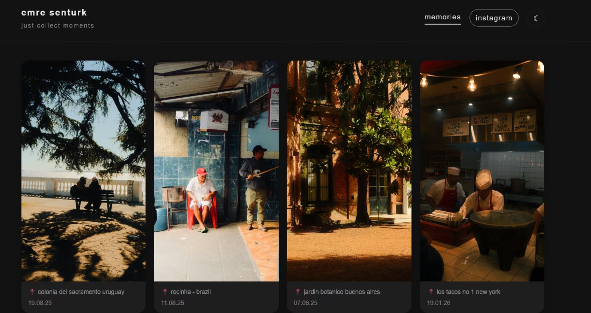
What stands out: A two-word tagline instead of a bio, one continuous gallery with no menu, and a light/dark toggle as the only visible control besides scrolling.
Emre Senturk's portfolio website is the definition of "minimalist." The entire site is a tagline ("just collect moments"), an Instagram link, and a gallery of vertical photos.
There is no About page, no services list, and no visible contact form. A sun-and-moon icon swaps between light and dark themes.
AI-built: This site was built with an AI website builder. It's included here because the result reads as a fully custom, deliberate design choice, exactly the outcome AI-built sites are often assumed to lack.
What to borrow: If your photography can carry the homepage on its own, you can restrict the copy to a few lines (or one line and some location captions, in this case). It keeps the photos the primary focus of the page.
2. Torin Nielsen Photography
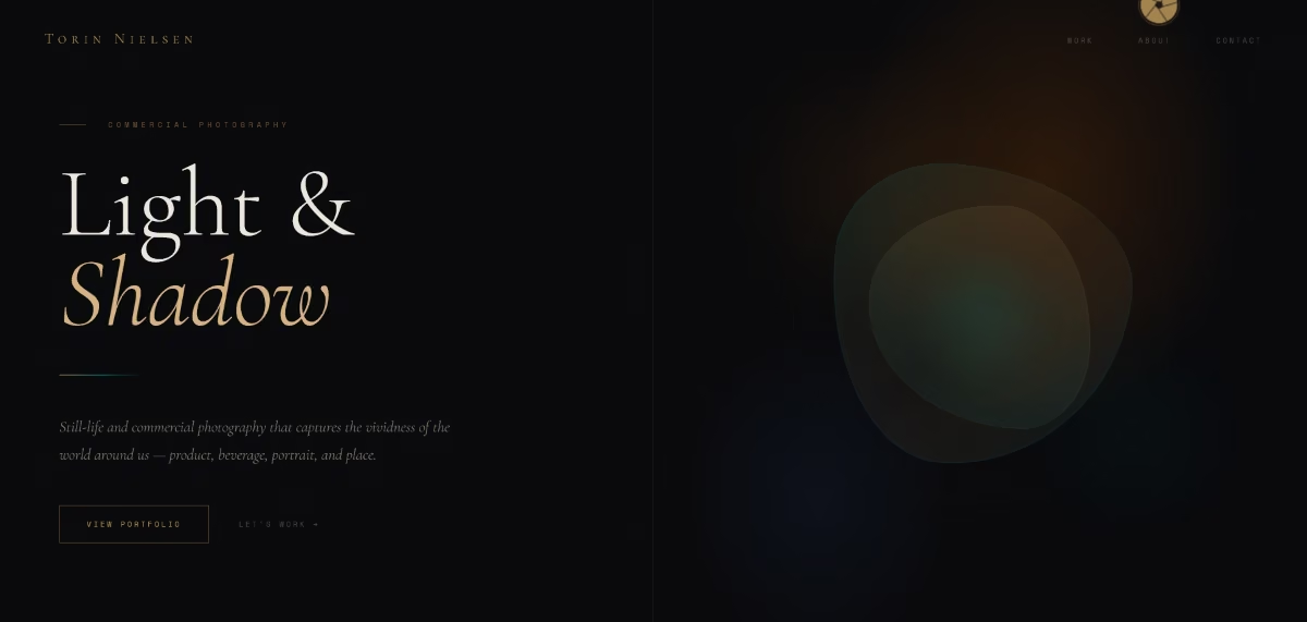
What stands out: A named personal project with an exact start date, category tags shown before a single image loads, and two calls to action placed side by side.
Torin Nielsen's photography portfolio is a lot more descriptive. You learn that he is a commercial photographer and he shoots product, food and beverage, and travel photography.
The headline "Light & Shadow" sets the tone before a photo loads, but the standout section is The Hedonism Series, a personal project described as an exploration of excess and the sublime, running since 2015.
AI-built: This site was also built with an AI website builder. The commercial focus, the named personal project, and the two-CTA layout all came from that process, evidence that an AI-built site can carry real editorial structure.
What to borrow: Naming and dating a personal project crystallizes it as a body of work rather than a folder of extra photos.
3. Dougal Gorman
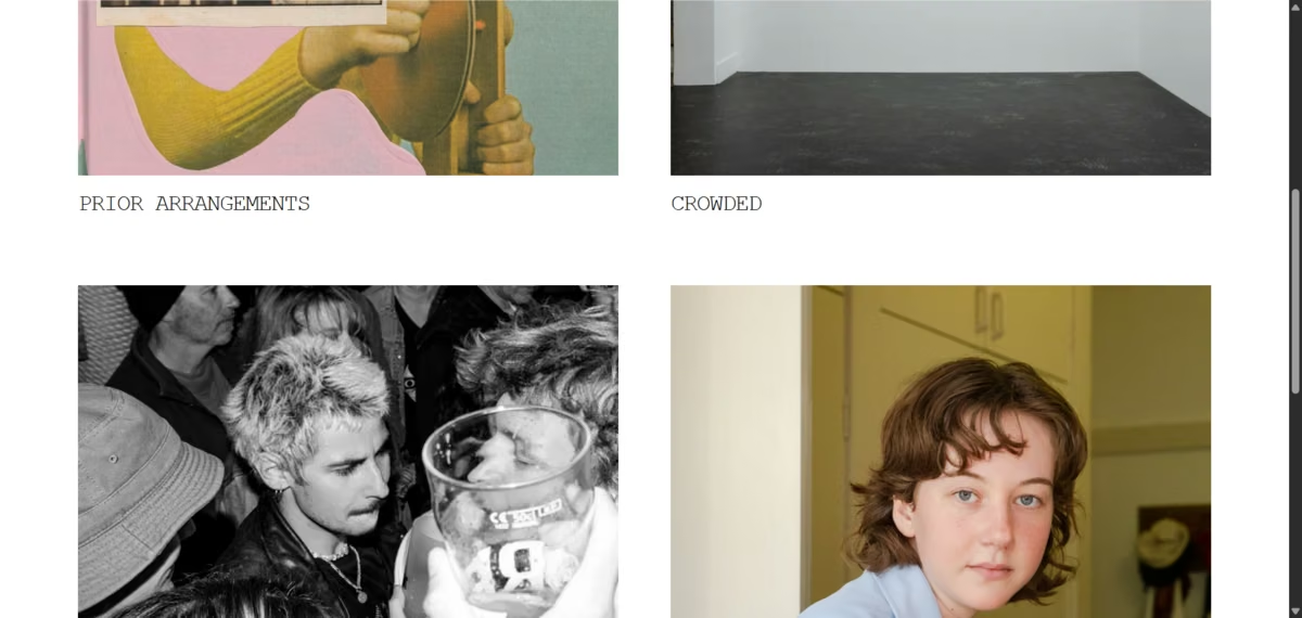
What stands out: Navigation organized entirely around event type.
Dougal Gorman is a Sydney-based music photographer documenting the subcultures around the live music world.
His site skips the usual Portfolio/About/Contact structure entirely. The main navigation reads Live, Tours, Press, and Video, categories built around how a booking editor or venue would search for his work.
What to borrow: If clients hire you for a specific occasion type, structure navigation around the occasion itself.
4. Marc Roberts
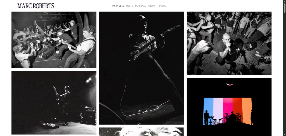
What stands out: A "Buy Image" purchase flow embedded directly on individual photos.
Marc Roberts shoots live music, portraits, and action photography. His gallery separates Music and Personal work into distinct sections, but the standout detail is commercial: a metal print purchase option sits directly on the image itself inside the gallery.
What to borrow: If you sell prints, put the buy button inside the gallery, where someone is already looking at the photo they might want.
5. Anthony Tuccitto
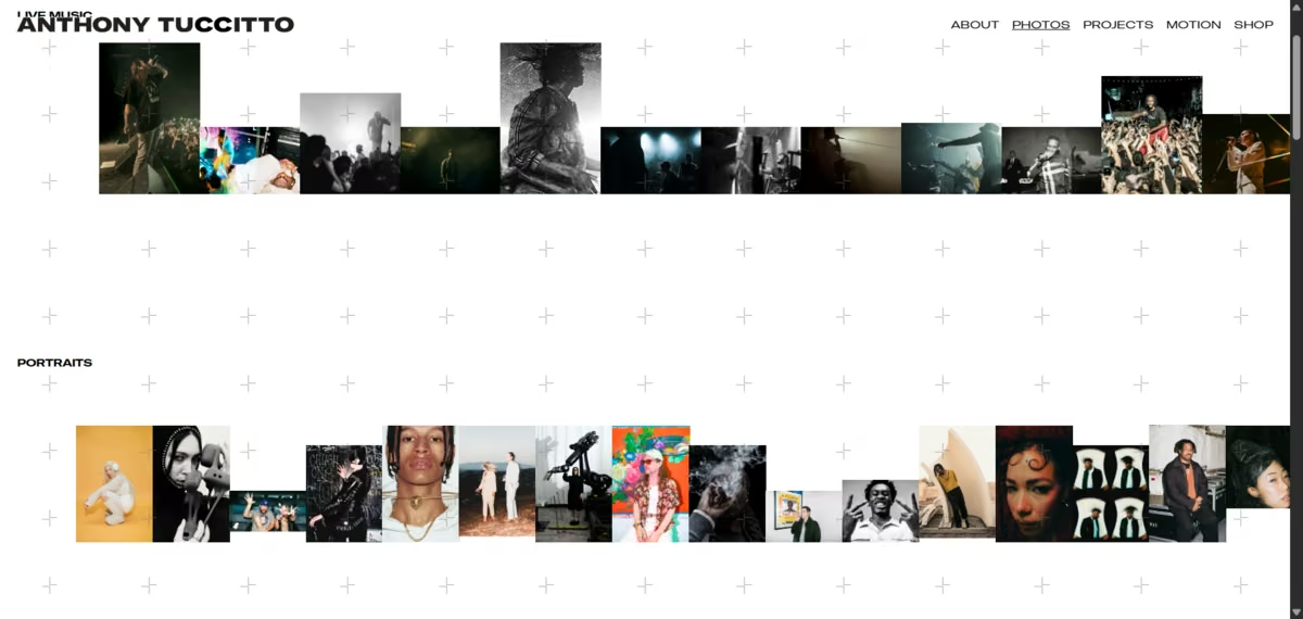
What stands out: Navigation split by media format instead of subject matter.
Anthony Tuccitto is a Toronto-based photographer, director, and visual artist working across fashion, documentary, and brand storytelling.
His site's navigation reads About, Photos, Projects, Motion, and Shop, deliberately separating single standout images ("Photos") from full editorial story sets ("Projects") and video work ("Motion").
What to borrow: If you shoot both one-off images and complete editorial stories, don't force them into the same gallery. Splitting by format instead of subject helps a client find the specific kind of work they're hiring for.
Also read our best website builders for photographers guide for how each platform handles galleries, image quality, and load speed.
6. Norayr Avagyan (Avagyan Wedding Photography)
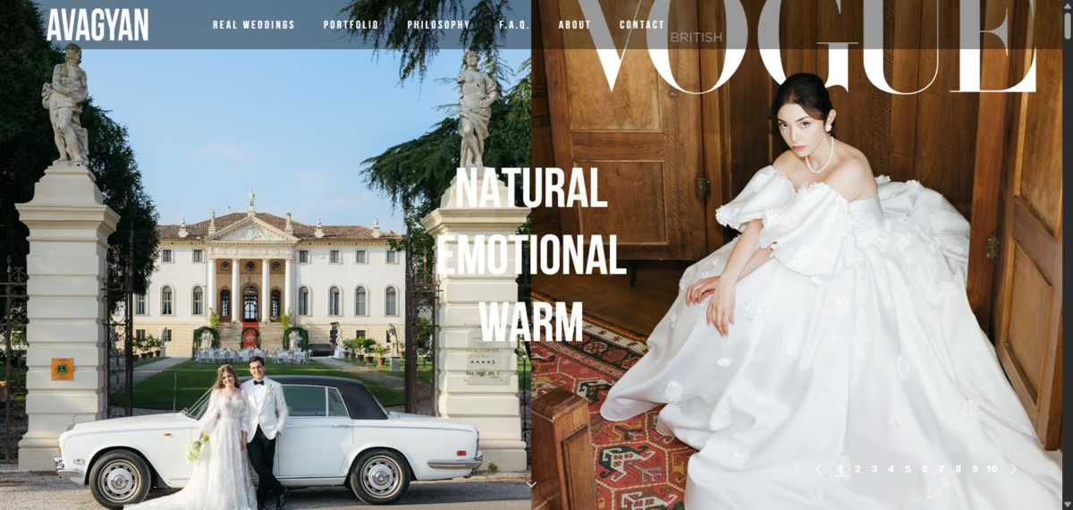
What stands out: An infinite-scroll gallery with no visible menu chrome interrupting the photos.
Norayr Avagyan shoots candid and fine art wedding photography across Italy, including Lake Como, the Amalfi Coast, and Tuscany.
His site is built as one continuous scroll: image after image with no pagination and minimal navigation breaking up the flow, letting the emotional momentum of a wedding gallery carry the visitor rather than making them click "next page."
What to borrow: Infinite scroll works especially well for wedding galleries because the momentum of a wedding day translates into "I don't want to stop looking," which a paginated gallery interrupts at exactly the wrong moment.
7. Simon Ganshorn
What stands out: A full-screen looping video as the homepage instead of a photo, and a portfolio gated behind direct contact.
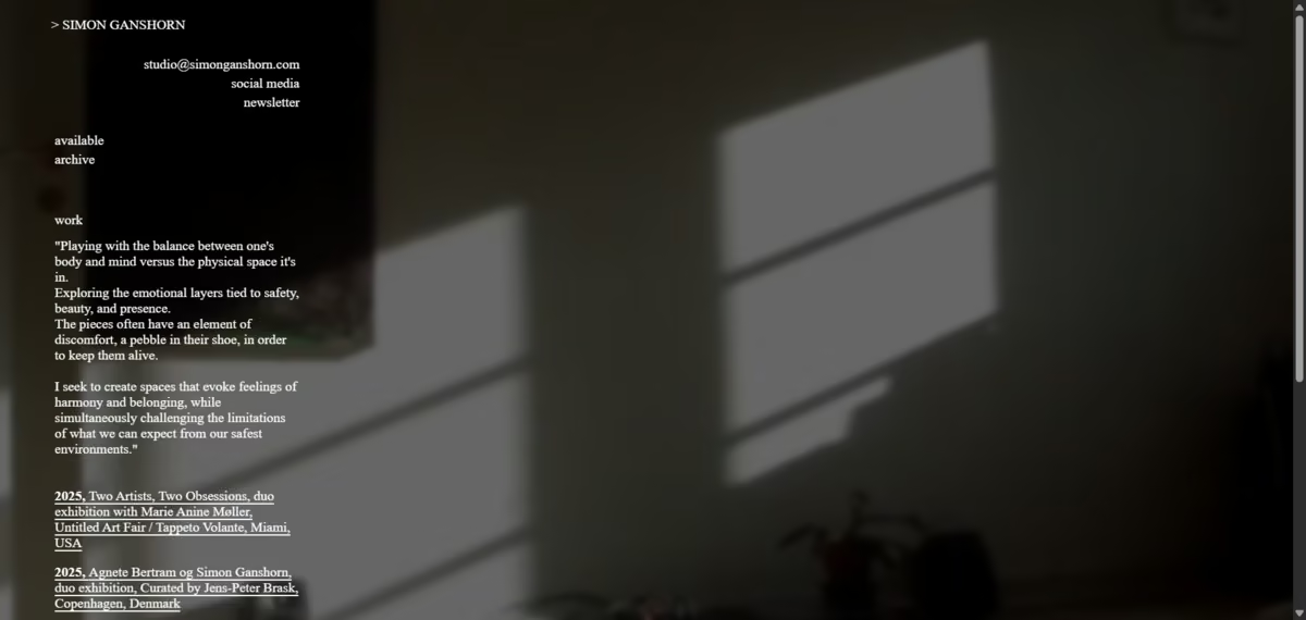
Simon Ganshorn is a Copenhagen-based fine art photographer represented in real galleries, including Galleri Lene Bilgrav, Tableau, and Untitled Art Fair Miami.
His homepage shows an artist statement and a dated exhibition history instead of a public gallery, ending in "for inquiries, please contact to see the complete portfolio."
What to borrow: If your credibility comes from where you've exhibited rather than how many images you have online, a dated show history can be more convincing than a gallery. It's the opposite instinct of most sites on this list, and that's exactly why it's worth studying.
8. Tamaki Yoshida
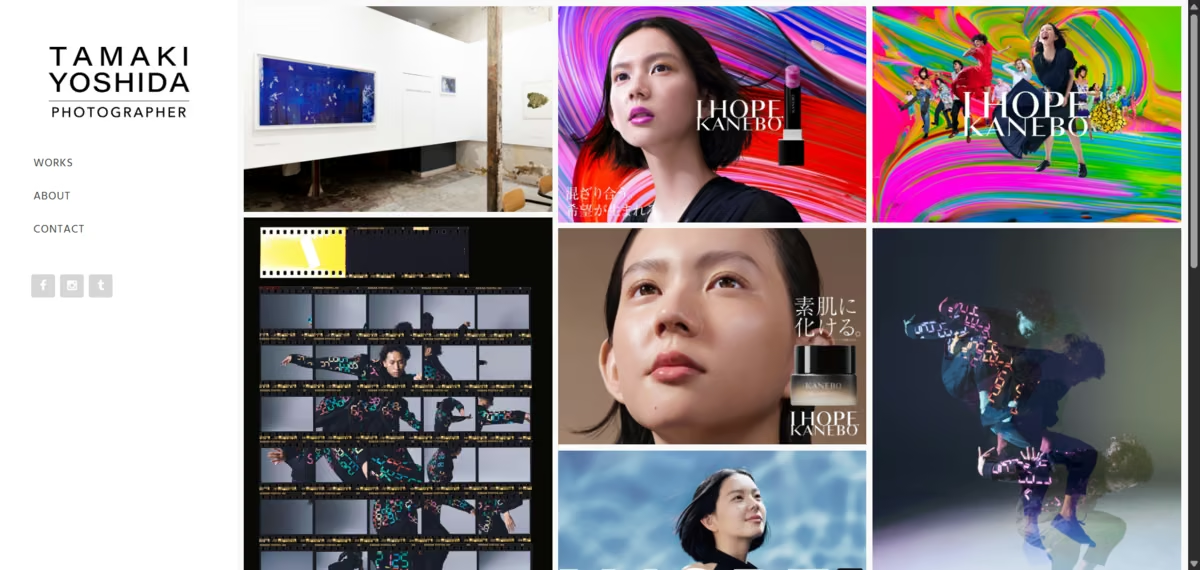
What stands out: A gallery organized entirely by named brand campaign instead of genre.
Tamaki Yoshida is a Tokyo-based commercial and fine art photographer whose work has shown at KYOTOGRAPHIE and earned the Canon New Cosmos of Photography Excellence Award.
Her site's gallery lists projects like "I Hope Kanebo," "A-POC ABLE Issey Miyake Type-II," and "Fisheye Gallery 2023" as individually titled pages rather than filing everything under a generic "Commercial" category. The site itself is worth a second look for a different reason: it runs on http with no https version at all, itself a detail worth studying alongside the gallery structure.
What to borrow: If most of your work comes from named campaigns or collaborations, giving each one its own titled page reads as more prestigious than sorting everything into generic service categories.
9. Isaak De Coninck (Project Aperture)
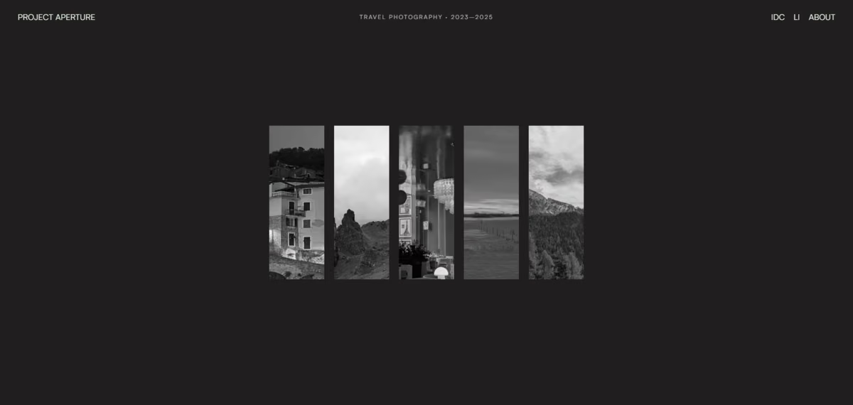
What stands out: A scattered, drag-and-scroll gallery instead of a grid.
Project Aperture is a travel photography portfolio spanning five trips between 2023 and 2025 across Italy, Scotland, Spain, Finnish Lapland, and the Alps.
Instead of rows of thumbnails, destinations are laid out as a scattered, scroll-driven arrangement you drag or arrow-key through, favoring quiet light and landscape over staged portraiture.
What to borrow: If your work is organized by place or journey rather than by client, a spatial layout can reinforce "these are separate trips" in a way a uniform grid never will.
10. Félix Péault
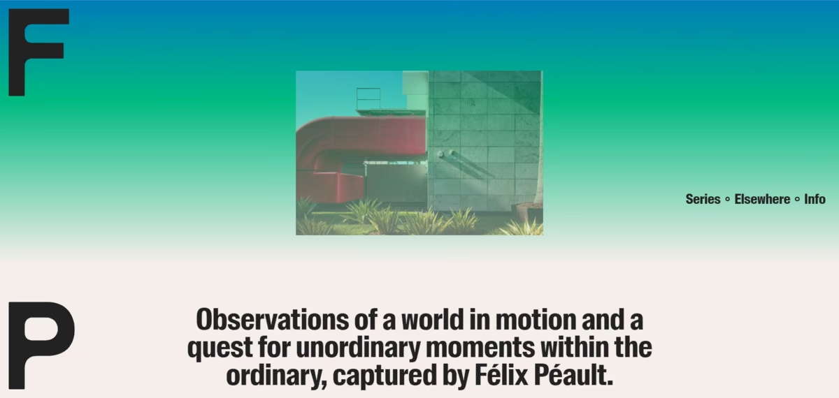
What stands out: A one-line mission statement and nothing else competing for attention.
Worth a caveat before the pattern: Félix Péault is primarily a career art director and co-founder of the design studio l'Étude, and photography is his secondary practice.
Félix Péault’s photography site, "observations of a world in motion, a quest for unordinary moments within the ordinary," is still a well-executed example of the radical-minimalism pattern, built with the same design discipline he brings to his primary work.
What to borrow: A single, specific mission line does more work than a paragraph of biography. It tells a visitor exactly what they're about to look at before they see a single image.
If you want to build something more complex than a one-page gallery, you should check out our guide on how to make a photography website, which covers picking a niche, structuring galleries, and setting up contact and booking pages.
Admiring a site is easier than building one. Our AI vs traditional website builders for photography comparison covers which route gets you closest.
What a Photography Website Looks Like When Emergent Builds It
The 10 sites above are hand-built, each around one clear idea. Below are two test builds I ran inside Emergent's photography website builder using prompts a photographer might type, to see what comes out with no template underneath.
These are illustrative test builds run for this article rather than published client sites.
Test Build 1: Editorial Fashion Site With Client Proofing
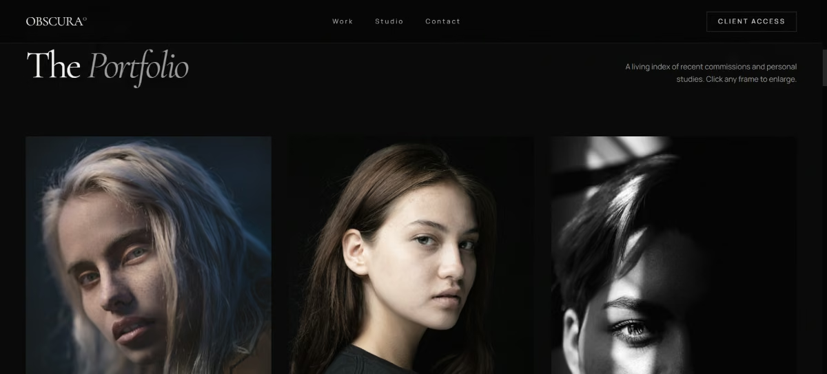
Prompt: "Build a dark-theme editorial photography site with a masonry gallery and a password-protected client gallery for proofing."
What came back: A dark masonry grid for the public portfolio, plus a separate gated gallery reachable only with a client-supplied password, using built-in client proofing.
Why this stands out: Client proofing usually means bolting a plugin onto the main site. Building both galleries from one prompt kept them on a single consistent design.
Test Build 2: Real Estate Photographer With Booking
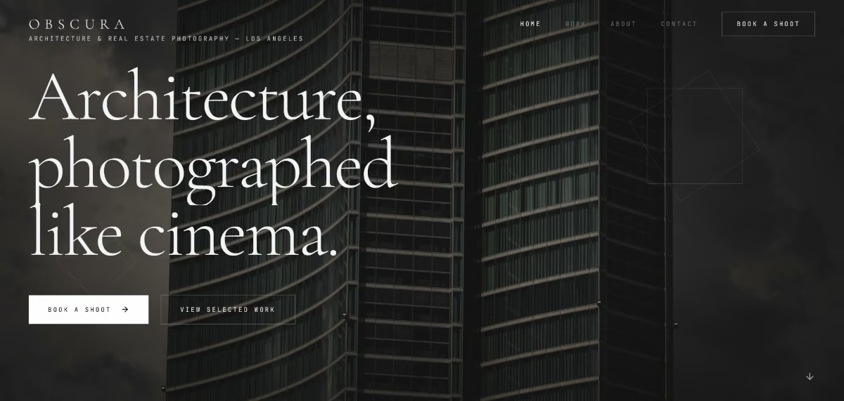
Prompt: "Build a real estate and architecture photography site with a project gallery, a booking form for shoot inquiries, and pages optimized for local search."
What came back: A project-organized gallery, a booking form capturing property address and shoot date upfront, and page structure built around city and service terms.
Why this stands out: Real estate and architecture photographers usually build this location-and-service structure page by page. Emergent generated a comparable structure directly from the one prompt.
Photography Website Design Ideas Worth Stealing
The websites above highlight a set of design principles worth borrowing when creating your own photography website:
- Cut the copy if the photos can carry it. A single tagline can do the job of an entire About page.
- Name and date your ongoing personal projects. It reads as a real body of work with its own history.
- Build navigation around how clients search. Occasion, media format, or campaign name often map to a client's need better than your own genre labels do.
- Let the layout match how the work is organized. Journeys and destinations can be scattered; galleries tied to one occasion can be one continuous scroll.
- Separate public and gated galleries. Client proofing and portfolio browsing are different jobs, and they read better as two distinct experiences.
Building an AI-powered website follows the same process regardless of your industry. Our guide on how to build a website with AI walks you through each step from start to finish.
How to Build Your Own Photography Website With AI
The 10 sites above show what's possible without an off-the-shelf theme. Eight are hand-built, and two, Emre Senturk and Torin Nielsen, came from an AI website builder. The two test builds came from Emergent's photography website builder, which works from a written description instead of a theme.
None of this requires a big budget. Several of the sites above, especially the single-tagline and infinite-scroll examples, are cheap to replicate even on a student or freelance budget, since the design decision is doing the work, not a custom feature set.
If your current site is just a template with your name swapped in, the quickest way to make it truly yours is to describe the photography website you actually want instead of settling for an off-the-shelf design. Start building your photography website with Emergent.

Most AI app builders stop at prototypes. Emergent creates production-ready apps you can actually launch.
- Production-ready apps
- Web & mobile apps
- Deploy in minutes