



People judge your portfolio before they speak with you. Even strong work can be overlooked when the site presents it poorly.
I've sat on the hiring side of the table, and I spent recent months going through 30 portfolio sites with the people who built them. I kept seeing the same problems. The most common was a page full of projects with no explanation of the work behind them.
Here are the 10 portfolio website mistakes that come up most and how to fix each one.
How I Put This List Together
I opened about 30 portfolios from designers, developers, photographers, and consultants I know, checking each on a laptop and again on a phone.
I noted every moment where I got confused, then checked those notes against the portfolio critiques published by Sarah Doody, the UX researcher behind Career Strategy Lab, which has coached more than 4,500 UX and product professionals.
The 10 Portfolio Website Mistakes to Avoid
Every one of these turned up repeatedly across the 30 sites, and the first few are the ones a visitor hits before anything else.
1. Making People Sit Through an Intro Before the Work
The worst offender of the 30 opened with a full-screen animation and a line about crafting meaningful experiences. The designer told me afterward that a recruiter had closed the tab before the work loaded.
People land on a portfolio to answer one question: “Can this person do the job?” Every second before the first project is one they can spend elsewhere.
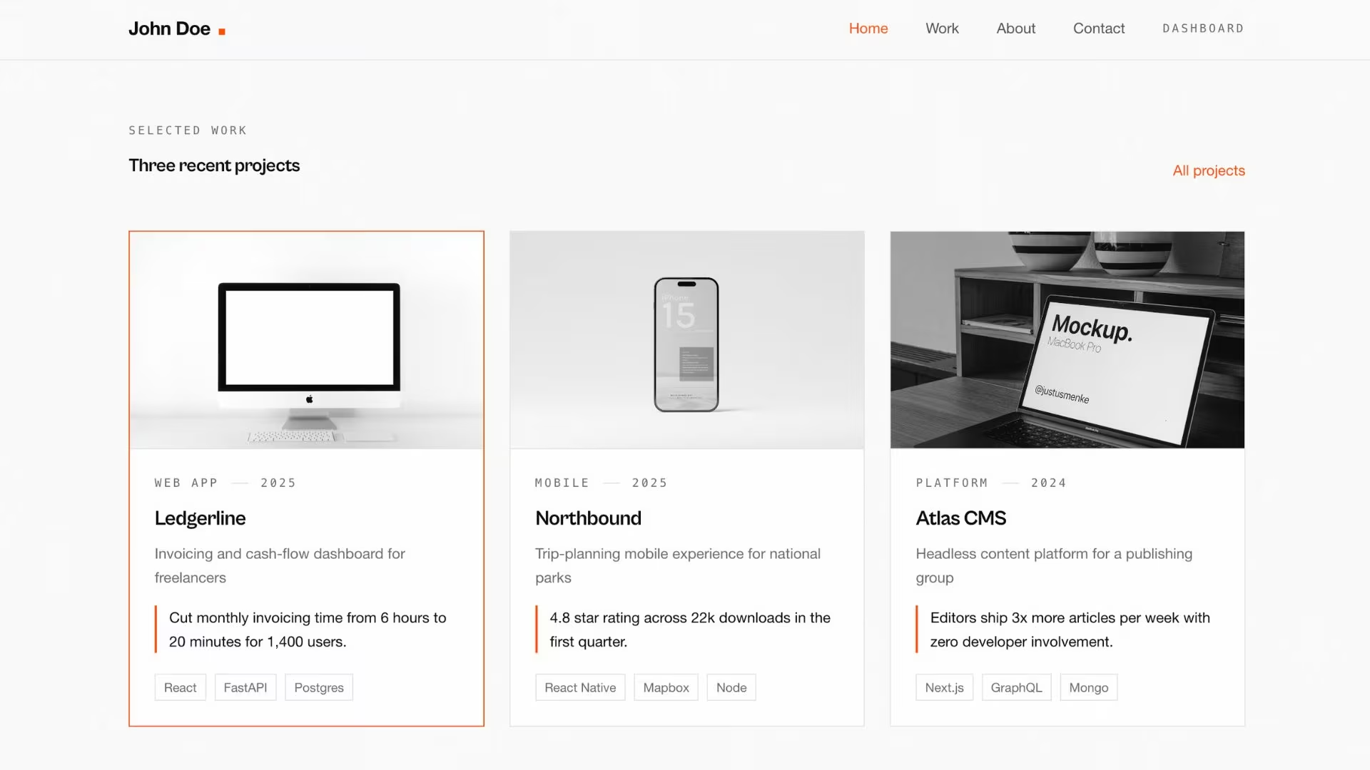
Put three pieces of work on the first screen: your name, one line on what you do, then the grid. Save the story for the About page.
2. Treating the Portfolio Like an Archive
A brand designer I know had 34 projects on her portfolio. Her two favorite projects appeared so far down the page that most people never reached them.
Too many projects hide your best work. Visitors may also judge your skills by the weakest project you include.
Choose six to eight projects that match the work you want next. My friend reduced her portfolio to seven projects, and three of her next four inquiries mentioned one of them.
3. Showing the Deliverable Without the Story
One designer's case study was nine screenshots and one caption. When I asked what she'd actually done on the project, the answer took her three minutes, and none of it was on the page. A hiring manager skimming that same page would've moved on before she got to sentence two.
Screenshots show the final result. Reviewers also need to understand the problem, the decisions you made, and why those decisions worked.
Open every project with a short setup before the images: the problem you were handed, what you owned, what moved.
4. Stopping at the Template
In one week I got two portfolio links from the same corner of my network. They had used the same template and layout, and almost the same line about being a multidisciplinary creative. An hour later, I couldn't have told you which was which.
The parts a visitor notices are the ones most people leave on default. Rewrite the two lines every template hands you: your headline and your About opener.
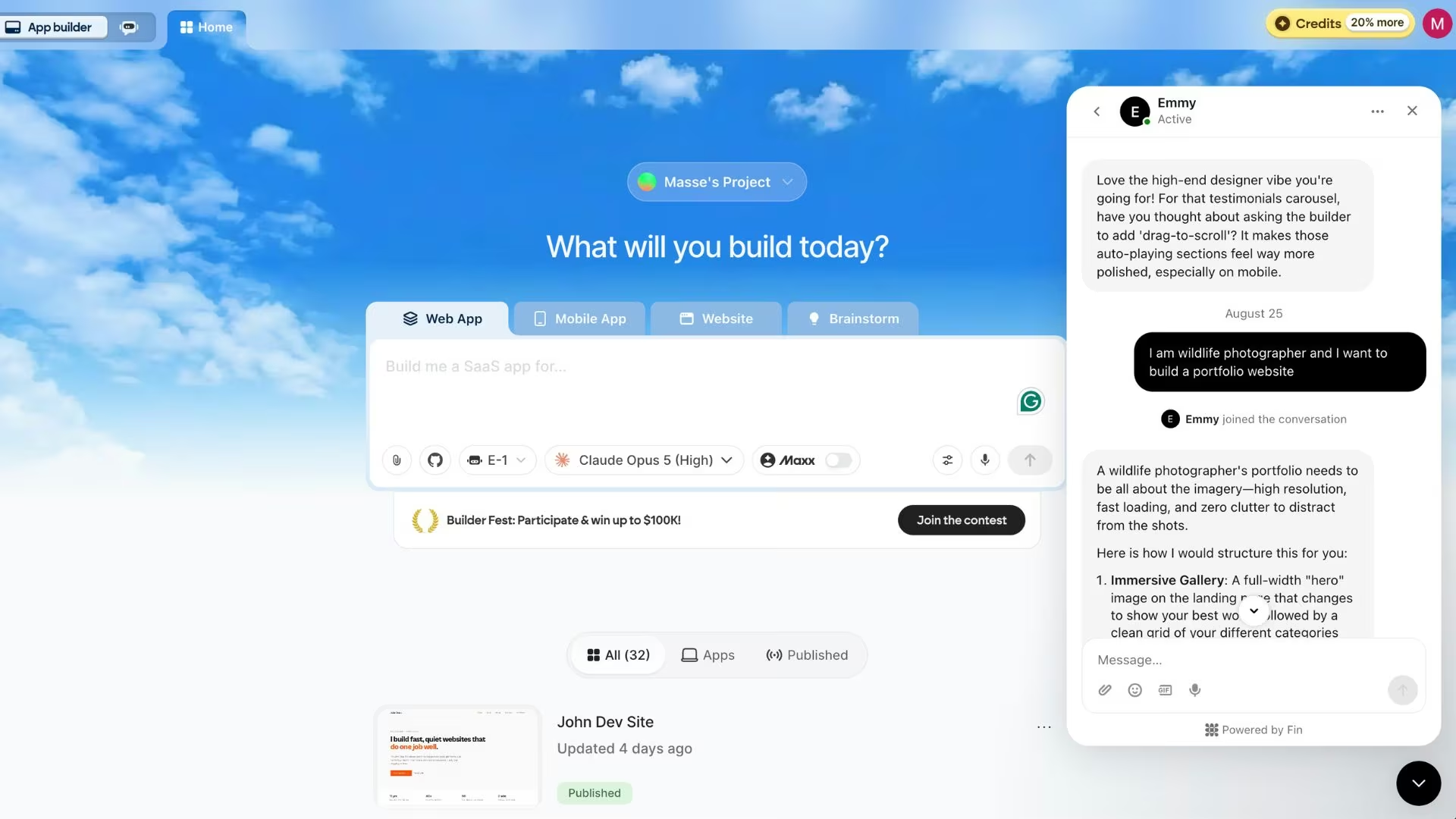
If you need help with what to write or how to design your website, you can ask an AI assistant like Emmy.
5. Ignoring How the Site Behaves on a Phone
One consultant's case studies had comparison tables on them. They looked sharp on his 27-inch monitor, but on a phone they ran off the side of the screen, and he'd never once checked.
This one isn't fifth by importance. If you only fix one thing on this list, fix this. Phones account for 49.36% of worldwide web traffic as of August 2026; call it half, and Google looks at the mobile version of your pages when it decides how to rank you.
Open your site on your own phone before you send it anywhere. Tap every link and submit the contact form.
Also read our guide on how to build a website including how to get the layout right on a phone before you send it anywhere.
6. Letting Full-Size Images Slow the Page Down
A Brooklyn photographer's homepage loaded 18 full-size photo files the moment it opened. On her studio Wi-Fi, it felt instant. On my phone, it took close to 10 seconds.
Google wants the largest thing on screen, usually your banner image, to appear within 2.5 seconds. Most image-first portfolios I opened were nowhere near it.
Export every image at the size it's displayed, then check the page in PageSpeed Insights.
7. Using Text Nobody Else Can Comfortably Read
One designer set her project captions in light gray at 14 pixels because it looked calm on a big screen. A client later told her he'd skipped the captions entirely, because on a phone in daylight he couldn't make them out.
This is the most common accessibility problem on the web's biggest sites. WebAIM's 2026 scan found faint text on 83.9% of the top million home pages, and 95.9% of those million pages had at least one detectable accessibility failure under WCAG (the standard used to judge whether a site is accessible).
Make your body text dark enough to pass the W3C contrast minimum of 4.5:1, then set it at 16 pixels or larger so it stays comfortable on a phone. That ratio compares how bright your text is against the background behind it.
8. Burying the Contact Step
The only way to reach one illustrator I worked with was an email address in the footer, saved as an image so bots couldn't scrape it. It also blocked everyone trying to copy it on a phone.
Portfolios lose people the moment they've decided they're interested, usually halfway down a project page. If the next step isn't in front of them, they tell themselves they'll come back. Almost nobody does.
Put a plain, selectable email address at the bottom of every project page. One line beats a form behind a navigation item.
9. Leaving the Site to Go Stale
One site I opened hadn't changed in 14 months. A link to a Dribbble account was dead, a client redesign had left the screenshots matching nothing real, and the homepage still offered a service the owner had stopped selling. That makes a visitor wonder what else is out of date.
Schedule a 20-minute review every three months. Check outbound links, your availability, and the site's oldest project.
10. Building on an Address You Don't Control
Someone I worked with spent two years building an audience on a free platform subdomain. Then the plans changed, the free tier lost custom pages, and the address she'd printed on business cards stopped working. She couldn't export it or forward anyone to a new address.
Your portfolio should outlive the tool you built it in. That means a domain in your name and pages a search engine can crawl. Register your own domain first.
Also read our best portfolio website builders guide for what each platform lets you take with you when you leave.
Final Thoughts
Most portfolio website mistakes are cheap to fix and expensive to ignore. Most take one working session. The two that take longer, moving to your own domain and rewriting your case studies, you can still do yourself.
If you do one thing this week, hand your portfolio to someone who doesn't know your work and watch where they stop. The ones that get replies answer a stranger's question fast, then say exactly what to do next.
What to Do If Your Portfolio Needs a Rebuild
If the site needs major changes, a clean rebuild may be easier than fixing every page separately.
Emergent is an AI website builder for portfolios built for vibe coding. You describe the projects, the order, and the tone in plain English, and it builds the pages and the data behind them.

Three faults it handles out of the box:
- Keep the address in your name: Buy a domain without leaving Emergent, through its built-in connection to the registrar IONOS, free the first year, or point a domain you already own at the site.
- Ship it yourself: You click Deploy, and typically about 15 minutes later the site is live at your own emergent.host address.
- Grow it later: If clients start booking or logging in, turning the site into an app is the next build.
The free plan includes 10 monthly credits, and Standard runs $20/month ($17/month billed annually) for 100. Credits stretch further on a simple portfolio than on one with client logins.
Try building your first portfolio on Emergent's website builder before paying for anything.
Emergent designs, writes, and publishes your whole site from one prompt. No templates, no drag-and-drop.
- Full site from one prompt
- Custom design, real pages
- Publish in minutes