Build a Minimalist Landing Page With One Message and One Action
Build a minimalist landing page with one headline and one button, and save each signup to a database you own.
Build a minimalist landing page that saves every signup to a database I own.
Trusted by Builders Worldwide
Active Builders Worldwide
Apps Successfully Created
Countries Globally Reached



Fewer Parts, Each One Placed on Purpose
A minimalist landing page carries one message and one action, and cuts every part that serves neither. Six parts hold it together.
One headline and one button from a prompt
Describe the offer in a sentence and name the one action a visitor should take. Emergent builds the page around those two parts, and you move or remove anything later by prompting.
Empty space treated as part of the layout
NN/g calls the empty areas of an interface negative space, also called white space. Ask for wide margins above and below the headline, and give the button room of its own.
Pale colors checked against WCAG contrast
A light gray line on white can look calm and still be hard to read. WCAG 2.2 sets a ratio of at least 4.5:1 for body text and 3:1 for large text. Test every pair first.
No menu bar beside the one button
In Laws of UX's words, the time it takes to make a decision increases with the number and complexity of choices. Drop the nav menu and footer links, and leave one choice.
Each entry saved to a table you own
Every entry from the page's one form lands in a database you own. Ask for the columns you need, such as email and project type, and Emergent builds that table with the page.
Hosted on your domain, exported as code
Publish on your own domain; custom domains are included and use credits. On paid plans, export the full code to your GitHub repository and keep the page wherever you host it.
Minimalist Landing Page Examples
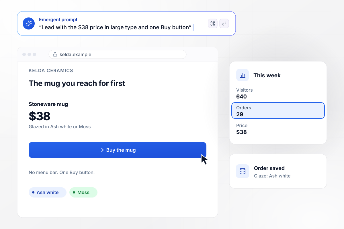
Kelda's price outsizes everything around it
Kelda Ceramics sells one stoneware mug, and its page shows nothing else. One line names the mug and the price, $38, sits below it in large type. A single Buy button follows, and there is no menu. This week the page had 640 visitors and took 29 orders, each saved with the glaze the buyer picked.
window.awbMockup = { oneNumber: "Build a landing page for Kelda Ceramics, my studio that sells one stoneware mug for $38. Use one line to name the mug, show the price below it in large type, add a single Buy button, and leave out the menu. Save every order with the glaze the buyer picks, and show me visitors and orders for the week.", typeOnly: "Make a type-only page for Osterlin Translation, my German and Dutch to English service. No images: a large headline on an off-white background, one short paragraph, and a Request a quote button that opens a form. Save each request with its language pair and count requests by month.", oneLine: "Create a landing page for Fenmarch Studio, my practice that designs house extensions. Use one headline that fits on a single line in large type, and put a form with 3 fields right under it: name, email, and project type. Save each inquiry to our database and count them by month.", singleField: "Build a pre-launch page for Quillary, my notes app. Say what the app does in one sentence, then show one email field and a Get early access button in the middle of the screen, with only a one-line footer below. Save every address as a row in a table I own and show the signup count." };
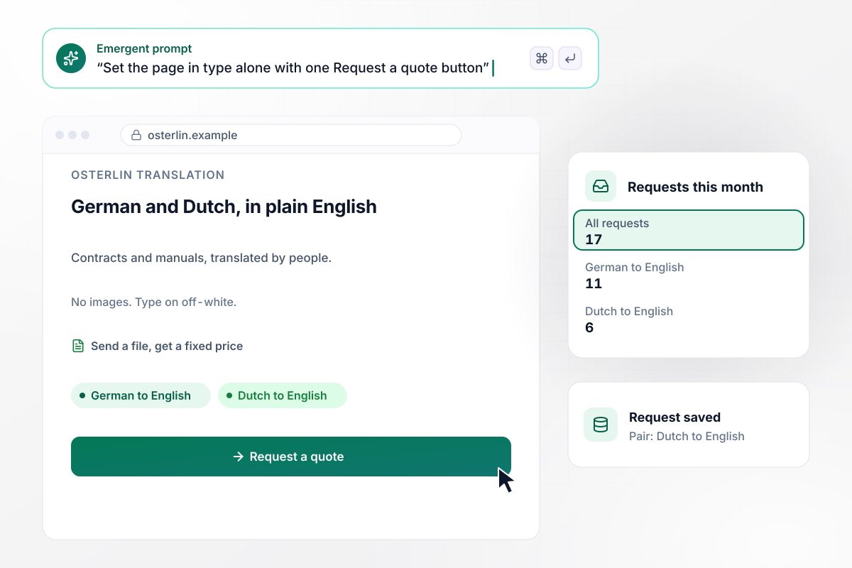
No images, and 17 quote requests this month
Osterlin Translation works from German and Dutch into English, and its page is set in type alone on an off-white background. A large headline names the service, a short paragraph explains it, and one button opens the request form. The page drew 17 quote requests this month, each saved with its language pair.
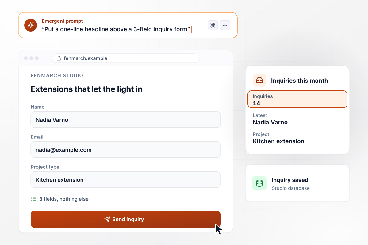
Six words on top and 3 fields underneath
Fenmarch Studio designs house extensions. Its page carries a single six-word headline in large type and puts a form straight under it. The form asks for 3 fields: name, email, and project type. Nadia Varno's kitchen extension was the 14th inquiry this month, saved to the studio's database.
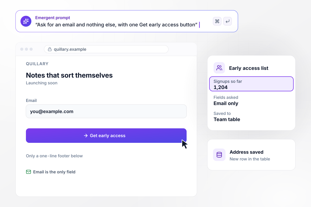
An email is all it asks, and 1,204 people gave one
Quillary is a notes app that has not launched yet. Its page says what the app does in one sentence, then shows one email field and a Get early access button in the middle of the screen. Nothing sits below them but a one-line footer. So far 1,204 people have signed up, and each address is a row in a table the team owns.





How to Build a Minimalist Landing Page
Seven steps to a minimalist landing page that says one thing, asks for one action, and stays readable, then build it with Emergent.
Write the sentence a visitor should remember if they read nothing else, such as "Hand-thrown mugs, fired once a month." If it takes two sentences to say, the page is carrying two offers. Keep the stronger one and give the other a page of its own.
Decide the one thing a visitor does here: buy, book, request a quote, or leave an email. Laws of UX gives the advice to minimize choices when response times are critical to decrease decision time. Remove secondary links that point anywhere else.
List every part you planned, from a logo strip to testimonials to footer links. For each one, ask whether it backs up the message or helps the visitor act. Keep the parts that do and delete the rest, even the ones that took a day to make.
Pick one typeface in two weights, and keep one accent color for the button alone. Hold body lines to about 65 characters. WCAG's AAA guideline on visual presentation says width is no more than 80 characters. Treat 80 as the ceiling.
Put the message, the action, the typeface, and the accent color into one prompt, with the fields the form needs. Emergent builds the page and the table behind its form. Prompt again to widen a margin or rename the button.
Open the page on a phone and look at the first screen only: the headline and the button should both be there, with nothing pushing them down. Tap the button with your thumb, send a test entry, and find it in the table.
Publish the page and leave it alone for a week. Then change a single part, such as the headline or the button label, and compare the next week's entries with the last. Two changes at once leave you guessing which one worked.
Why Build a Minimalist Page With Emergent?
Say the one message and the one action. Emergent builds the page, sends signups to a database you own, and exports code on paid plans.

|
Unbounce | Landingi | Wix | |
|---|---|---|---|---|
| How you build | Prompt for a campaign page | Templates and drag-and-drop, AI copy assist | Templates and drag-and-drop, AI assist | Prompt for a full site |
| Where submissions go | A database table you own, plus integrations | Unbounce lead storage and integrations | Vendor lead storage and integrations | Wix dashboard submissions and Contacts |
| Visitor limits | No per-visitor pricing | Monthly visitor caps by plan | Tiered by traffic on most plans | Site plan bandwidth |
| A/B testing | Generate variants by prompt | A/B testing on higher-tier plans only | Higher plans | Limited or add-on |
| Code ownership | Full code export to GitHub on paid plans | Hosted only | Hosted only | Hosted only |



Pick the Pricing Plan That Works for You
Choose the plan that fits your building ambitions. From weekend projects to enterprise applications, we've got you covered.



Find the right landing page for you
Frequently Asked Questions
Your Questions, Answered
Don't change this element unless you know what you are doing
More things you can build
with Emergent
on Emergent today